


This website uses cookies to improve your web experience.
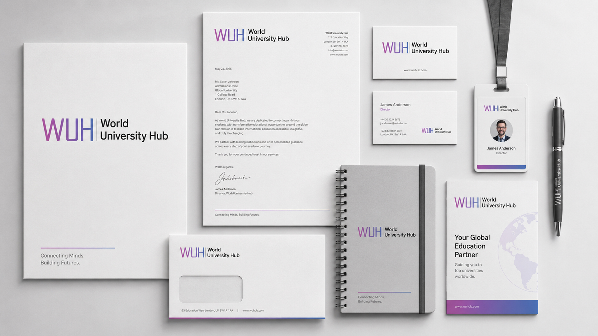
M4YOURS IT designed a modern World University Hub identity for study abroad services, combining gradient WUH typography with clean structure to reflect guidance, international education, trust, and student success clearly.
Logo Design
Brand Identity Design
Visual Identity Design
Natural
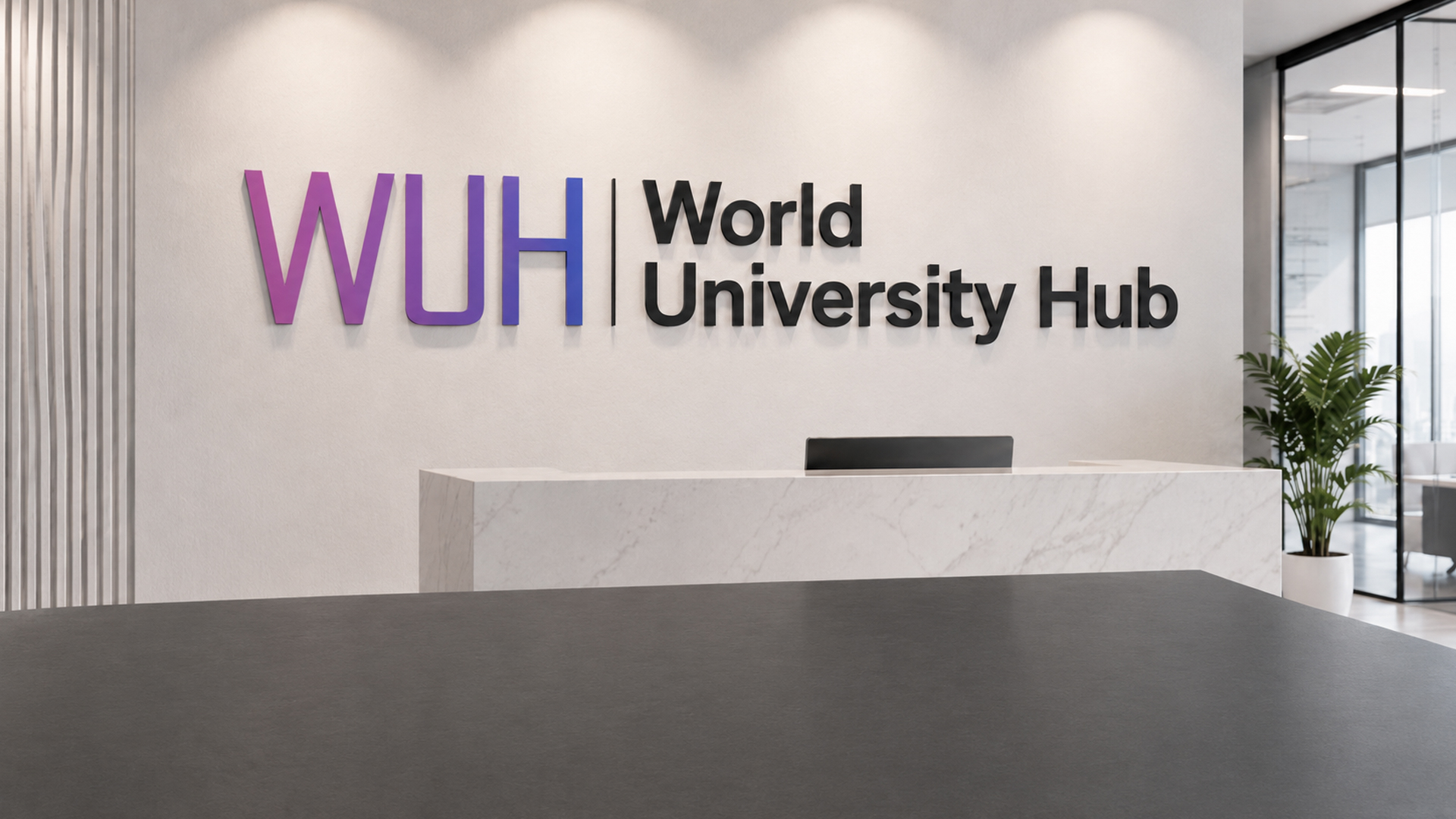
World University Hub needed a professional brand identity for a study abroad platform focused on helping students explore international education opportunities with confidence. M4YOURS IT created a clean and modern logo concept using the abbreviated “WUH” as the main visual mark, supported by the full name, “World University Hub.” The gradient purple and blue color direction reflects ambition, global opportunity, digital innovation, and academic growth. The bold typography gives the brand strong visibility, while the vertical divider creates a structured and professional layout. The identity is designed to work across the website, student consultation materials, social media campaigns, digital ads, presentations, and education fair branding. The final visual identity positions World University Hub as a trusted platform for students planning to study abroad. It supports brand recognition, improves professional credibility, and creates a consistent foundation for future marketing, lead generation, and student engagement communication across digital channels.
Client Name: World University Hub
Website: worldunihub.com
Industry: Study Abroad
Service Category: Branding & Creative Design
Services Provided: Logo Design, Brand Identity Design, Education Brand Visual Identity
Project Type: Portfolio Branding Project
Design Style: Modern, Clean, Academic, Digital, Professional
Color Direction: Purple and Blue Gradient with Black Typography
Primary Goal: Create a professional study abroad brand identity that reflects trust, global education opportunities, student guidance, and modern academic support.
Adding {{itemName}} to cart
Added {{itemName}} to cart