


Mobile-First Website Design
Mobile-first website design focuses on designing websites primarily for mobile devices before scaling the layout for larger screens. This approach ensures that essential content and navigation remain clear and accessible for smartphone users.

Responsive Layout Design
Responsive layout design uses flexible grid systems and adaptive design techniques to ensure that website layouts adjust automatically to different screen sizes. This ensures content remains readable and visually balanced on all devices.

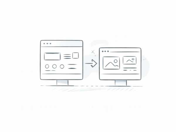
Adaptive Image Optimization
Adaptive image optimization ensures that images automatically adjust their size and resolution depending on the device being used. This improves loading speed and ensures images display clearly across devices.
Responsive Website Redesign
Responsive website redesign services help businesses update older websites that are not optimized for mobile devices. Our team redesigns layouts, navigation, and visual structures to ensure the website works seamlessly across all screen sizes.

Responsive Navigation Design
Responsive navigation design focuses on creating mobile-friendly navigation systems such as collapsible menus, simplified navigation bars, and touch-friendly interface elements.

Cross-Device Interface Testing
Cross-device interface testing evaluates how websites perform across different devices, browsers, and screen sizes to ensure consistent functionality and user experience.