Packaging Design
Urban Fortified Soybean Oil Packaging Design
A clean and trustworthy fortified soybean oil packaging design for Urban, created with bright yellow visuals, oil-flow imagery, health-focused icons, and clear retail product communication.
Food & Beverage
FMCG
Packaging Design
Urban Food & Beverage
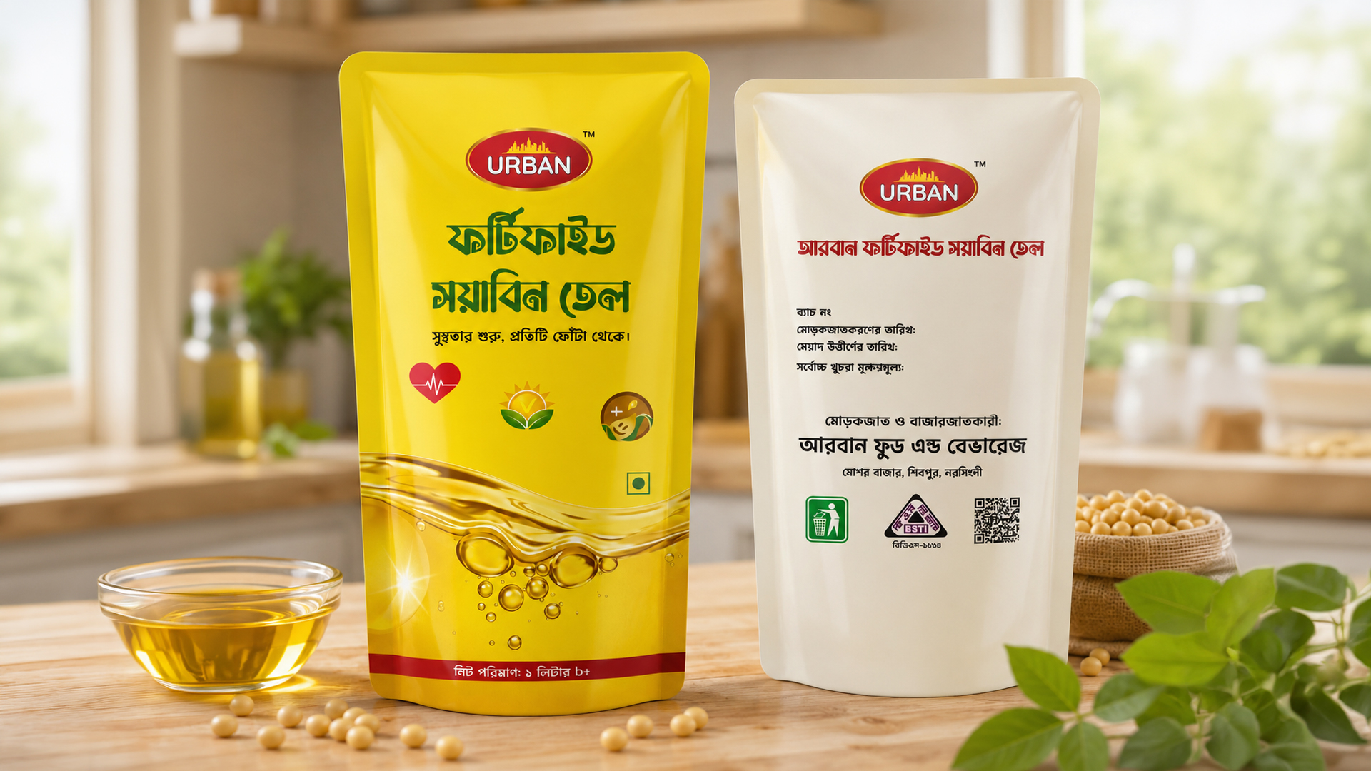
Urban Fortified Soybean Oil Packaging Design
The Urban Fortified Soybean Oil Packaging Design project was created for Urban Food & Beverage to develop a professional, clean, and consumer-friendly edible oil packaging solution. The design uses a bright yellow color palette to reflect purity, freshness, energy, and food-grade quality, while the flowing oil visual reinforces the product category clearly.
The front packaging highlights the Urban brand identity, Bangla product name, freshness-focused tagline, health-related icon set, vegetarian mark, and net quantity information. The back packaging maintains a minimal and organized layout with batch details, production information, expiry information, maximum retail price section, manufacturer details, BSTI mark, QR code, and waste disposal icon. Overall, the packaging was designed to build consumer trust, improve shelf visibility, and present the product as a reliable FMCG edible oil brand for the local market.
Design Focus
- Fresh and pure edible oil visual direction
- Bright yellow packaging for strong shelf visibility
- Clean Bangla typography for local market communication
- Oil-flow graphic to highlight product category
- Health, quality, and freshness-focused icon placement
- Minimal back panel information layout
- Manufacturer, BSTI, QR code, and product detail placement
- Retail-ready FMCG packaging presentation
Key Deliverables
- Front packaging design
- Back packaging design
- Product label layout
- Edible oil packaging visual concept
- Brand-focused typography composition
- Regulatory and product information layout
- QR code and certification placement
- Print-ready packaging concept
Project Details
Project Type: Product Packaging Design
Product Name: Urban Fortified Soybean Oil
Client: Urban Food & Beverage
Industry: Food & Beverage / FMCG Edible Oil Product
Design Style: Clean, minimal, bright, health-focused, retail-ready
Primary Color Palette: Yellow, Golden Oil Tone, White, Red Accent, Green Accent
Packaging Format: Front and back edible oil label / pouch packaging
Language Used: Bangla
Product Quantity: 1 Liter
Target Market: Local household consumers, grocery shops, supermarkets, and retail stores