
Website Mobile-First Optimization
Build Mobile-Optimized Websites for Better User Experience and Conversions
Optimize your website with a mobile-first approach to deliver fast, seamless, and user-friendly experiences across smartphones and tablets.
Website mobile-first optimization focuses on designing and improving websites primarily for mobile devices before adapting them for larger screens. With the majority of users accessing websites through smartphones, businesses must ensure their platforms deliver smooth, fast, and intuitive mobile experiences.
At M4YOURS IT, we take a mobile-first approach to optimize layout, navigation, content structure, and performance for smaller screens. We analyze how users interact with your website on mobile devices and identify areas where usability can be improved.
Our process includes simplifying layouts, optimizing touch interactions, improving loading speed, and ensuring content is easy to read and navigate. We also focus on responsive design to ensure consistent experience across all devices.
By prioritizing mobile usability, we help businesses improve engagement, reduce bounce rates, and increase conversions. A mobile-first optimized website ensures your digital presence meets modern user expectations and performs effectively in competitive markets.
Why Businesses Need Website Mobile-First Optimization Service
Mobile traffic has surpassed desktop usage, making mobile optimization essential for business success. Websites that are not optimized for mobile often lose users due to poor usability and slow performance.
Mobile-first optimization ensures your website delivers a smooth, fast, and engaging experience across all devices.
Key Benefits
- Improved Mobile User Experience: Optimized layouts and interactions make it easy for users to navigate and engage on mobile devices.
- Higher Conversion Rates on Mobile: Simplified user flows and faster performance encourage users to complete actions.
- Faster Mobile Loading Speed: Optimized design improves loading time across different mobile network conditions.
- Better Search Engine Rankings: Search engines prioritize mobile-friendly websites, improving visibility.
- Reduced Bounce Rates: A seamless mobile experience keeps users engaged and reduces drop-offs.
- Cross-Device Consistency: Ensures smooth experience across smartphones, tablets, and desktops.
[ Blog ]
Mobile-First Optimization
Explore insights on mobile UX design, responsive strategies, and performance optimization techniques that help businesses improve mobile engagement and conversions.
Website Mobile-First Optimization Services
Mobile-first optimization services from M4YOURS IT help businesses create websites that perform seamlessly on mobile devices.
We analyze user behavior, design layouts optimized for smaller screens, and improve performance to ensure fast and smooth interactions. Our approach combines UX strategy, responsive design, and performance optimization.
By focusing on mobile usability, we help businesses improve engagement, increase conversions, and deliver better user experiences. Our solutions are scalable, practical, and aligned with modern mobile usage trends.

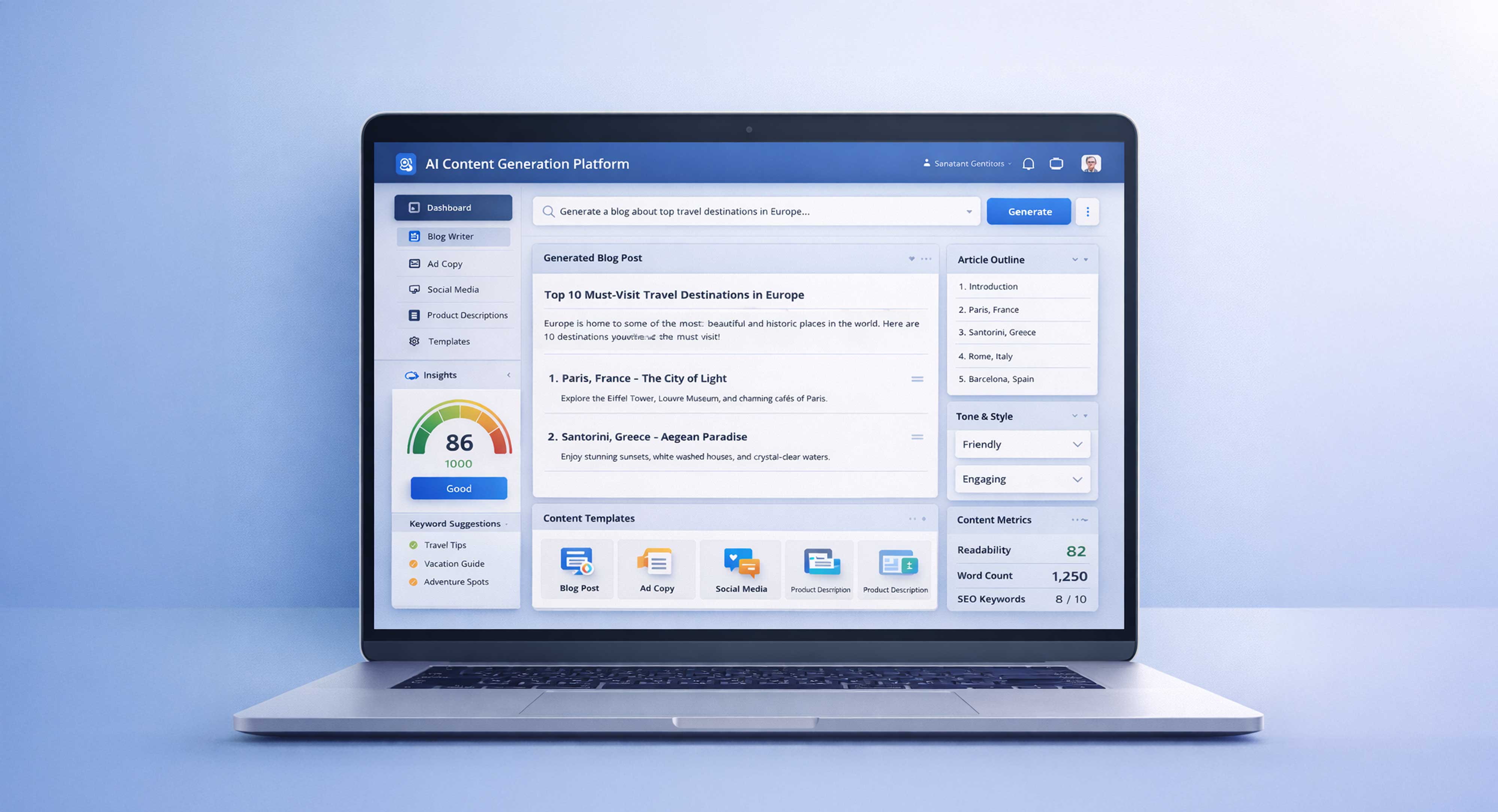
Mobile UX Audit & Usability Analysis
We analyze your website’s mobile experience by evaluating navigation, layout structure, interaction patterns, and usability issues. This helps identify friction points, accessibility gaps, and performance problems that affect user engagement, allowing us to create targeted improvements for a smoother mobile experience.

Mobile Layout & Responsive Design Optimization
We redesign your website layout specifically for mobile devices, ensuring content is properly structured, readable, and visually balanced. This includes optimizing grid systems, spacing, and element positioning to create a seamless and consistent experience across different screen sizes and resolutions.

Touch Interaction & Navigation Optimization
We optimize all interactive elements such as buttons, menus, forms, and links for touch-based usage. This ensures users can easily navigate your website without errors, improving usability, reducing frustration, and creating a more intuitive mobile browsing experience.

Mobile Speed & Performance Optimization
We improve mobile loading speed by optimizing design elements, reducing unnecessary components, and enhancing performance efficiency. This ensures faster page load times, smoother interactions, and better performance across different network conditions, especially for users on slower mobile connections.

Content Simplification & Readability Enhancement
We restructure content to make it concise, easy to read, and optimized for smaller screens. This includes improving typography, spacing, and content hierarchy to ensure users can quickly understand information without scrolling excessively or facing readability challenges.

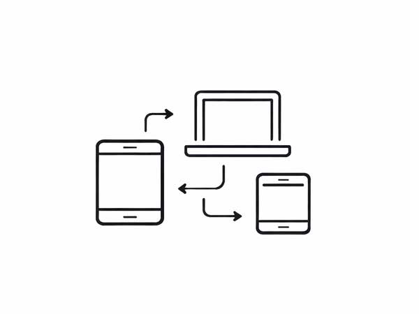
Cross-Device Testing & Optimization
We test your website across various mobile devices, screen sizes, and browsers to ensure consistent performance and usability. This helps identify issues and ensures your website delivers a seamless experience for all users regardless of device or platform.
Our Website Mobile-First Optimization Process
Our process is designed to transform your website into a mobile-optimized platform that delivers fast, intuitive, and seamless experiences across all devices. At M4YOURS IT, we combine UX strategy, responsive design principles, and performance optimization to ensure your website performs effectively in a mobile-first environment.
Mobile Performance Audit & Analysis
We analyze your website’s current mobile performance, usability issues, loading speed, and user behavior. This helps identify friction points, navigation challenges, and performance gaps that impact mobile user experience.
Mobile UX Strategy & Layout Planning
We define a mobile-first design strategy focused on user behavior, content prioritization, and interaction flow. This ensures your website structure is optimized for smaller screens and touch-based navigation.
Responsive Design Optimization & Implementation
We redesign layouts, components, and visual elements to ensure full responsiveness. This includes optimizing grids, typography, and spacing to create a seamless experience across all screen sizes.
Interaction & Performance Optimization
We optimize touch interactions, improve loading speed, and refine user interface elements to ensure smooth navigation and fast performance on mobile devices.
Testing, Validation & Continuous Optimization
We test your website across multiple devices, browsers, and network conditions. Continuous monitoring and optimization ensure your mobile experience remains efficient, scalable, and high-performing over time.
[ Portfolio ]
Website Mobile-First Optimization
Explore our portfolio where M4YOURS IT has optimized websites for mobile performance, improving usability, engagement, and conversion rates across smartphones and tablets.
Why Choose M4YOURS IT for Website Mobile-First Optimization
M4YOURS IT delivers mobile-first optimization solutions that improve usability, performance, and engagement across all devices.
Key Advantages
- Mobile-First Design Expertise: We specialize in designing and optimizing websites for mobile users as the primary audience.
- User-Centered Mobile Experience: We create intuitive, easy-to-use mobile interfaces that improve engagement and usability.
- Performance Optimization Focus: We ensure fast loading speed and smooth performance across all mobile devices.
- Responsive Design Excellence: We deliver seamless experiences across smartphones, tablets, and desktops.
- Conversion-Focused Mobile Optimization: We optimize mobile user journeys to increase leads, sales, and user actions.
- Cross-Device Compatibility: We ensure consistent experience across different devices, browsers, and platforms.
- Scalable Mobile Optimization Strategy: Our solutions support long-term growth and continuous performance improvement.
- Results-Oriented Approach: Our goal is to deliver measurable improvements in mobile engagement and conversions.
Frequently Asked Questions
Mobile-first optimization is the process of designing and improving a website primarily for mobile devices before adapting it for larger screens.
It ensures that mobile users get the best possible experience, which is critical as most traffic comes from smartphones.
Mobile-first design is important because the majority of users access websites through mobile devices.
A poor mobile experience can lead to high bounce rates, while a well-optimized mobile design improves engagement and conversions.
Mobile-first design starts with designing for smaller screens first, while responsive design adapts layouts for different devices.
Mobile-first ensures better performance and usability by prioritizing mobile user needs from the beginning.
Yes, mobile optimization significantly improves conversions by simplifying user journeys, improving speed, and enhancing usability.
A better mobile experience encourages users to complete actions such as purchases or inquiries.
Mobile optimization is designed to improve overall performance without negatively impacting desktop experience.
In many cases, it improves consistency and usability across all devices.
We test mobile optimization using real devices, browser testing tools, and performance analysis platforms. We evaluate loading speed, usability, interaction flow, and responsiveness.
This ensures your website performs consistently across different devices, screen sizes, and network conditions while delivering a smooth user experience.
Yes, mobile optimization plays a major role in SEO. Search engines prioritize mobile-friendly websites through mobile-first indexing.
Improving mobile usability, speed, and responsiveness helps increase search visibility, improve rankings, and attract more organic traffic.
Not always. Depending on your website condition, we may optimize specific elements such as layout, navigation, and performance without a full redesign.
However, for outdated websites, a complete mobile-first redesign may be recommended for better results.
The timeline depends on your website size and complexity. Smaller optimizations can be completed quickly, while larger projects may take more time.
A structured process ensures efficient delivery without compromising quality or performance.
Getting started is simple. Contact M4YOURS IT to discuss your website performance, user experience challenges, and business goals.
We will analyze your platform, define a mobile-first strategy, and create a structured optimization plan. Once approved, we begin improving your website for better mobile performance.
Deliver a Seamless Mobile Experience for Your Users
Your users are on mobile, and your website needs to perform perfectly on every device. A mobile-first optimized website improves engagement, reduces bounce rates, and increases conversions.
M4YOURS IT helps businesses create fast, responsive, and user-friendly mobile experiences that drive real results.
Whether you need optimization or a complete mobile-first redesign, our team is ready to help you improve your website performance.
Contact M4YOURS IT today to optimize your website for mobile-first performance.


