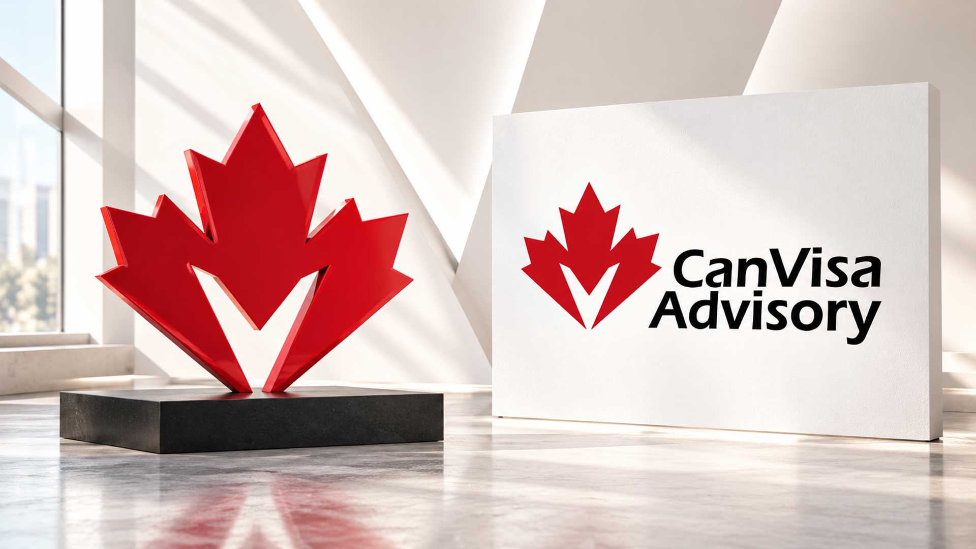

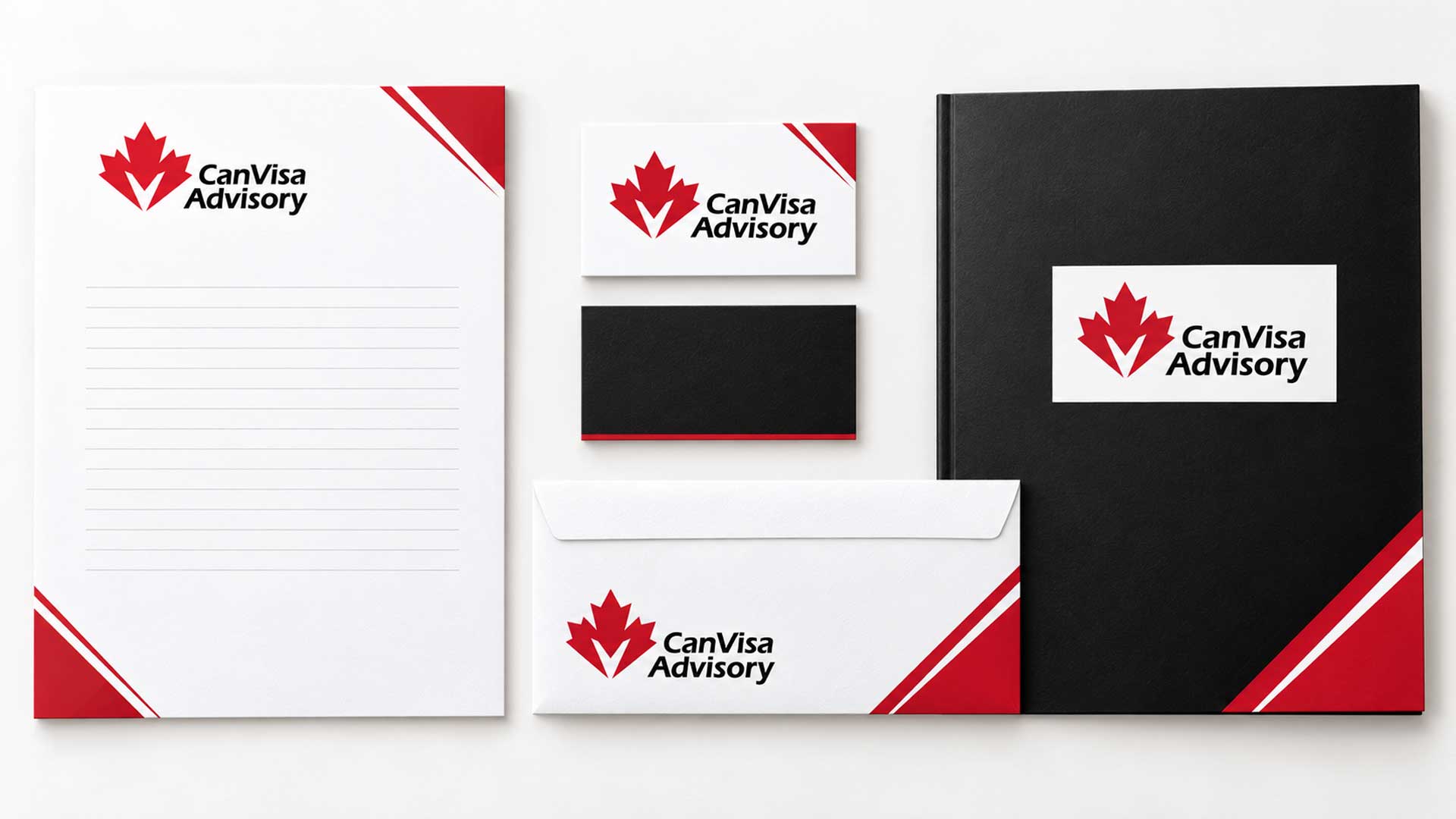



A distinctive immigration logo for CanVisa Advisory, combining a red maple leaf, V-shaped negative space, and bold black typography to communicate Canadian identity, direction, and confidence.
The CanVisa Advisory logo creates an immediate visual connection to Canada through a prominent red maple leaf. Paired with a bold black wordmark, the symbol gives the identity a clear focal point and a strong presence.
A white V-shaped opening introduces a distinctive detail within the leaf, creating a subtle connection to “Visa” in the business name. The lettering places “CanVisa” and “Advisory” on separate lines, forming a compact text block beside the emblem.
The identity combines familiar Canadian symbolism with a focused typographic treatment. Its character comes from the contrast between the angular red leaf, the open white space, and the forward slant of the black lettering.
Client
Industry
Creative focus
Designed by
Design Concept
The concept brings Canadian identity and a sense of direction into one composition. The maple leaf establishes the Canadian connection, while the V-shaped opening adds a visual link to the brand name. Bold italic lettering introduces energy and gives the wordmark a confident character.
A recognisable Canadian symbol: The red maple leaf communicates the brand’s Canadian focus at a glance.
A distinctive use of space: The white V-shaped opening becomes part of the emblem, giving the familiar leaf a more individual appearance.
Typography with momentum: The bold, slanted lettering adds movement while keeping the business name prominent.
A compact composition: The two-line wordmark balances the height of the emblem, bringing the symbol and name together in a unified layout.
A focused red, black, and white palette gives each element a clear role.
| Colour | HEX Code | RGB | Purpose |
|---|---|---|---|
| Brand Red | #C11725 | 193, 23, 37 | Highlights the maple leaf and establishes the Canadian connection. |
| Black | #000000 | 0, 0, 0 | Gives the wordmark prominence and creates a strong contrast with the emblem. |
| White | #FFFFFF | 255, 255, 255 | Defines the V-shaped opening and provides space around the complete identity. |
Red draws attention to the symbol, black anchors the business name, and white keeps the internal detail and overall composition clear.
Explore our logo design portfolio showcasing distinctive brand identities created for startups, SMEs, and enterprise clients across technology, ecommerce, and service industries.



The final CanVisa Advisory logo combines a prominent Canadian emblem with a confident, compact wordmark. The white V-shaped opening adds a distinctive feature to the red maple leaf, while the bold italic lettering gives the name a sense of movement.
Together, these elements establish a clear visual direction for the brand. The emblem, typography, and focused palette provide a foundation for future website graphics, business stationery, presentation materials, and other brand communications.
Your next project
Have a business in mind? Tell us about your ideas, your audience, and the identity you want to create.
Prefer a direct conversation?
Explore logo design insights, branding strategies, design trends, and expert guidance that help businesses create memorable and effective brand identities.
The logo combines a Canadian maple leaf with a bold wordmark to express Canadian identity and a sense of direction. Its visual language connects the business name with the idea of moving towards a new chapter.
The opening creates a subtle connection to “Visa” in CanVisa. It also gives the maple leaf an individual detail, using negative space as an active part of the emblem.
Red highlights the maple leaf and its Canadian association. Black gives the business name a strong visual presence. White defines the internal opening and separates the different elements of the design.
The bold italic lettering introduces energy and keeps the name prominent. Stacking “CanVisa” above “Advisory” creates a compact wordmark that balances the emblem beside it.
The complete logo can guide applications such as website headers, letterheads, business cards, and presentation covers. The maple leaf emblem can also support compact brand graphics, with each layout adapted to its intended size and format.

Hi there 👋🏼How can we help you?

M4YOURS IT
Hi, how can I help you?
M4YOURS IT
Hi, how can I help you?
M4YOURS IT
yes sir
M4YOURS IT
Hi, how can I help you?
M4YOURS IT
Hi, how can I help you?
M4YOURS IT
yes sir
M4YOURS IT
Adding {{itemName}} to cart
Added {{itemName}} to cart