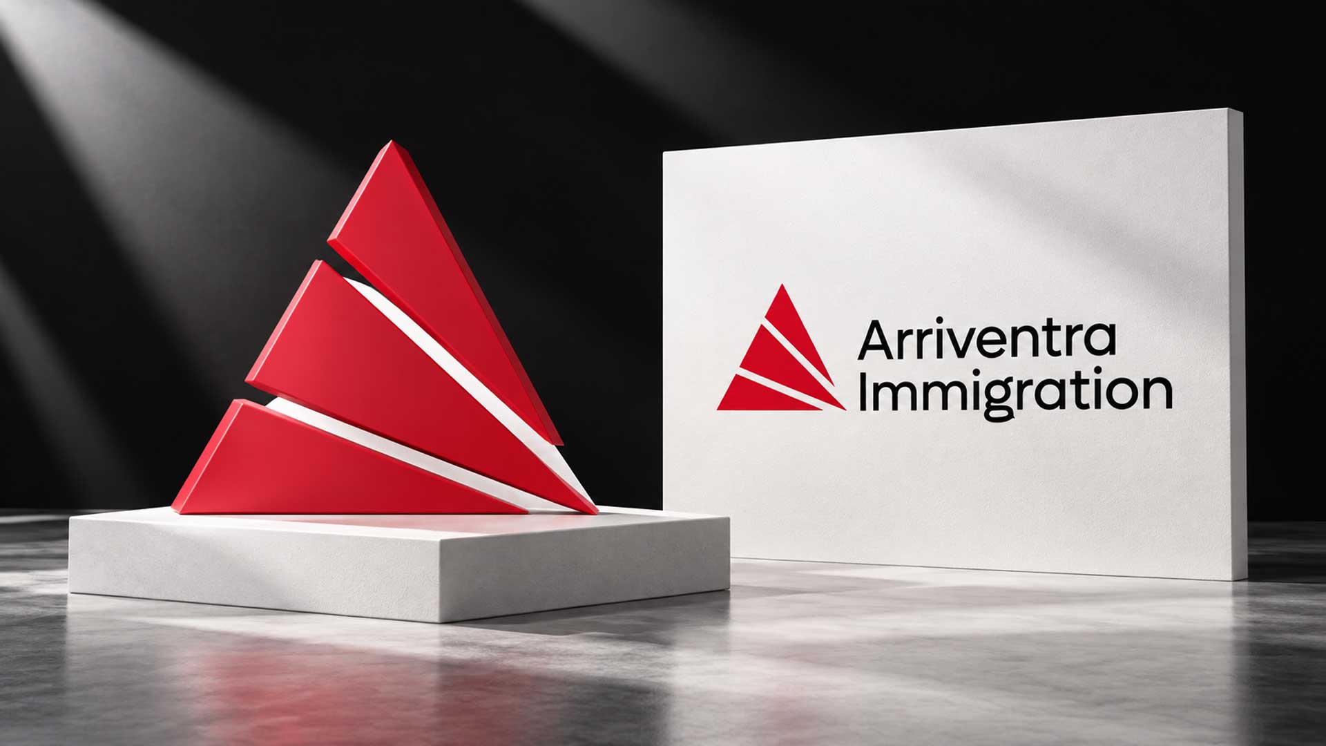
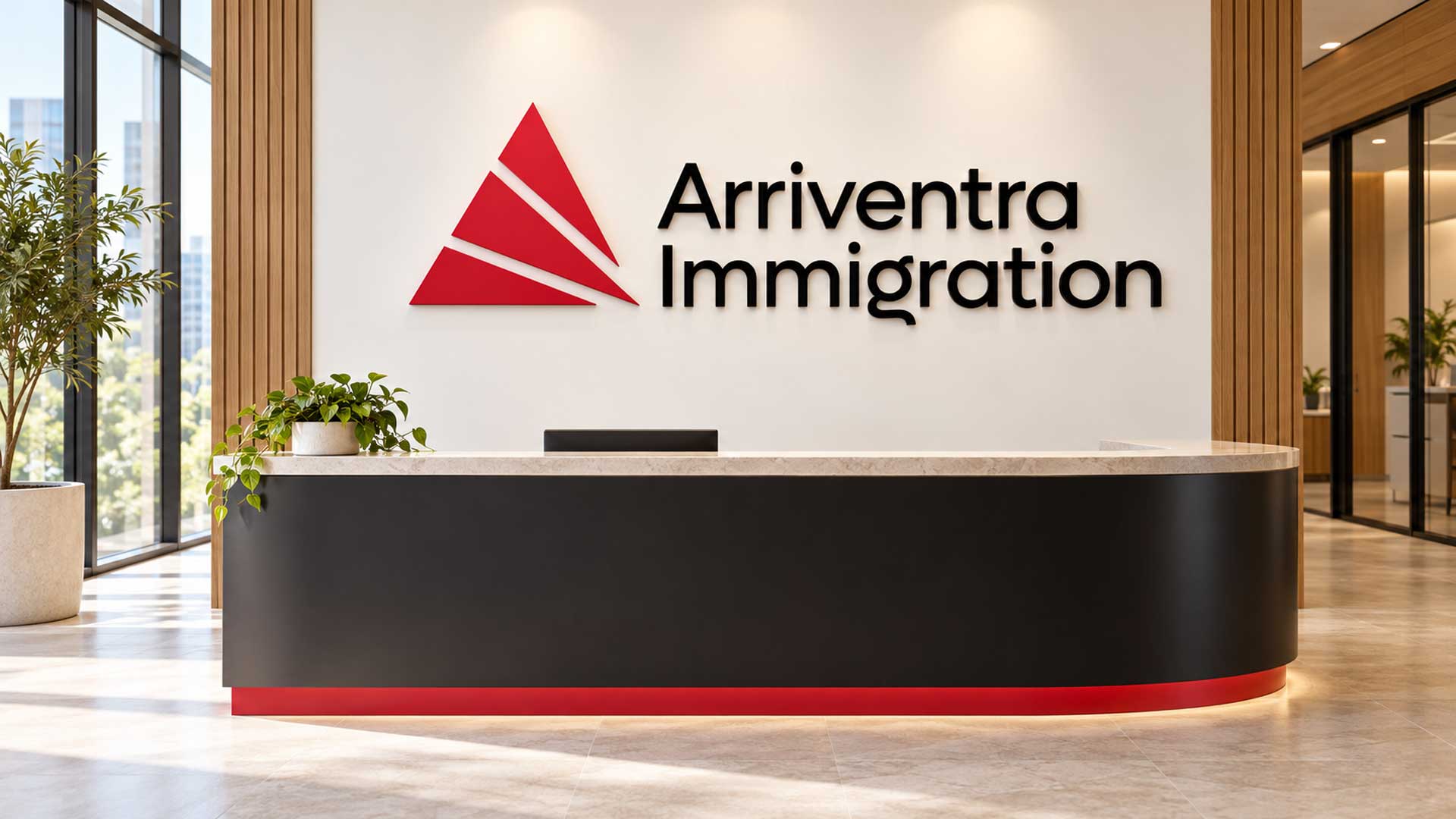
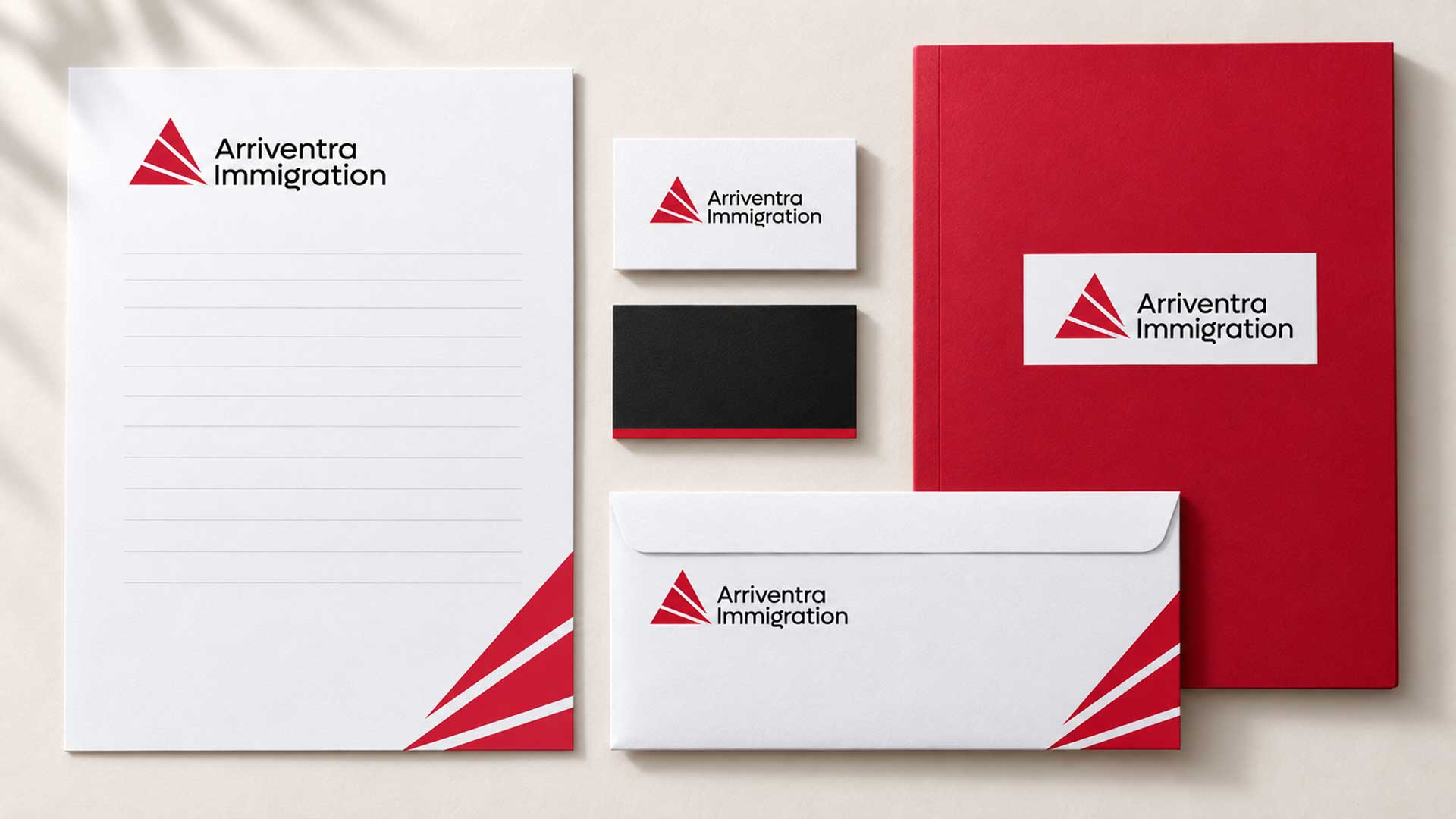
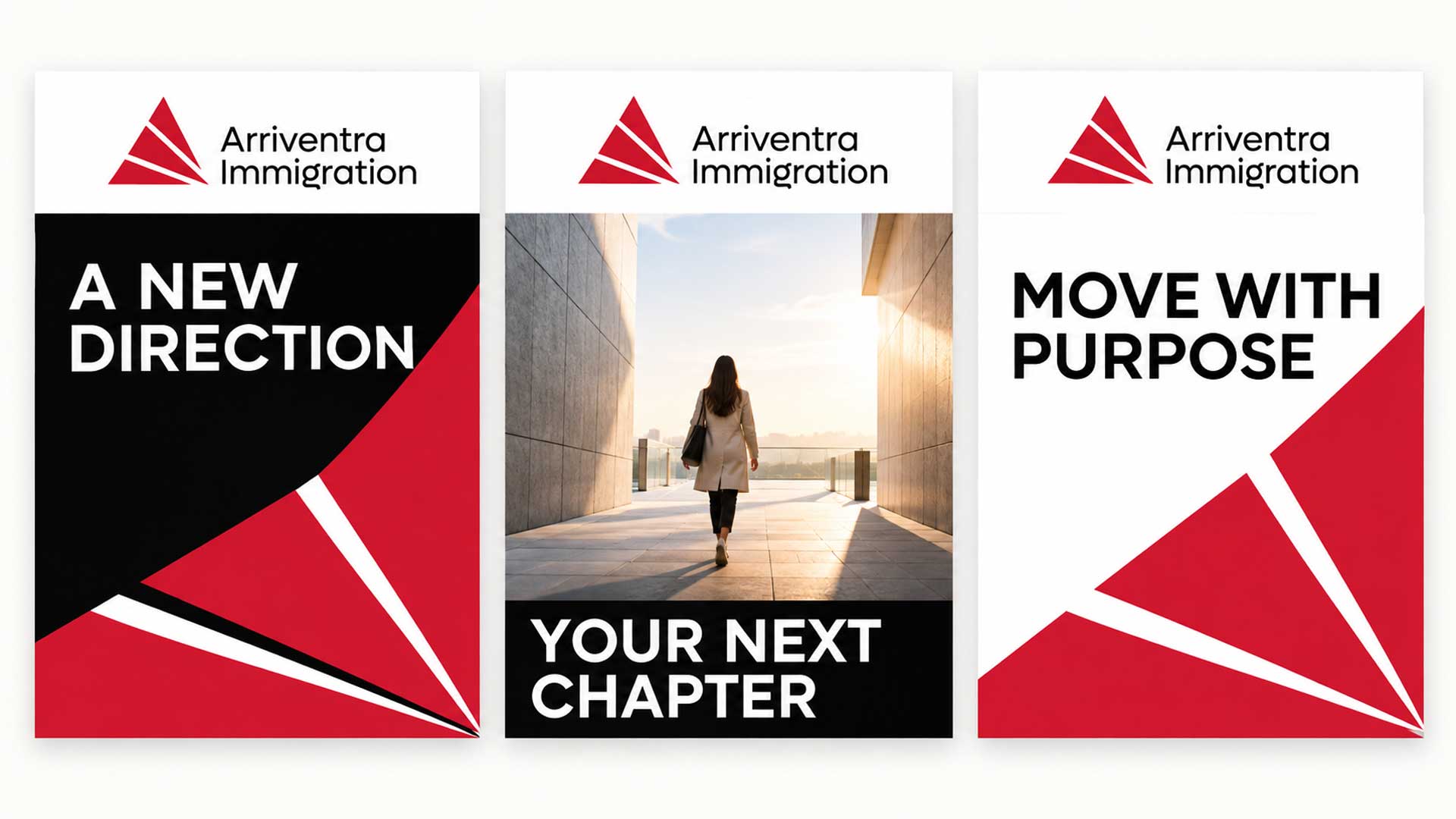


A distinctive logo for Arriventra Immigration, combining an abstract red emblem, clean black typography, and purposeful negative space to express direction, ambition, and new beginnings.
The Arriventra Immigration logo brings together a geometric symbol and a clear wordmark to create an identity with a strong sense of direction. Its visual character comes from the relationship between the red emblem, diagonal white openings, and stacked black lettering.
The triangular silhouette introduces an A-inspired form, connecting the symbol with the opening letter of Arriventra. Inside the emblem, the white channels separate the angular shapes and suggest pathways moving towards a shared point.
The two-line wordmark gives the business name a prominent position alongside the symbol. Together, these elements establish a focused identity for an immigration brand built around the idea of moving towards a new beginning.
Client
Industry
Creative focus
Designed by
Design Concept
The concept uses shape and space to express a journey. The red forms create a compact, rising silhouette, while the diagonal white channels introduce movement within it. This combination gives the identity both structure and energy.
An A-inspired emblem: The triangular composition creates a subtle connection to the first letter of Arriventra.
Pathways through negative space: The white openings guide the eye through the symbol, suggesting direction and the possibility of different paths leading forward.
A clear wordmark: The black lettering presents “Arriventra” and “Immigration” on separate lines, giving both parts of the name room within the composition.
A focused visual language: Red, black, and white create a direct relationship between the emblem, typography, and surrounding space.
The logo uses three colours, each with a clear role in the identity.
| Colour | HEX Code | RGB | Purpose |
|---|---|---|---|
| Brand Red | #CD1E37 | 205, 30, 55 | Gives the geometric emblem prominence and introduces energy to the composition. |
| Black | #000000 | 0, 0, 0 | Defines the wordmark and provides a strong visual anchor beside the symbol. |
| White | #FFFFFF | 255, 255, 255 | Creates the diagonal pathways within the emblem and breathing room around the identity. |
Red establishes the focal point, black keeps the business name prominent, and white makes the internal structure of the symbol clear.
Explore our logo design portfolio showcasing distinctive brand identities created for startups, SMEs, and enterprise clients across technology, ecommerce, and service industries.


The final Arriventra Immigration logo combines a distinctive geometric emblem with a clear, balanced wordmark. The red symbol draws the eye, while the stacked black lettering gives the business name a strong presence.
The diagonal negative space adds character to the mark and reinforces the concept of direction. Together, the symbol, typography, and focused palette provide a consistent foundation for future website graphics, stationery, presentations, and other brand communications.
Your next project
Have a business in mind? Tell us about your ideas, your audience, and the identity you want to create.
Prefer a direct conversation?
Explore logo design insights, branding strategies, design trends, and expert guidance that help businesses create memorable and effective brand identities.
The logo expresses direction, progress, and new beginnings through an abstract geometric emblem. Its triangular silhouette suggests an A-inspired form, while the diagonal openings introduce the idea of pathways moving forward.
The white spaces separate the red forms and guide the eye through the emblem. They are an active part of the design, creating movement and helping define the symbol’s distinctive shape.
Red brings attention to the emblem and gives it an energetic visual presence. Black gives the wordmark clarity and weight. Together with white, the colours create a focused and recognisable composition.
The clean lettering keeps attention on the business name. Placing “Arriventra” and “Immigration” on separate lines creates an organised text block that balances the geometric emblem beside it.
The emblem can serve as a compact brand element for profile images, favicons, and supporting graphics. The full logo provides clearer identification where the business name needs to appear. Each adaptation should be checked for legibility at its intended size.

Hi there 👋🏼How can we help you?

M4YOURS IT
Hi, how can I help you?
M4YOURS IT
Hi, how can I help you?
M4YOURS IT
yes sir
M4YOURS IT
Hi, how can I help you?
M4YOURS IT
Hi, how can I help you?
M4YOURS IT
yes sir
M4YOURS IT
Adding {{itemName}} to cart
Added {{itemName}} to cart