

A bilingual wordmark for Rasiid, combining Arabic and English lettering, rounded forms, and a deep green finish to create a connected and distinctive brand identity.
The Rasiid logo brings Arabic and English lettering into one connected composition. Its character comes from the relationship between rounded Latin forms, flowing Arabic strokes, and carefully positioned circular dots.
The English name extends into the Arabic lettering through shared curves and a consistent visual weight. This connection gives the identity a continuous rhythm while allowing the two scripts to contribute their own shapes and character.
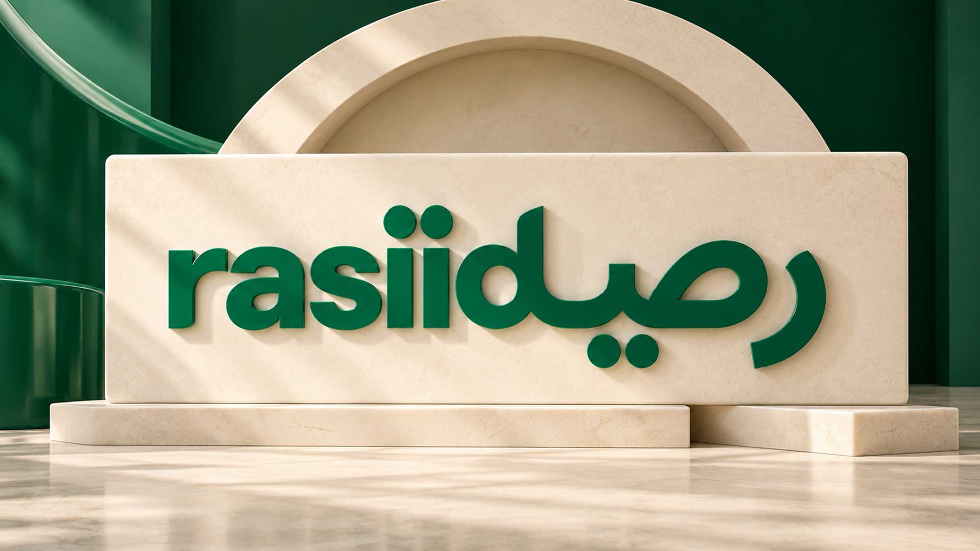
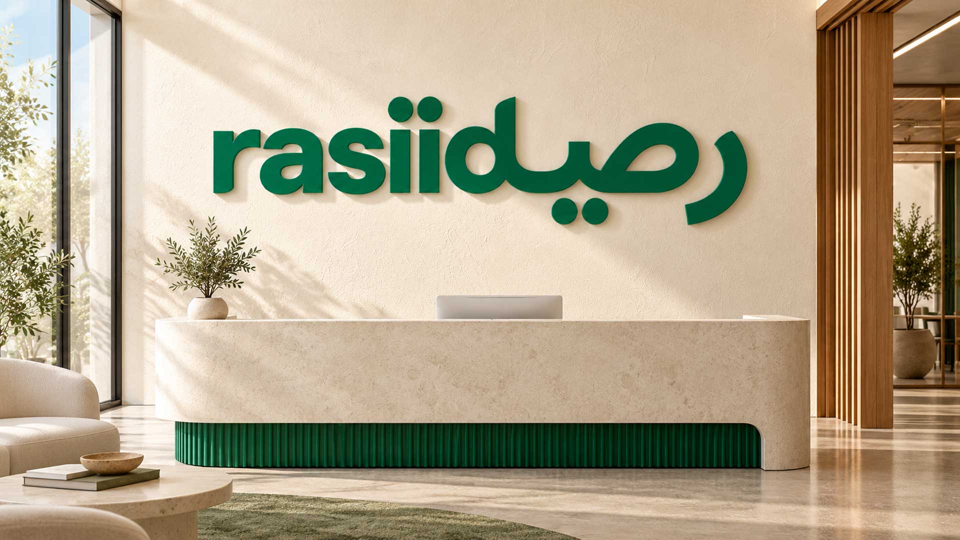
The supplied presentation shows the wordmark as raised green signage on a textured neutral wall. The depth, soft shadows, and warm background highlight the lettering and demonstrate how the identity could appear in a physical setting.
Design Concept
The concept centres on a shared typographic signature. Rounded shapes, flowing connections, and a consistent stroke weight bring Arabic and English forms into a unified visual identity.
Connected lettering: The relationship between the two scripts is the defining feature of the design, creating a continuous wordmark with a distinctive silhouette.
Shared visual weight: Substantial strokes give the composition presence and help its different letterforms feel related.
Dots with purpose: The circular dots are part of the lettering and contribute to its rhythm, appearing above and below the main forms.
A focused presentation: The green finish and restrained neutral background keep attention on the wordmark’s shape, connections, and dimensional character.
The signage presentation pairs emerald green with a warm ivory background. These are approximate colours sampled from the mockup, where lighting and shadows affect the visible shades.
| Colour | Approximate HEX | RGB | Role |
|---|---|---|---|
| Emerald Green | #016441 | 1, 100, 65 | Gives the wordmark a strong visual presence and defines its connected letterforms. |
| Warm Ivory | #D9C8B3 | 217, 200, 179 | Provides a soft neutral setting that supports the green lettering and its shadows. |
The restrained combination allows the typography to remain the focal point while giving the signage presentation warmth and depth.
Explore our logo design portfolio showcasing distinctive brand identities created for startups, SMEs, and enterprise clients across technology, ecommerce, and service industries.


The final presentation gives Rasiid a distinctive bilingual signature built around connected letterforms, rounded details, and a consistent visual weight.
Shown as raised green signage, the wordmark gains depth through its material finish and soft directional shadows. The presentation demonstrates a possible physical application of the identity and establishes a visual direction that can inform future website graphics, stationery, and brand communications.
Your next project
Have a business in mind? Tell us about your ideas, your audience, and the identity you want to create.
Prefer a direct conversation?
Explore logo design insights, branding strategies, design trends, and expert guidance that help businesses create memorable and effective brand identities.
The design brings Arabic and English lettering together in one connected wordmark. Shared curves, rounded forms, and a consistent visual weight create a relationship between the two scripts.
Its character comes from the connections between the letterforms, the substantial rounded strokes, and the placement of circular dots. These details give the wordmark a recognisable overall silhouette.
The dots are part of the letterforms and contribute to the visual rhythm of the composition. Their positions and spacing are important to the identity and should stay consistent when the artwork is adapted.
The deep green gives the lettering a strong presence against the warm neutral wall. Keeping the presentation focused on one main colour draws attention to the wordmark’s form and its bilingual connection.
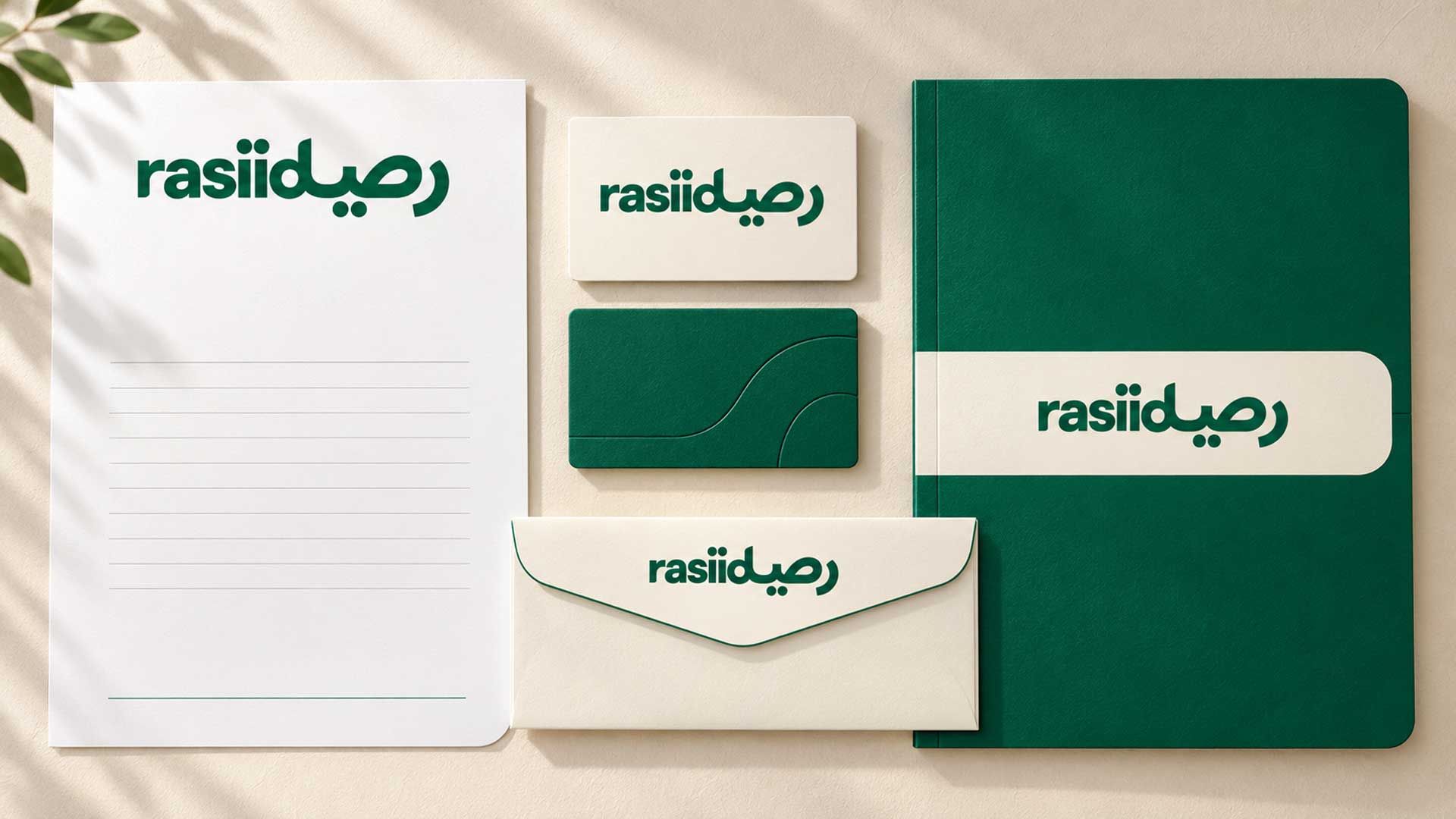
The wordmark can inform applications such as website headers, business stationery, presentation covers, and signage. Layouts for smaller spaces should be developed with attention to the lettering, connections, and dot details.

Hi there 👋🏼How can we help you?

M4YOURS IT
Hi, how can I help you?
M4YOURS IT
Hi, how can I help you?
M4YOURS IT
yes sir
M4YOURS IT
Hi, how can I help you?
M4YOURS IT
Hi, how can I help you?
M4YOURS IT
yes sir
M4YOURS IT
Adding {{itemName}} to cart
Added {{itemName}} to cart