

Logo Design
ZOLV Logo Design
A bold logo for ZOLV, combining rounded lettering, a flowing detail, and a vivid blue identity, extended across coordinated packaging for four oral strip variants.
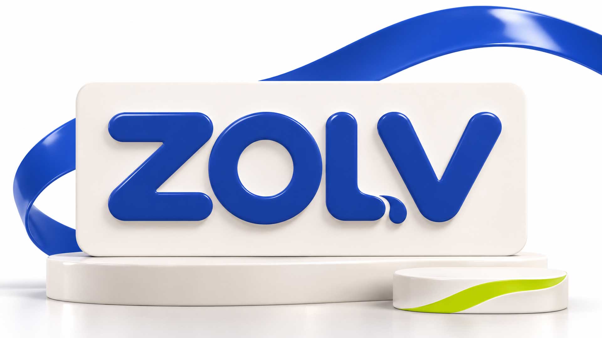
The ZOLV identity centres on a bold uppercase wordmark with rounded forms and a distinctive flowing detail at the base of the L. Its substantial strokes give the short brand name prominence, while the curved terminals introduce a softer character.
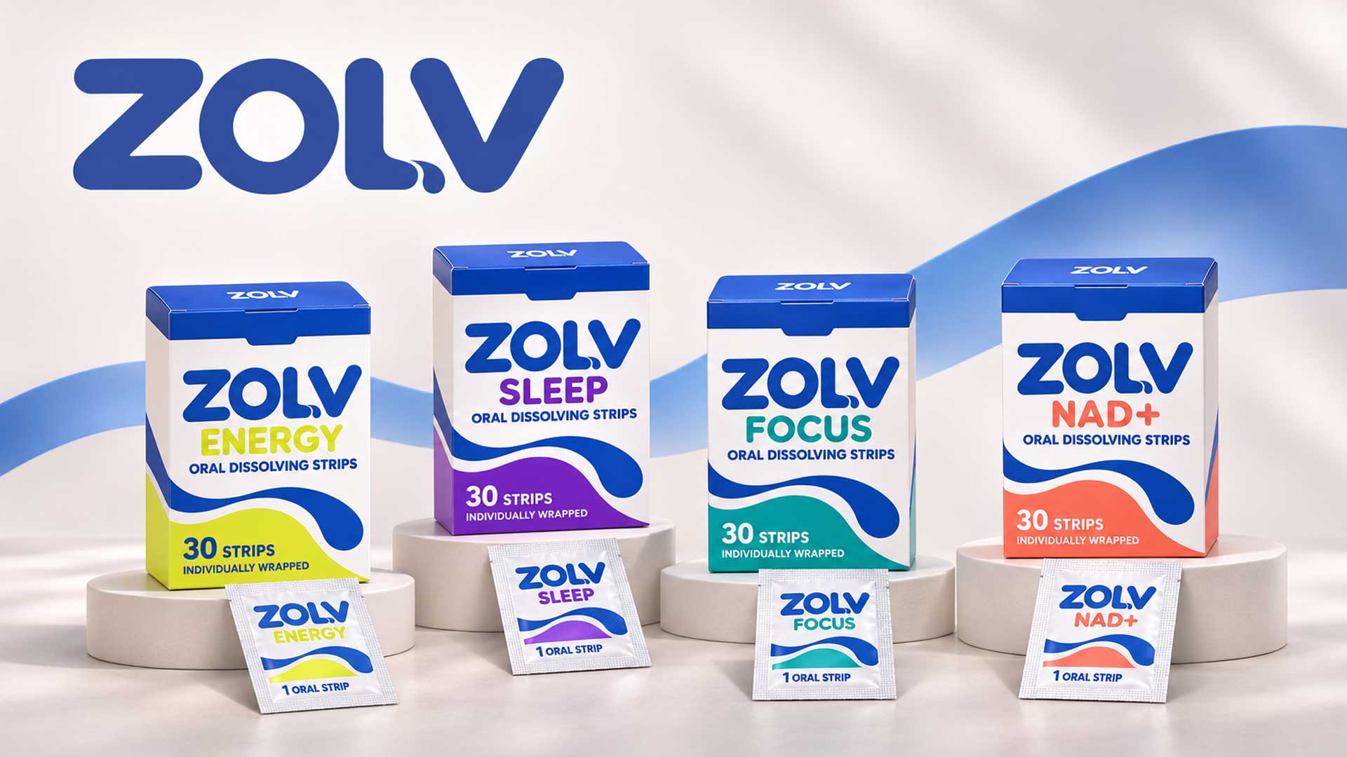
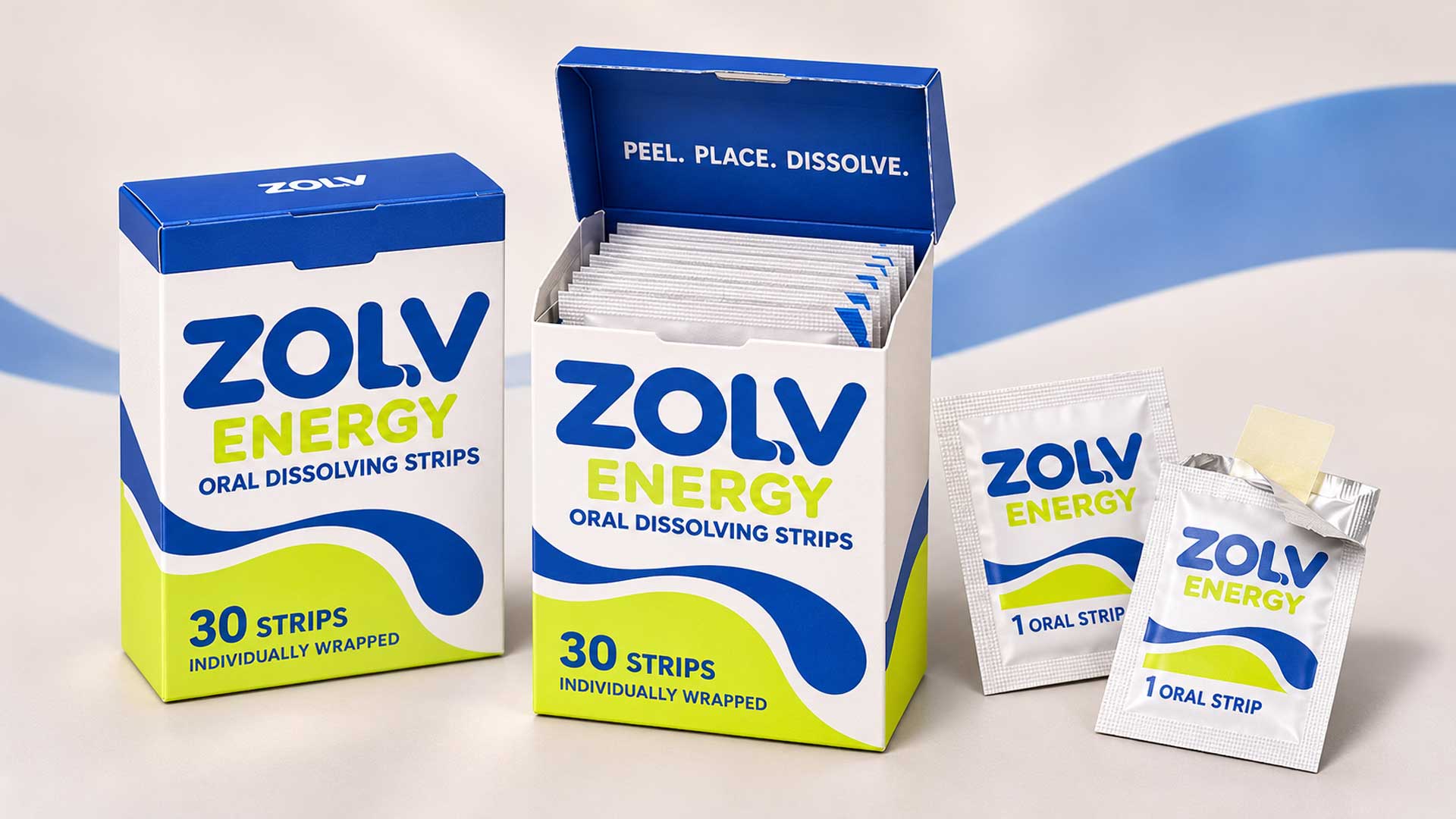
The packaging presentation extends this visual language across flip-top cartons and matching sachets. A consistent blue wordmark, white background, and flowing wave graphic connect the range, while different accent colours distinguish Energy, Sleep, Focus, and NAD+.
The hierarchy on each front panel gives the logo, variant name, product format, and strip count their own place. Together, the wordmark and packaging create a coordinated identity with a clear relationship between the master brand and its product variants.
Client
NextGen Canada Immigration Consultancy
Industry
Creative focus
Designed by
Design Concept
A Bold Wordmark with a Fluid Finish
The concept combines strong lettering with a sense of flow. The rounded Z, circular O, and soft V create visual continuity, while the curved detail at the base of the L adds an individual signature.
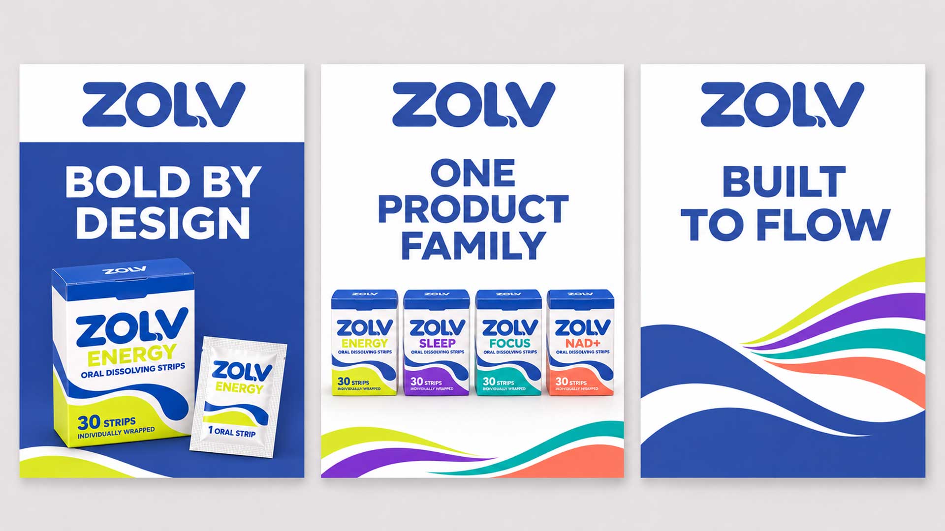
That flowing detail carries into the packaging through broad blue curves and white channels, linking the logo with the wider visual system.
Bold, rounded lettering: Substantial strokes and softened terminals give the wordmark presence and an approachable character.
A distinctive L detail: The flowing extension introduces movement and can be read as a subtle reference to the product’s dissolving format.
A consistent brand foundation: Blue and white remain recognisable across the logo, carton fronts, lids, and sachets.
Colour for each variant: Lime, purple, teal, and coral give the four products distinct visual identities within the same packaging structure.
Colour Palette
Blue and white anchor the identity. The blue reference below comes from the standalone wordmark; the variant accent values are approximate samples from the packaging mockups.
| Colour | Reference HEX | RGB | Role |
|---|---|---|---|
| Core Blue | #3B54A7 | 59, 84, 167 | Defines the main wordmark and connects the packaging range. |
| White | #FFFFFF | 255, 255, 255 | Creates contrast and space around the logo and product information. |
| Energy Lime | #E1E634 | 225, 230, 52 | Identifies the Energy variant. |
| Sleep Purple | #6C2AC0 | 108, 42, 192 | Identifies the Sleep variant. |
| Focus Teal | #07A3A6 | 7, 163, 166 | Identifies the Focus variant. |
| NAD+ Coral | #F16C51 | 241, 108, 81 | Identifies the NAD+ variant. |
The shared use of blue and white keeps the family connected, while the accent colours support differentiation alongside the printed variant names.
[ Portfolio ]
Logo Design
Explore our logo design portfolio showcasing distinctive brand identities created for startups, SMEs, and enterprise clients across technology, ecommerce, and service industries.

Warning: Undefined variable $custom_arrow_icon in /var/www/m4yours.com/wp-content/themes/hub/templates/portfolio/tmpl-style02.php on line 13
Warning: Undefined variable $custom_arrow_icon in /var/www/m4yours.com/wp-content/themes/hub/templates/portfolio/tmpl-style02.php on line 16
CoreField Brand Identity Design

Warning: Undefined variable $custom_arrow_icon in /var/www/m4yours.com/wp-content/themes/hub/templates/portfolio/tmpl-style02.php on line 13
Warning: Undefined variable $custom_arrow_icon in /var/www/m4yours.com/wp-content/themes/hub/templates/portfolio/tmpl-style02.php on line 16
Gifts Do Brand Identity Design
Warning: Undefined variable $custom_arrow_icon in /var/www/m4yours.com/wp-content/themes/hub/templates/portfolio/tmpl-style02.php on line 13
Warning: Undefined variable $custom_arrow_icon in /var/www/m4yours.com/wp-content/themes/hub/templates/portfolio/tmpl-style02.php on line 16
Arriventra Immigration Logo Design

Warning: Undefined variable $custom_arrow_icon in /var/www/m4yours.com/wp-content/themes/hub/templates/portfolio/tmpl-style02.php on line 13
Warning: Undefined variable $custom_arrow_icon in /var/www/m4yours.com/wp-content/themes/hub/templates/portfolio/tmpl-style02.php on line 16
Keraniganj News Portal Brand Identity Design
Final Result
The final presentation brings together a distinctive ZOLV wordmark and a coordinated packaging family. The logo appears prominently on the carton fronts and sachets, with a white version shown on the blue carton lids.
The flowing graphics, consistent information hierarchy, and variant colours create a clear visual relationship across Energy, Sleep, Focus, and NAD+. Open and closed carton mockups show how the identity carries across several packaging surfaces, establishing a visual direction for future product and digital brand materials.
Your next project
Let’s make your brand recognizable.
Have a business in mind? Tell us about your ideas, your audience, and the identity you want to create.
Prefer a direct conversation?
[ Blog ]
Logo Design
Explore logo design insights, branding strategies, design trends, and expert guidance that help businesses create memorable and effective brand identities.



FAQ
ZOLV is a typographic logo built around a bold uppercase wordmark. Rounded terminals, substantial strokes, and a flowing detail at the base of the L give the lettering its distinctive character.
The curved extension introduces movement into the wordmark. Within this design concept, it provides a subtle connection to the oral strip format and relates to the wave graphics used across the packaging.
Blue gives the wordmark a strong visual presence, while white creates contrast around the lettering and product information. Keeping these colours consistent helps connect the different products within the range.
Each variant has a different accent colour: lime for Energy, purple for Sleep, teal for Focus, and coral for NAD+. Prominent product names support this colour system, while the logo and layout remain consistent.
The presentation includes the standalone wordmark, open and closed cartons, matching sachets, and the complete packaging family. These mockups demonstrate how the identity can extend across a coordinated product range.

