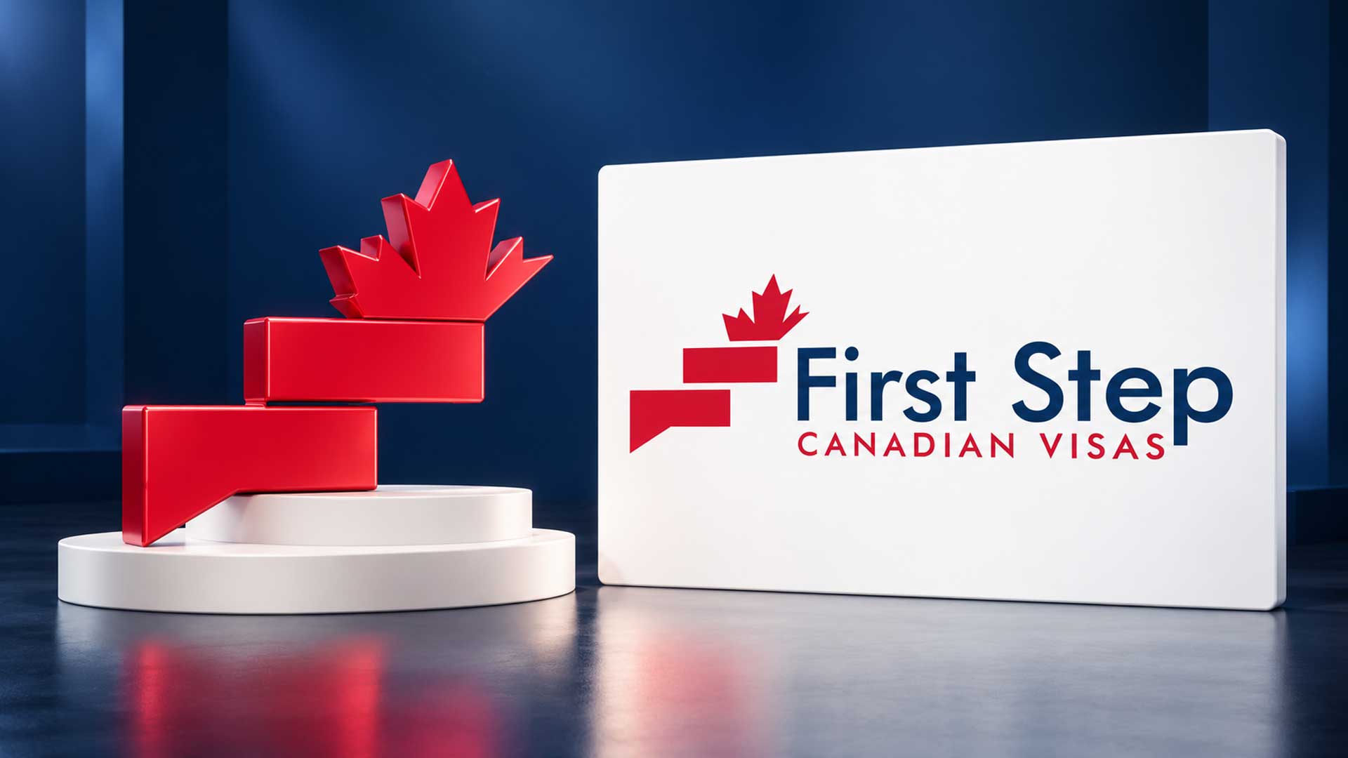
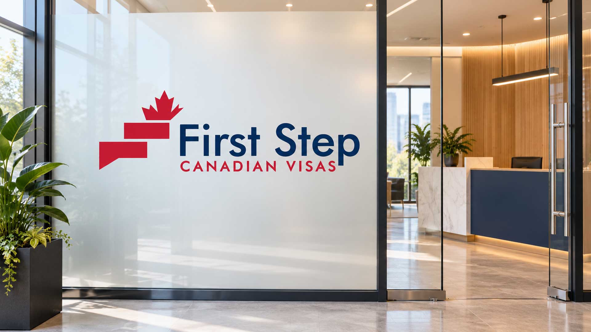
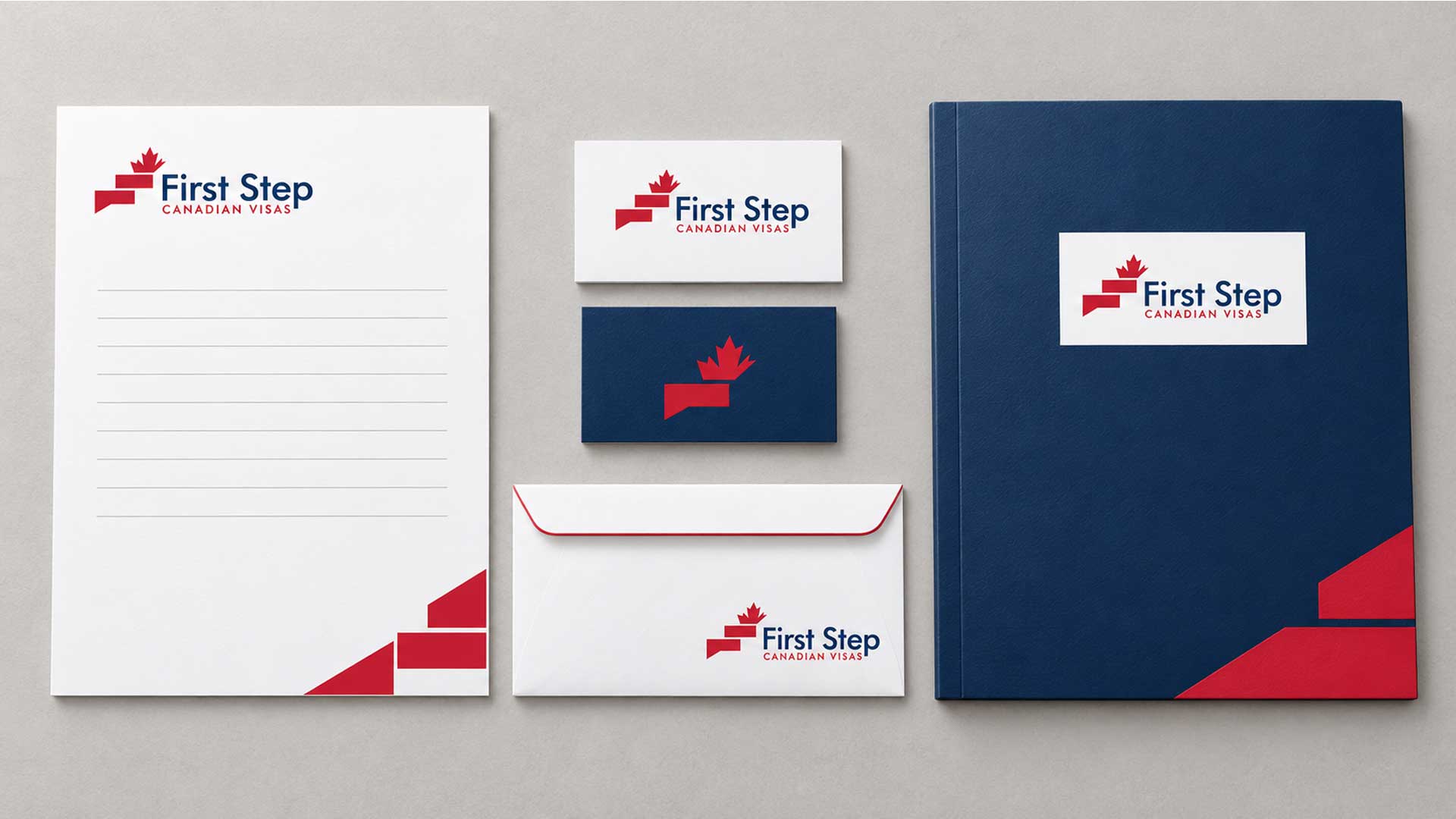
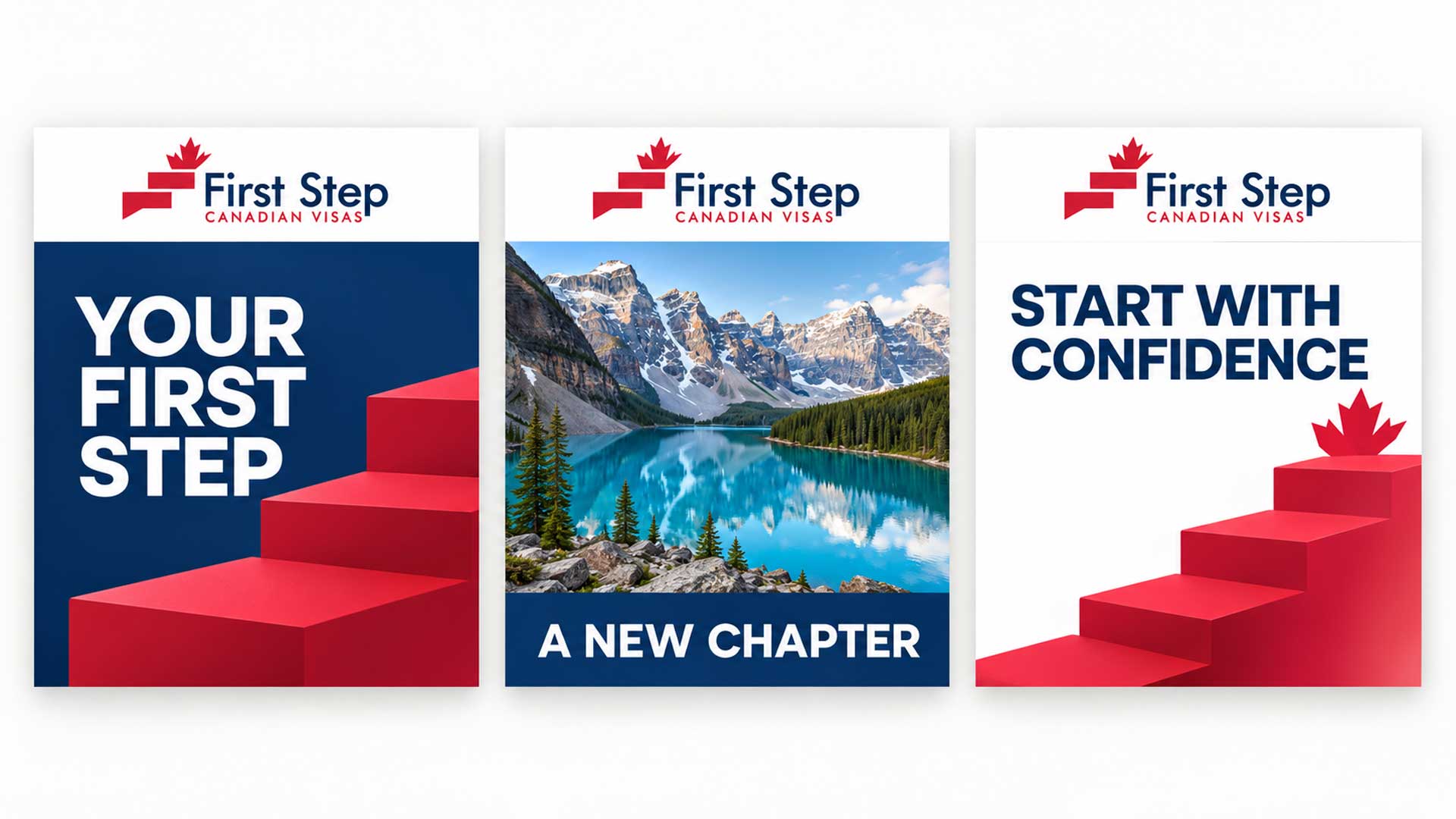
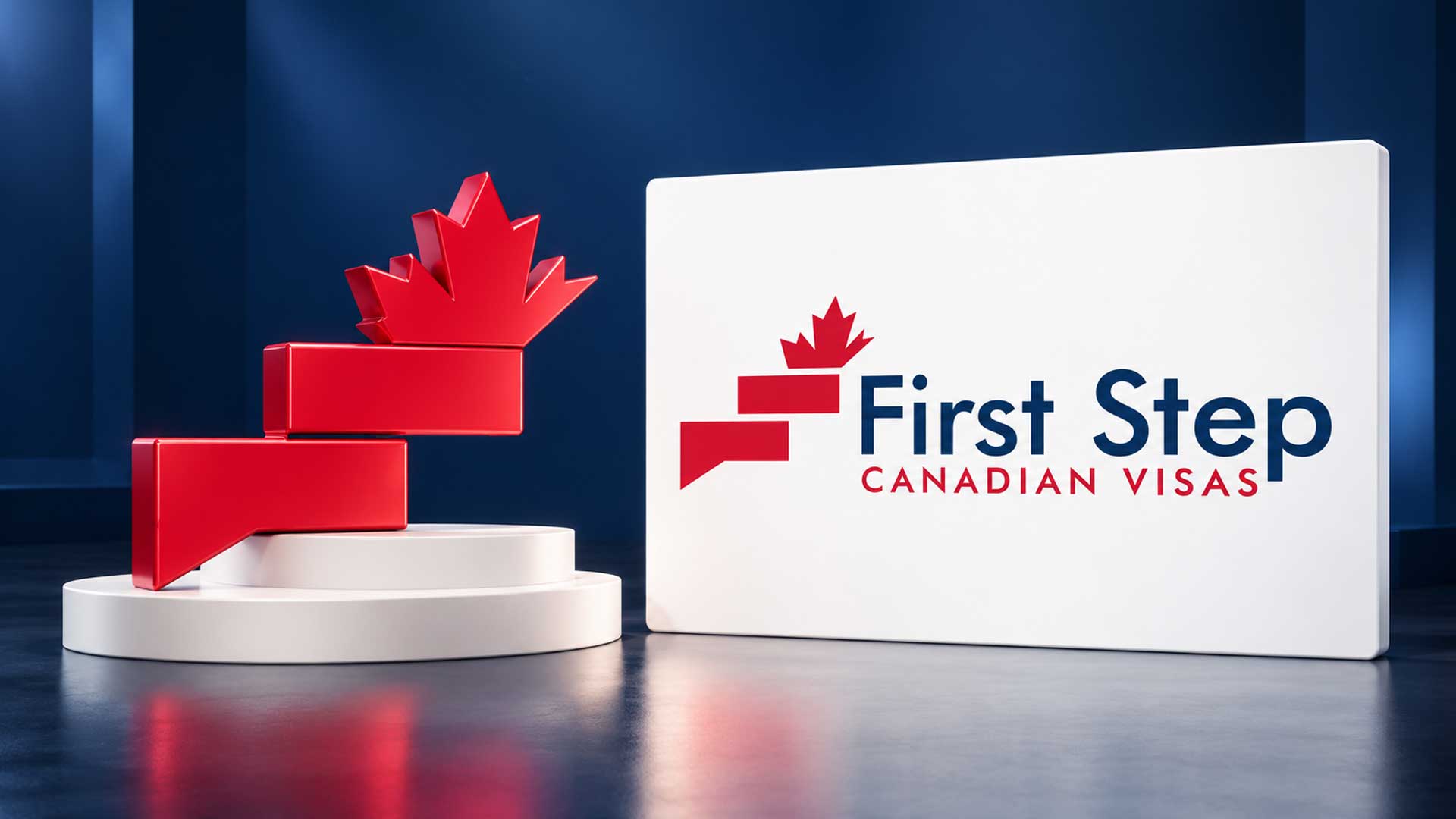


A clear, confident logo for First Step Canadian Visas, combining a stepped emblem, Canadian maple leaf, and navy and red typography to represent progress and new beginnings.
The First Step Canadian Visas logo brings the brand name to life through a simple visual idea: every journey begins with a first step. The identity combines an ascending geometric symbol, a Canadian maple leaf, and a clearly structured wordmark.
The red emblem introduces movement and direction, while the navy “First Step” lettering provides a strong visual anchor. Beneath it, the spaced uppercase “CANADIAN VISAS” descriptor establishes a clear hierarchy and keeps the full business name easy to follow.
Together, these elements create an identity centred on progress, clarity, and the possibility of a new chapter in Canada.
Client
Industry
Creative focus
Designed by
Design Concept
The concept translates the brand name into a recognisable symbol. Two offset red forms suggest steps moving upwards, with a maple leaf above them connecting the idea of progress to Canada.
A symbol of progress: The stepped arrangement gives the emblem an upward direction and makes the name’s central idea visible.
A Canadian connection: The maple leaf identifies the destination within the same compact composition.
Clear typography: The prominent navy brand name and smaller red descriptor give each part of the identity a distinct role.
A balanced identity: The geometric emblem sits beside the wordmark, creating a horizontal composition that brings the symbol and business name together.
The identity uses a focused combination of deep navy, red, and white.
| Colour | HEX Code | RGB | Purpose |
|---|---|---|---|
| Deep Navy | #0C3161 | 12, 49, 97 | Defines the main “First Step” wordmark and provides a strong visual foundation. |
| Brand Red | #CD1E37 | 205, 30, 55 | Highlights the stepped emblem, maple leaf, and “CANADIAN VISAS” descriptor. |
| White | #FFFFFF | 255, 255, 255 | Provides a clear background and breathing room around the identity. |
Navy gives the main name prominence, while red connects the symbol and descriptor. White keeps the overall presentation open and uncluttered.
Explore our logo design portfolio showcasing distinctive brand identities created for startups, SMEs, and enterprise clients across technology, ecommerce, and service industries.



The final logo combines a distinctive stepped maple leaf emblem with a clear, balanced wordmark. Its visual character comes from the relationship between the ascending red forms, the navy brand name, and the carefully spaced descriptor.
The portfolio explores the identity through a sculptural logo showcase, stationery mockup, office entrance signage, and coordinated social media concepts. These presentations show how the same colours, symbol, and typography can establish a consistent direction across different brand materials.
Your next project
Have a business in mind? Tell us about your ideas, your audience, and the identity you want to create.
Prefer a direct conversation?
Explore logo design insights, branding strategies, design trends, and expert guidance that help businesses create memorable and effective brand identities.
The logo brings together the idea of taking a first step and beginning a journey towards Canada. The ascending forms suggest progress, while the maple leaf establishes the Canadian connection.
Placing the maple leaf above the stepped forms creates a clear visual destination. It connects the upward movement of the emblem with the Canadian focus of the brand.
Navy gives the main wordmark a strong visual presence. Red draws attention to the emblem and descriptor, helping those elements work together. White creates space around the complete identity.
“First Step” appears as the dominant text, making the main brand name easy to identify. The smaller, spaced uppercase descriptor adds a second level of information and supports the overall visual hierarchy.
The project includes logo, stationery, office signage, and social media presentations. These visual mockups demonstrate how the identity can guide a range of digital and physical brand materials.

Hi there 👋🏼How can we help you?

M4YOURS IT
Hi, how can I help you?
M4YOURS IT
Hi, how can I help you?
M4YOURS IT
yes sir
M4YOURS IT
Hi, how can I help you?
M4YOURS IT
Hi, how can I help you?
M4YOURS IT
yes sir
M4YOURS IT
Adding {{itemName}} to cart
Added {{itemName}} to cart