

You hand someone your business card after a useful conversation. A few days later, they reach for it to contact you. Can they quickly find your name, understand what you do, and read your phone number?
That is where business card design matters. A crowded layout, blurry logo, or incorrect email address can make an otherwise useful card frustrating to use.
Whether you are creating your first card or updating an existing design, these ten common business card design mistakes are worth checking before you send the artwork to print.
1. Adding Too Much Information
It is tempting to include every service, social media account, office address, and contact number. Soon, the card becomes crowded, and the details people need are difficult to find.
How to avoid it: Start with the essentials:
- Your name.
- Job title or professional role.
- Company name and logo.
- One primary phone number.
- Email address.
- Website.
Add an address if customers visit your premises. Include a social profile if it is a useful way to reach you or view your work.
For a longer service list, link to a relevant website page. An education consultancy, for example, can place its destination countries and application services online.
2. Using Fonts That Are Difficult to Read
Decorative lettering, thin strokes, and tiny contact details can look attractive in an enlarged preview. At the card’s actual size, they may be difficult to read.
Using several unrelated fonts also makes the design feel inconsistent.
How to avoid it: Choose a clear font for essential information. One font family with different weights often gives you enough variety for names, roles, and contact details.
As a practical starting point, try contact text around 9–10 points, then check a printout at actual size. Some typefaces need more space or a larger size to remain comfortable to read.
If the text feels too small, shorten the content. For cards using both Bangla and English, check each script separately and review the exported file for missing or altered characters.
3. Choosing Weak Color Contrast
Light grey text on white, dark text on a dark background, or lettering over a detailed photograph can make contact information hard to read.
A design may appear clear on a bright monitor and become less readable in ordinary lighting.
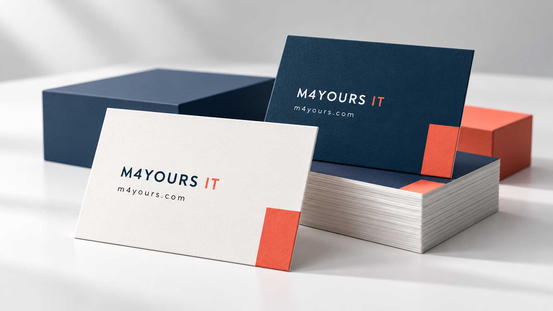
How to avoid it: Give essential text a clear contrast against its background. Dark navy or black text on white is a useful starting point.
Use brand accent colors for selected details, shapes, or highlights. Check smaller text especially carefully, and avoid placing it over busy images.
Ask to see a printed sample when possible. Review it under normal indoor lighting, where someone is likely to use the card.
4. Ignoring Your Brand Identity
A business card can look polished and still feel disconnected from your business. Different logo versions, unrelated colors, or inconsistent typography can make it difficult to connect the card with your website and other materials.
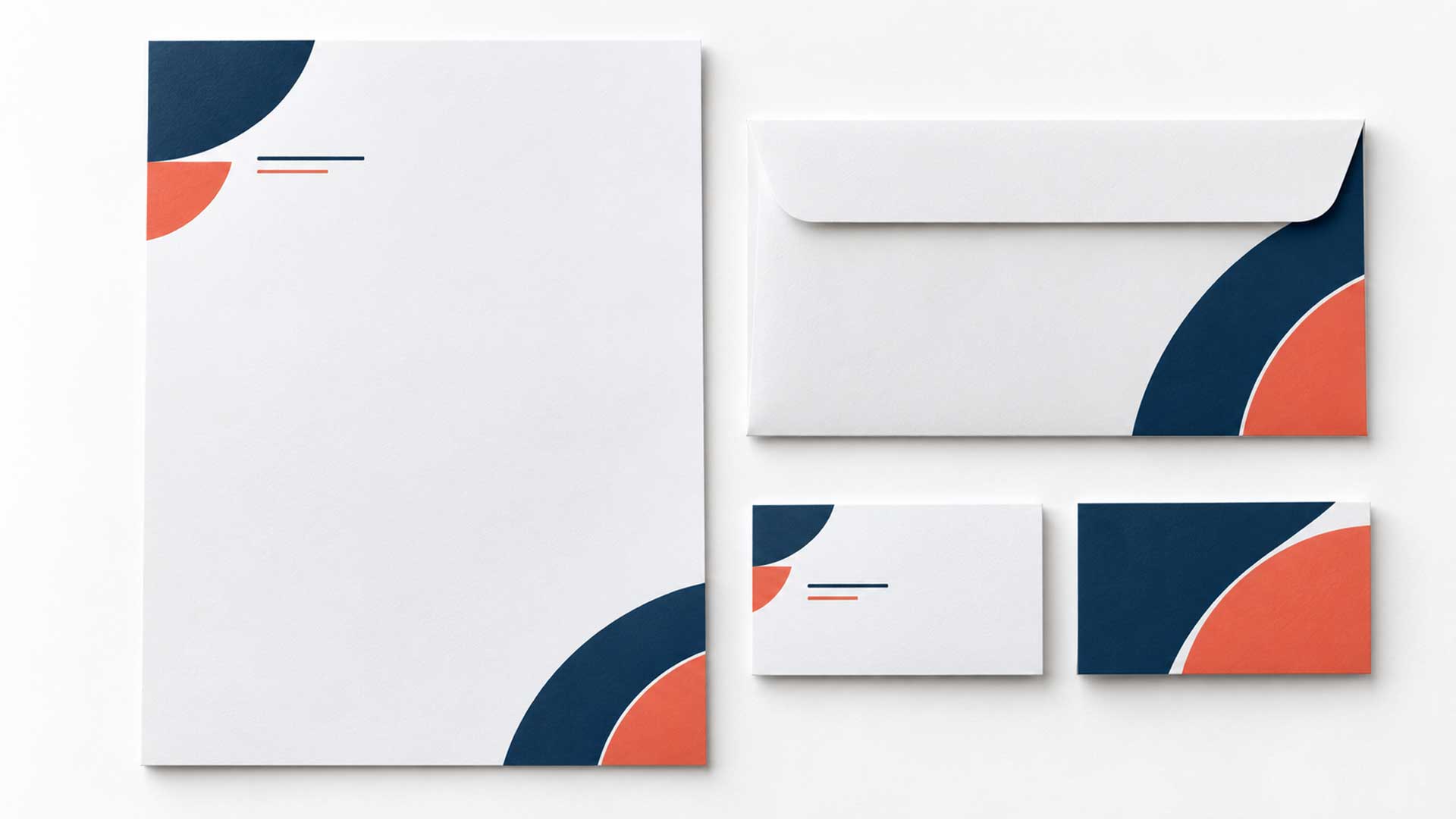
How to avoid it: Use your approved logo, brand palette, and typography. Follow the same visual direction across your website, social profiles, letterheads, and business cards.
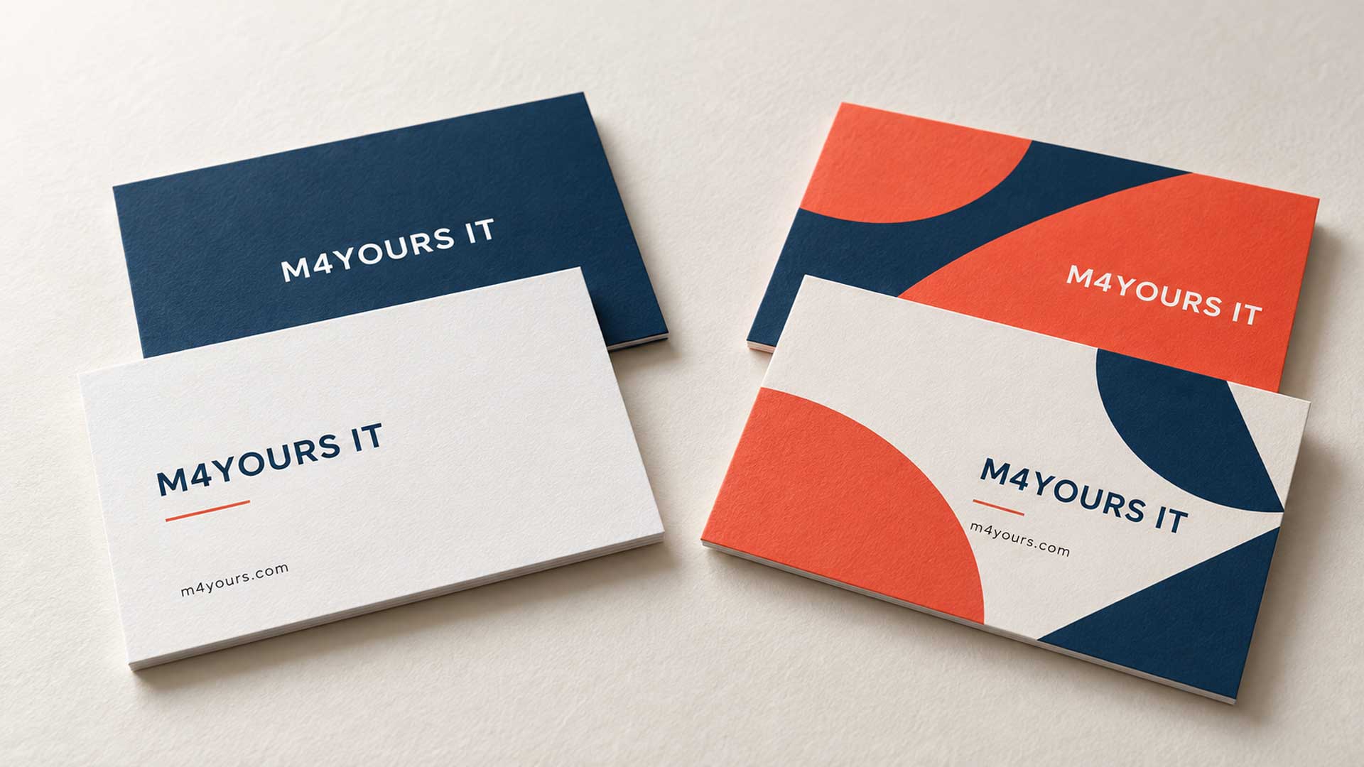
A creative studio might use expressive shapes, while a consultancy might prefer a quieter layout. Choose a direction that fits your business and audience.
If your materials currently follow different styles, corporate identity design can help establish a consistent visual system.
5. Using Blurry Logos and Low-Resolution Images
A logo downloaded from social media or copied from a screenshot may look acceptable on screen. Printed on a card, it can have soft edges or visible pixels.
Enlarging a small image does not restore its missing detail.
How to avoid it: Use original logo artwork, preferably in a vector format. For photographs, check the resolution at their final printed size; MOO recommends 300 dpi or higher in its artwork guidelines. MOO
If the only available logo is blurry, request the original files or consider having the artwork professionally recreated through a logo design service.
6. Forgetting Bleed and Safe Margins
Artwork that looks balanced on screen can lose important details during trimming. A phone number too close to the edge may be cut, while a background that stops at the trim line can leave an unwanted white edge.
How to avoid it: Understand these three areas:
| Area | What it means |
|---|---|
| Trim | The intended finished edge of the card. |
| Bleed | Background artwork extending beyond the trim edge. |
| Safe area | The inner area where important text and logos should stay. |
Extend background artwork into the bleed and keep essential content within the safe area. MOO’s business card templates show these boundaries. MOO
Use your chosen printer’s template. Confirm the finished size, bleed, safe margins, and export requirements before designing. Thin borders near the edge also deserve care because small cutting shifts can make them look uneven.
7. Printing Incorrect or Outdated Contact Details
A beautiful card becomes much less useful when the email address is misspelled or the phone number is no longer active.
These errors are easy to overlook when everyone is focused on the layout.
How to avoid it: Check the final exported artwork against a verified contact list. Review names, titles, phone numbers, email addresses, website addresses, and office locations.
Then test the details:
- Call the listed phone number.
- Send a test email.
- Open the website address.
- Check any social profile or QR destination.
For international contacts, include the country code. Ask the person named on the card to approve their information, and repeat the check after any final edits.
8. Giving Every Element the Same Visual Weight
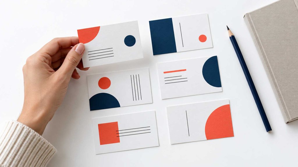
When the name, logo, title, contact details, and tagline all compete for attention, readers have to work harder to understand the card.
Uneven spacing and inconsistent alignment add to that confusion.
How to avoid it: Decide what someone should notice first. On a personal networking card, that may be the person’s name. On a company card, the brand may take priority.
Use size, weight, and spacing to establish a clear reading order. Group related contact details together and keep alignment consistent.
Leave enough empty space around each group. This gives the reader room to identify information quickly. Ask someone unfamiliar with the design to find the name and phone number without prompting.
9. Choosing Paper and Finishes Without Testing Them
The paper and finish affect how the card feels and functions. A highly reflective coating may make small text harder to read at certain angles. A heavily coated surface may also be inconvenient if you want to write appointment details on it.
Foil, embossing, and other effects need to suit the artwork and printing process.
How to avoid it: Request samples and consider how the card will be used. Evaluate texture, thickness, readability, and whether people need to write on it.
Confirm the printer’s requirements for any special finish. Keep those effects focused on selected elements, and inspect a proof before approving the full order when available.
10. Adding a QR Code Without Testing It
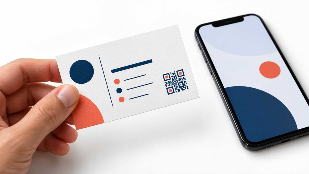
A QR code can help people view a portfolio, book a consultation, or save contact information. Problems arise when the code is too small, crowded by other artwork, or connected to an unsuitable page.
A successful scan from your screen does not prove the printed version will work.
How to avoid it: Give the code a useful destination and a short label, such as “View portfolio” or “Book a consultation.”
Keep a clear margin around a standard QR code. DENSO WAVE specifies a quiet zone four modules wide on every side; a module is one small square in the code. Its QR code guidance explains this requirement. DENSO WAVE
Test the code from a printout at the finished size using different phones. Also check that the destination works well on mobile and that any redirect service will remain active.
Business Card Checklist Before Printing
Review the final file against these questions:
- Can someone quickly identify the person and business?
- Are the contact details readable at actual size?
- Have all names, numbers, and addresses been verified?
- Does the design follow the brand’s visual identity?
- Are the logo and images sharp enough for printing?
- Does the artwork follow the printer’s template and file requirements?
- Have the paper and any special finishes been reviewed?
- Does the printed QR code scan and open the correct page?
Confirm the printer’s requested color settings and PDF specification as part of the file check. Review a physical proof when available, especially for unfamiliar paper, small text, or special finishes.
Frequently Asked Questions
What information should a business card include?
Usually, include your name, role, company name or logo, primary phone number, email address, and website. Add an office address or social profile when it helps the recipient contact you or use your services.
What font size should I use on a business card?
Try 9–10 points for contact details as a starting point. The right size depends on the font, its weight, the background, and the audience. Check a printout at actual size and increase the text size if it is difficult to read.
Should I choose a single-sided or double-sided card?
Choose based on the content. A single-sided card can work well for a short set of details. A double-sided card gives you room to separate contact information from branding, a short service statement, or a QR code.
Does every business card need a QR code?
Include one when it helps the recipient take a useful next step. A portfolio, booking page, or digital contact card can be suitable. Keep essential contact details visible so people can reach you directly.
What file format should I send to the printer?
Ask the printer for its required format and export settings. A print-ready PDF is a common choice. Confirm bleed, color settings, font handling, and any separate artwork needed for special finishes before exporting.
Need Help Designing Your Business Card?
M4YOURS IT offers custom business card designs with clear layouts, consistent branding, and print-ready artwork. Whether you are creating a new card or improving an existing one, our team can help you present your details professionally. Professional Business Cards
Explore our business card design services and share your logo, contact details, and preferred style to discuss your project.