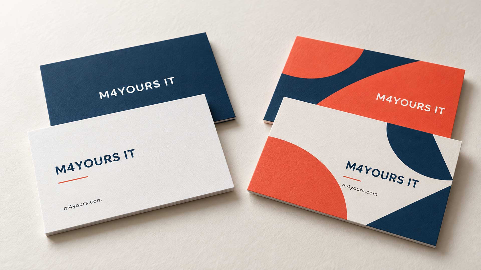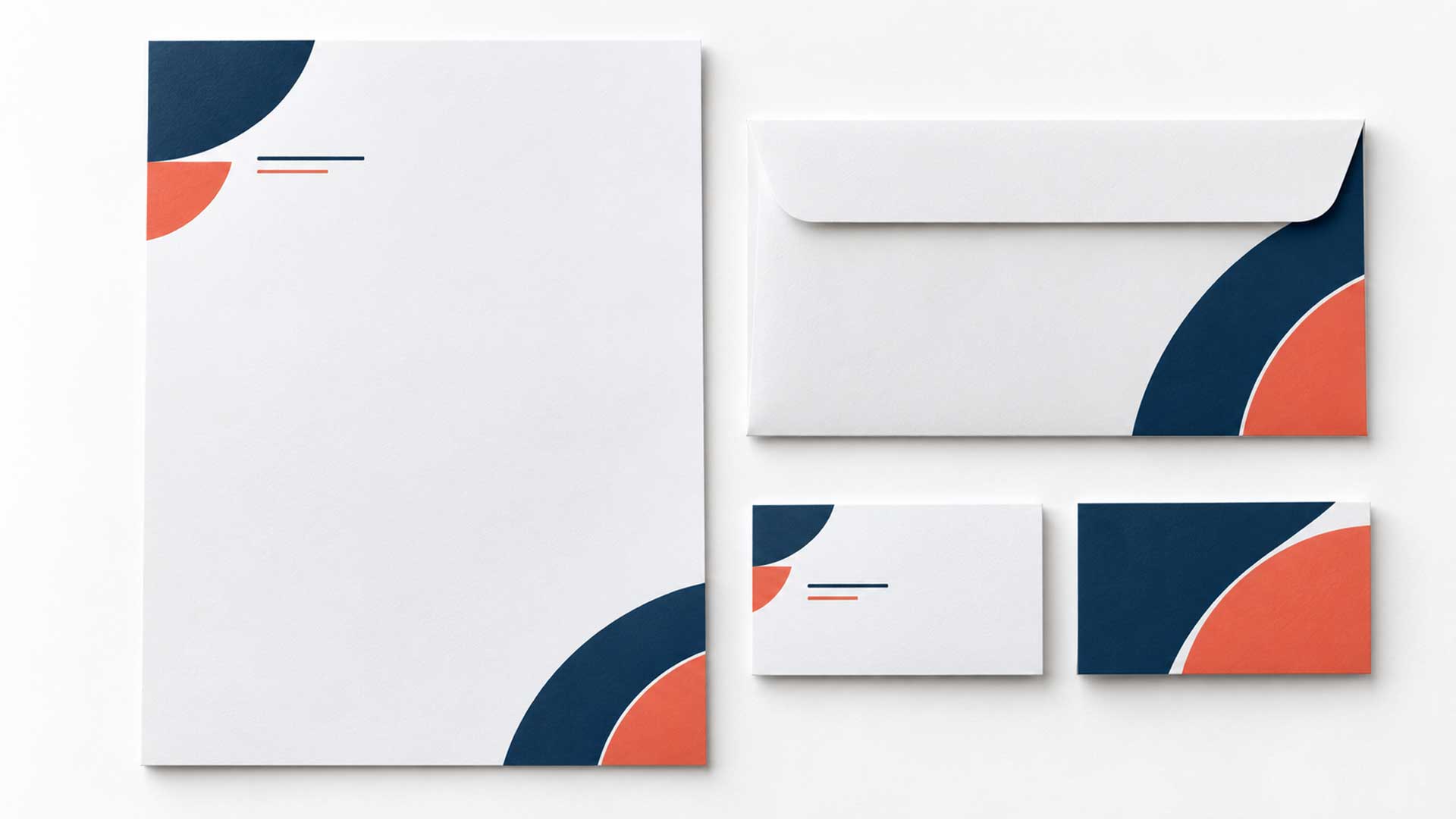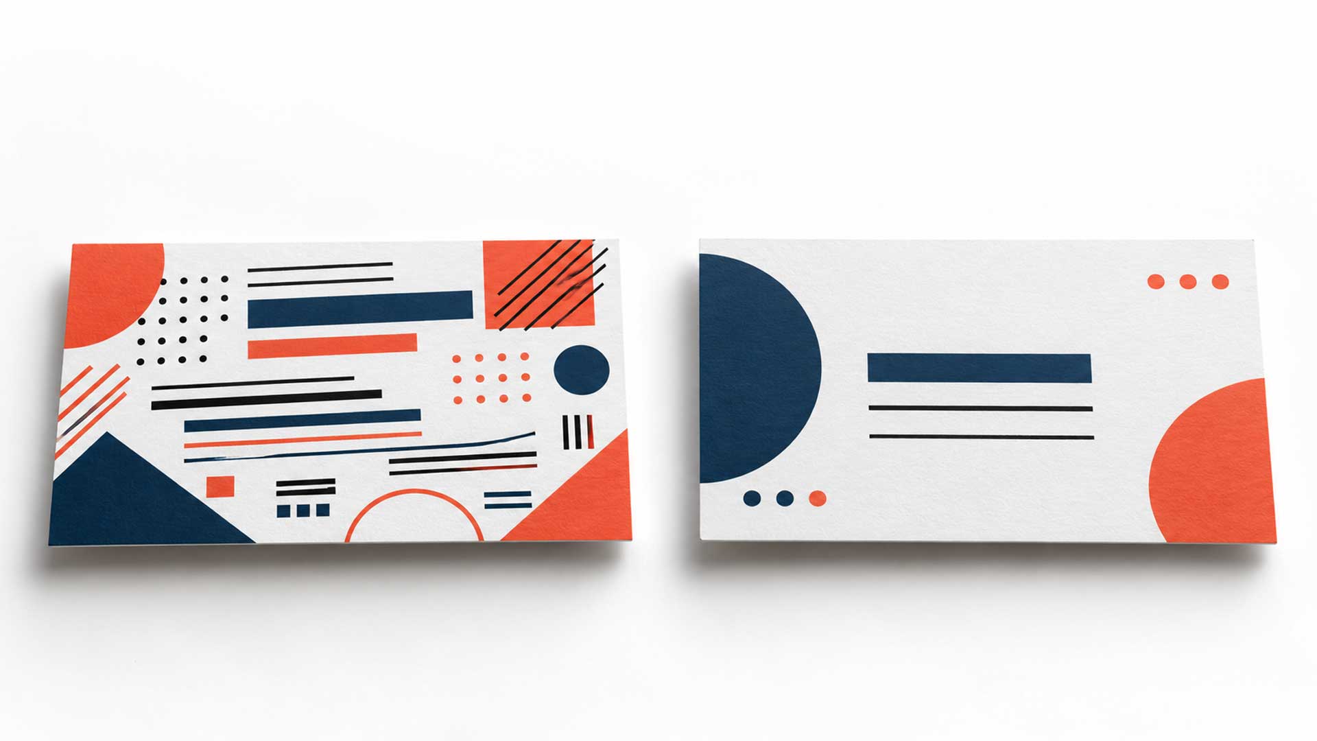

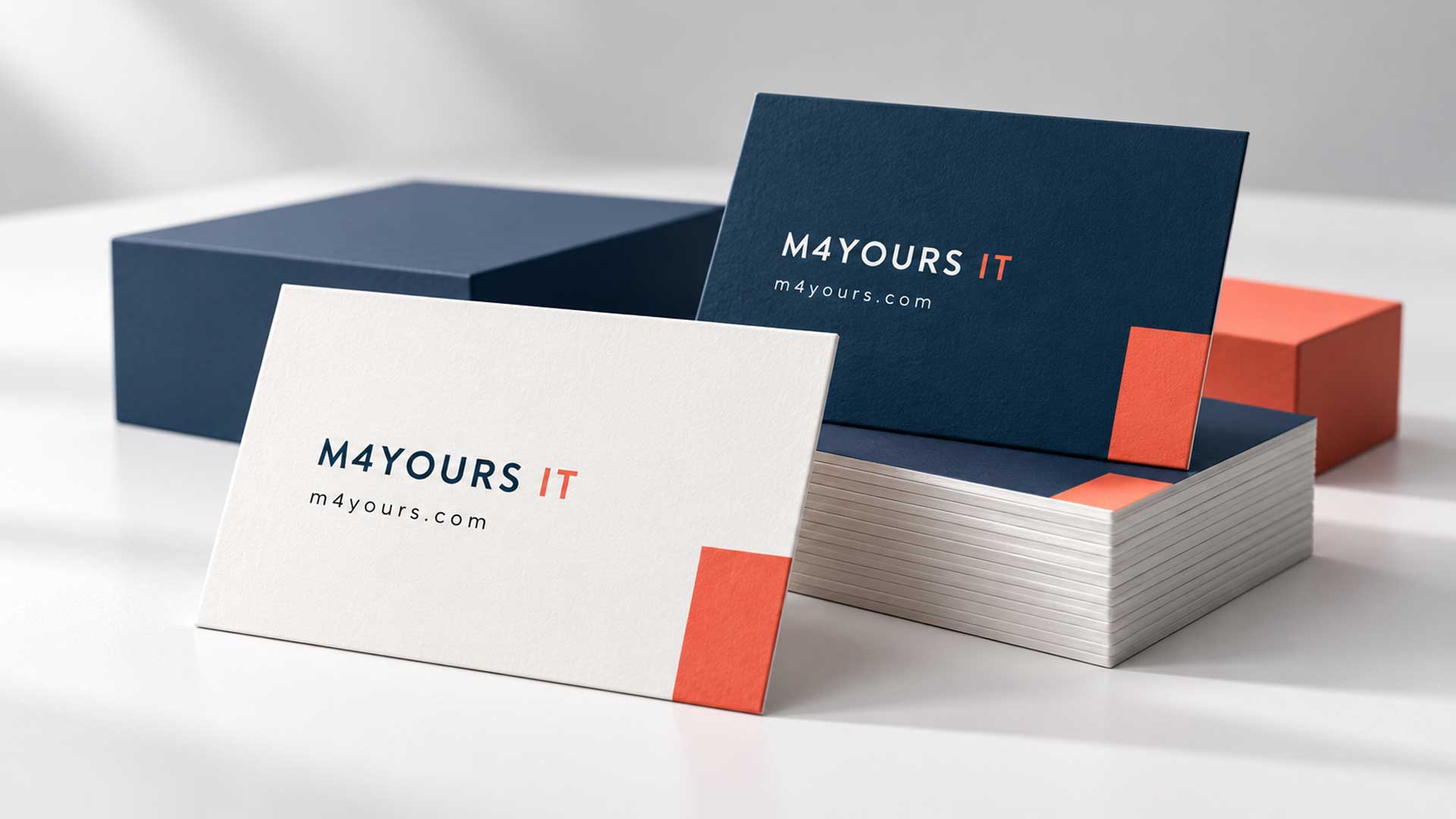

To design a business card that makes a strong first impression, start with a clear layout, readable typography, consistent branding, and essential contact information. Review the design at its actual printed size, then check a physical proof before ordering a large batch.
A good business card helps someone remember your business and continue the conversation after a meeting. Every design choice should make that easier, from the size of your name to the destination of your QR code.
Why Business Card Design Matters
After a networking event or client meeting, your card may be the reminder someone uses to find you again. If your role is unclear or your contact details are difficult to read, following up takes more effort.
Professional business card design gives your information a clear order and connects it with your brand. The goal is to create a card that feels appropriate for your business and remains useful when someone needs it.
1. Define Your Audience and Purpose
Before choosing colors or fonts, decide who will receive your card and what you want them to do next.
A consultant may want potential clients to book a meeting. A photographer may want people to view a portfolio. A local store may need customers to remember its location and phone number.
Choose one main follow-up action. This helps you decide which information deserves the most space and whether a QR code would be useful.
2. Include the Information People Actually Need
For most professionals, a business card should include:
- Your name.
- Your job title or a clear description of your role.
- Your company name and logo.
- A primary phone number.
- A professional email address.
- Your website.
Add your address if customers visit your office or store. Include a social media handle when that platform plays a meaningful role in how customers find or contact you.
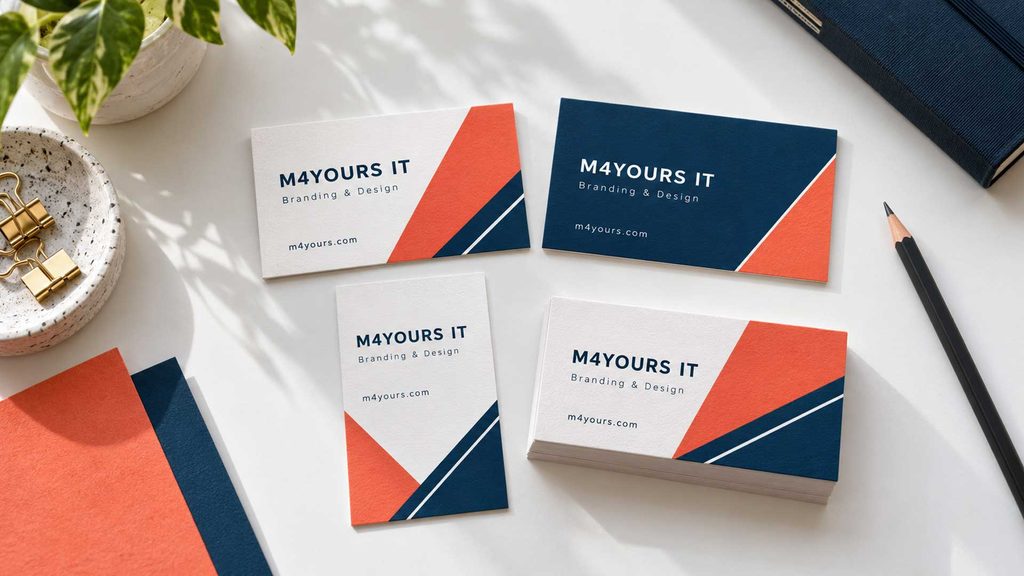
Avoid filling the card with every service, office location, and social account. If the information becomes difficult to fit, decide what can move to your website.
For international contacts, include your phone number’s country code. Make sure your email and website are easy to read without decorative lettering.
3. Keep the Design Consistent With Your Brand
Use the same approved logo, colors, and typography that appear on your website and other business materials.
This gives people a familiar visual connection when they move from your card to your online presence. If your website uses a restrained style, carry that style into the card. If your brand uses expressive graphics, choose one element that works well in a small space.
Use your original logo file wherever possible, and preserve its proportions. Stretching a logo to fill an empty area makes the design look unfinished.
Treat brand consistency as a starting point for the layout. It will save you from choosing colors and fonts that compete with your existing identity.
4. Give the Layout a Clear Reading Order
Visual hierarchy means arranging information so people can tell what to read first.
Make your name or company identity prominent, depending on the purpose of the card. Place your role nearby, then group the contact details together.
Use consistent alignment and enough space between these groups. Empty space helps separate information and keeps the card comfortable to read.
For a double-sided card, one practical arrangement is to place your logo and a short service description on one side, with your name and contact information on the other. A single-sided card can also work well when your information fits comfortably.
Avoid shrinking everything simply to include more content.
5. Choose Typography That Works at Printed Size
A font that looks clear on a large screen may become difficult to read on a small card. Review the lettering at the size people will actually hold.
MOO’s artwork guidance sets an 8-point minimum for text. Treat that as a printer guideline rather than a guarantee that every font will be comfortable to read.
Our recommendation is to start contact details around 9–10 points where space allows, then test the result. Some typefaces need more room, particularly those with thin strokes or narrow characters.
Use your brand typeface if it remains readable. One font family with different weights is often enough to distinguish your name, role, and contact information.
If space is tight, shorten the content before reducing the text size.
6. Confirm the Card Size Before Designing
Ask your printer for the correct artwork template before building the layout. Size options vary between printers and markets.
For example, MOO’s US standard card has a finished size of 3.5 × 2 inches. Your printer may offer a different format.
A familiar rectangular shape is a practical starting point for cards people will store in wallets or card holders. Vertical and square formats can suit some brands, but check how much room they leave for your information.
Choose a shape because it supports the design and use of the card.
7. Select Paper and Finishes With a Purpose
Ask for physical samples before choosing paper or a special finish. You need to assess how the stock feels, how the colors reproduce, and whether the details remain clear.
Matte finishes can provide a subdued appearance, while gloss adds shine. If you need to write appointment times or notes, ask for a suitable uncoated surface and test it with a pen. MOO, for example, identifies its uncoated Luxe cards as writable.
Foil, embossing, or spot gloss can draw attention to a selected detail. Use them where they support your brand and fit your budget.
Approve the basic layout and readability before paying for decorative finishes.
8. Give Your QR Code a Useful Destination
A QR code is useful when it provides a convenient next step. Depending on your business, it could open:
- A portfolio.
- An appointment booking page.
- A product catalog.
- A contact page.
Add a short label such as “View our portfolio” or “Book a consultation” so people know what scanning will do.
Keep the code clear of surrounding artwork. DENSO WAVE specifies an empty margin four modules wide on every side of a standard QR code; a module is one small square in the code’s grid.
Test the code on the printed proof using more than one phone. Keep your website or phone number visible so people can still contact you without scanning.
9. Prepare the Artwork for Your Printer
A polished screen preview still needs correct artwork preparation.
Confirm these three areas with your printer:
- Trim size: The final dimensions after the card is cut.
- Bleed: Background artwork extending beyond the trim line to accommodate small cutting variations.
- Safe area: The inner area where important text and logos should remain.
Bleed helps prevent unwanted white gaps at the edges. Use the printer’s specified measurements for your design.
Keep logos as vector artwork where possible. For photographs or other raster images, around 300 pixels per inch at the final printed size is a common preparation target. Export a print PDF using your printer’s preferred settings, including its color profile and bleed requirements. Adobe also recommends checking for missing fonts, low-resolution images, and other preflight errors before export.
10. Review the Card as Someone Receiving It
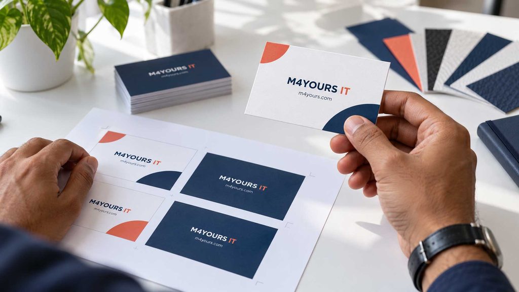
Print the design at 100% scale and cut it to the intended dimensions. This helps you judge spacing and text size, although an office printout will not accurately represent the final paper, finish, or color.
Ask someone unfamiliar with your business to review it. Can they identify your role and find the right contact method easily?
Then check a proof from your print supplier before approving a large order. Review both sides, including orientation, color, trimming, and QR code performance.
M4YOURS IT Recommendations for Different Businesses
Use your business needs to choose a design direction.
| If your business needs | Choose this approach |
|---|---|
| A consistent identity across a corporate team | Use one shared layout with fixed typography and spacing for every employee. |
| A card for a creative freelancer or agency | Use one distinctive brand element and a QR code linking to selected work. |
| More bookings for appointment-based services | Make the contact method prominent and include a clearly labeled booking link. |
| A card for customers visiting a store | Prioritize the business name, location, phone number, and opening information where relevant. |
| Information in both Bangla and English | Consider one language on each side, with equivalent essential details. |
| A practical result within a limited budget | Start with a standard format and a readable layout, then compare paper samples and printing quotes. |
Business Card Design Checklist Before Printing
Before approving the final artwork, confirm that:
- Your name, role, and company details are correct.
- Phone numbers, email addresses, and website URLs have been checked.
- Text is comfortable to read at actual size.
- Your logo retains its correct proportions.
- Both sides use consistent branding.
- Essential information stays within the printer’s safe area.
- The QR code opens the intended page from a printed proof.
- You have approved the paper, finish, artwork settings, and print quantity.
Frequently Asked Questions
What makes a business card look professional?
A professional business card uses readable typography, consistent branding, a clear layout, and accurate contact information. Careful spacing helps people find the information they need.
Should I choose a single-sided or double-sided business card?
Choose a single-sided card when your essential information fits comfortably. Use two sides when separating branding, contact details, or languages gives each element more room.
Should I include all my services on a business card?
Usually, a short description of your main service is enough. Direct people to your website or portfolio for the full range of services rather than crowding the card.
Is a QR code necessary?
Include a QR code when it makes an action easier, such as viewing work or booking an appointment. Keep ordinary contact information visible as well.
Can I use the same design for every employee?
Yes. Use a shared template and allow defined areas for each person’s details. Check the longest names, job titles, and email addresses before approving the template for the whole team.
Create Your Business Card With M4YOURS IT
Start with the information your contacts need, build a layout that reflects your brand, and test it at printed size. These steps give you a practical foundation for a card you can confidently share.
At M4YOURS IT, we create custom business card designs with clear typography, consistent branding, and artwork prepared for printing. Share your logo, contact details, preferred style, and printer requirements to get started.