



Yes, people can recognize a business through its colors, layouts, photography, language, and other familiar cues. Whether they recognize your posts is something you need to check with your audience.
Cover the logo on one of your recent graphics. Then hide the business name, account handle, and other obvious identifiers.
Does the remaining design still suggest your business?
For many small companies, the answer is uncertain. The posts may look professional individually, yet feel unrelated when viewed together. Different fonts, changing color treatments, and inconsistent imagery give customers little to connect across encounters.
A recognizable social media presence uses repeatable cues that people learn to associate with the business. Your logo remains an important part of that system.
The practical goal is to make your content easier to identify while keeping the message clear. Here is how to assess your current posts and strengthen the identity around them.
What Recognition Actually Means
Recognition happens when someone connects a piece of content with your business.
That differs from noticing that several posts share the same design style.
| What you observe | What it tells you |
|---|---|
| Posts use matching colors and fonts | The designs are visually consistent |
| Someone says the posts look professional | They have a positive design impression |
| Someone identifies your business without obvious identifiers | Other cues may be supporting recognition |
| Someone understands your offer and next step | The content communicates clearly |
All four observations can be useful, but they answer different questions.
The Ehrenberg-Bass Institute’s discussion of distinctive brand assets emphasizes both how strongly an element is associated with a brand and whether it evokes that brand rather than competitors. It also recommends checking what customers have actually learned. marketingscience.info
A small business should therefore treat its color palette or graphic style as something to build and assess, rather than assuming it already identifies the company.
Why Attractive Posts Can Still Feel Forgettable
A design can explain a message well while doing little to reinforce a particular business.
This often happens when each post starts from a different template, trend, or reference.
One announcement uses a minimal white layout. The next promotion introduces several new colors. An educational post uses a different font and illustration style. A video cover introduces another visual direction.
Each choice might be reasonable on its own. Together, they leave few stable cues.
Another problem is relying on common category conventions. A familiar industry color and a widely used stock photograph may help people understand the type of business, while giving them little reason to identify your specific company.
Review your current content for elements worth keeping before creating a completely new identity.
Your existing audience may already associate certain photographs, phrases, layouts, or recurring series with you.
Build Recognition Across a Few Repeatable Cues
Choose a manageable set of elements your team can apply across different content.
The following areas provide useful starting points.
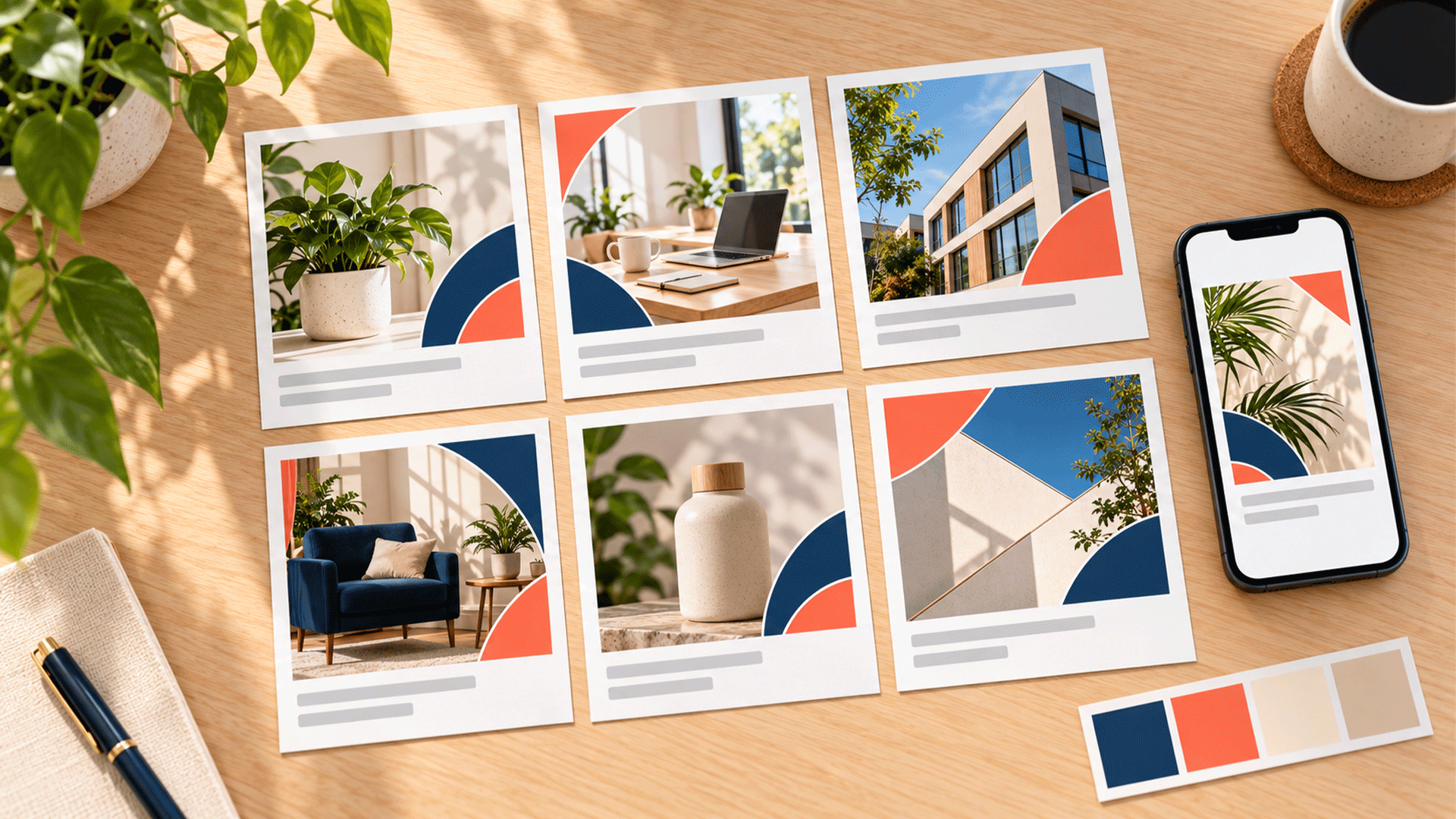
1. Color Use and Proportions
Define how your colors behave in a post.
For example, specify the usual background, headline color, accent treatment, and supporting neutrals.
A palette can appear inconsistent if every post uses those colors in completely different proportions.
Test the combinations with photographs, promotional messages, and educational content. Give the team approved alternatives for situations where the default treatment does not work.
Also look at competitor content. A commonly used color needs support from other identifying elements.
2. Typography and Text Hierarchy
Choose fonts and a clear relationship between headings and supporting information.
Decide how headlines are aligned, which weights are used, and how emphasis works.
Test actual content, including longer wording and the languages your business publishes. A system that handles English but breaks when Bangla appears will be difficult to maintain.
The aim is to give different messages a familiar structure while preserving readability.
3. Layout and Spacing
Repeat useful layout habits: where headlines begin, how images are framed, how supporting details are grouped, and how much breathing room surrounds the content.
Create variations for different purposes.
A product introduction may need a large photograph. A process explanation may need several steps. Both can share alignment, spacing, and a recognizable treatment of headings.
This gives your team flexibility within an identifiable family of designs.
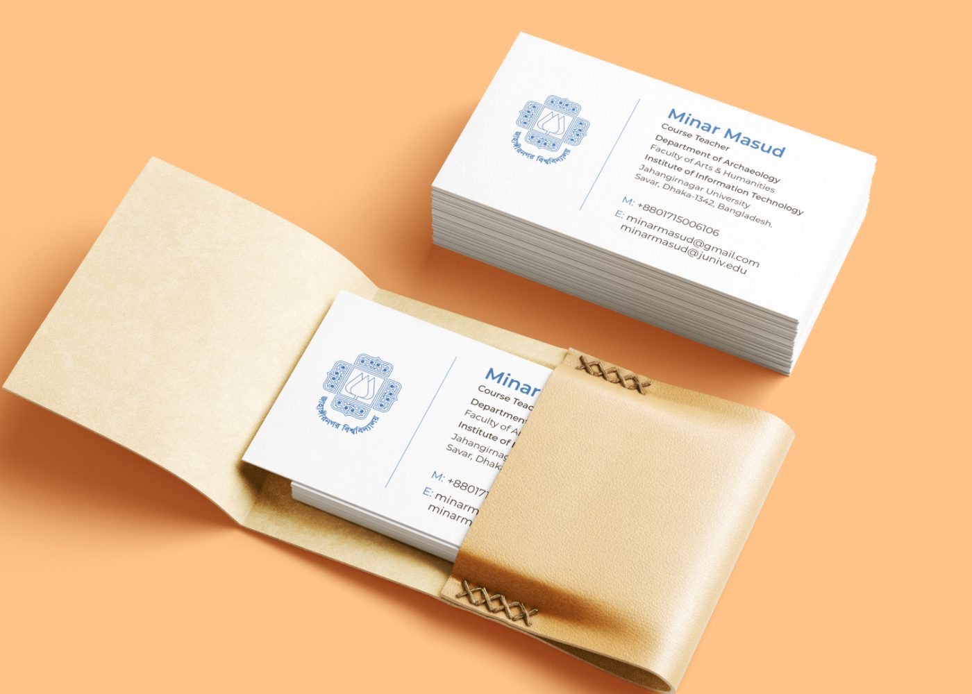


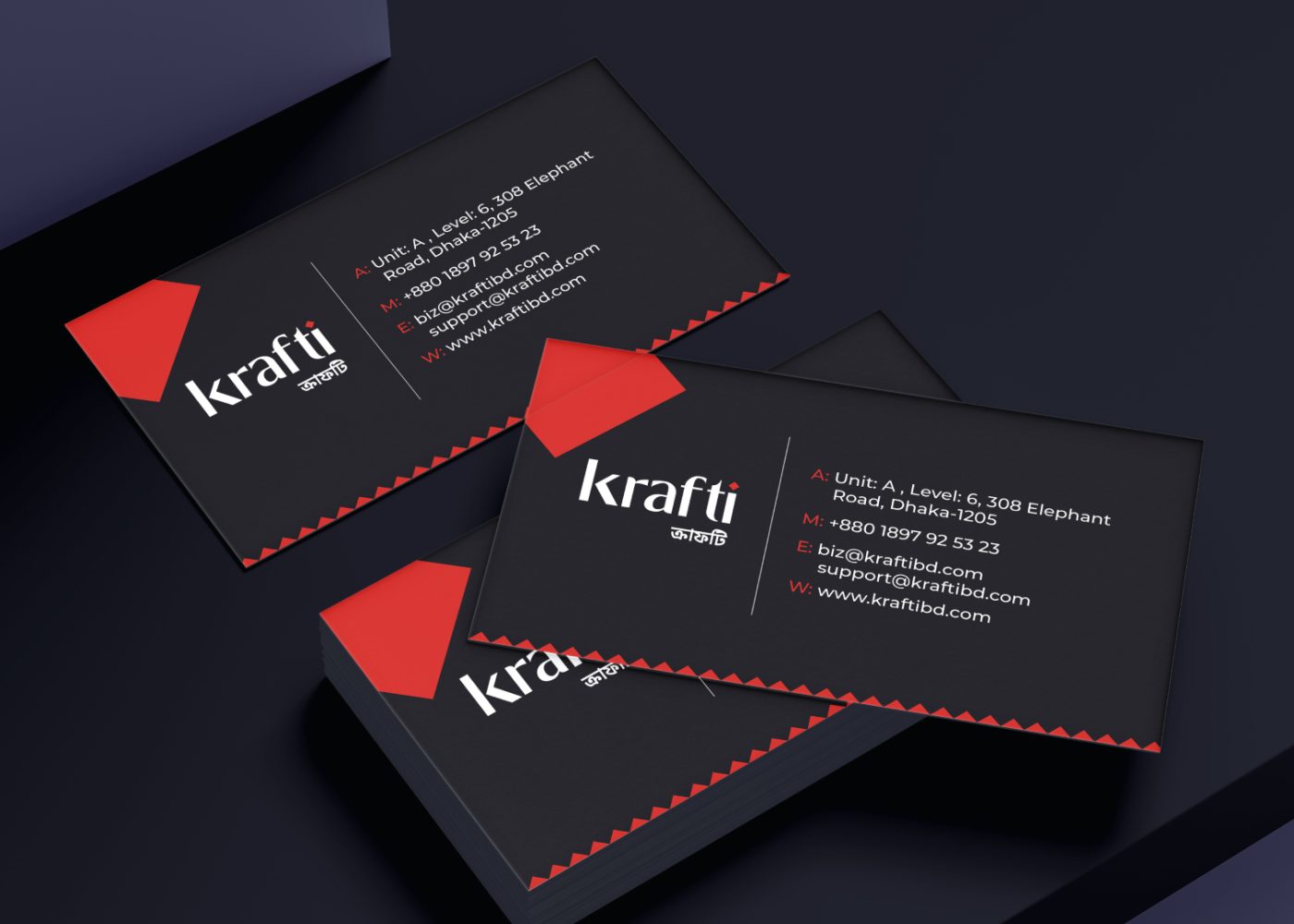

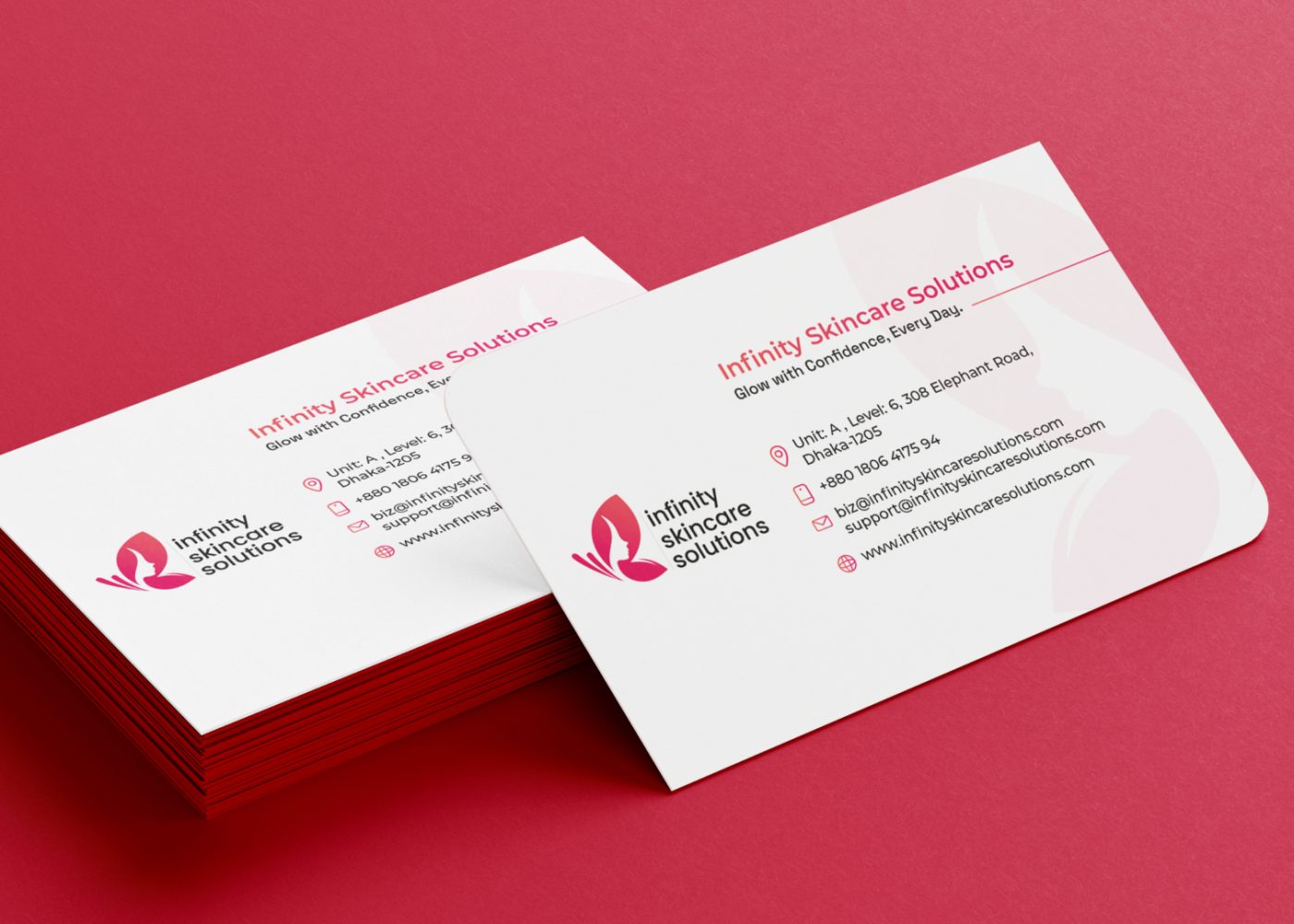



4. Photography and Image Treatment
Your choice of imagery can help create continuity.
Consider the subjects you show, lighting, backgrounds, camera distance, and how images are cropped.
Real product, team, workplace, and process photographs can also make content more specific to your business.
Write practical guidance your team can follow. For example: use clear product photographs against simple backgrounds, or show service delivery through accurate workplace images.
Avoid relying on a filter to connect unrelated photographs.
5. Graphic Elements
A recurring frame, shape, illustration treatment, or image border can provide another cue.
Choose an element that fits the wider identity and works across the formats you use.
Check that it leaves enough room for the message. A decorative device that dominates every image may become difficult to use.
Treat a new graphic element as a candidate for building recognition. Customer feedback can help establish whether it becomes associated with you.
6. Writing Style and Recurring Content
Your language also contributes to how the business feels.
Define how you explain ideas, address customers, introduce services, and invite the next step.
A helpful voice guide includes examples. “Professional and friendly” leaves more room for interpretation than a sample caption showing the intended tone.
Recurring content series can add continuity too. Keep their naming and presentation clear enough that people can understand the topic when encountering a post on its own.
Keep Your Brand Direction Clear
Visual decisions become easier when the business knows who it wants to reach and what it needs to communicate.
A consultancy explaining a complex service may need a different content approach from a retailer introducing new products.
Write a short statement covering your priority audience, offer, useful evidence, and desired customer action.
If these points remain unclear, a brand strategy foundation can help establish the direction behind your design and messaging.
Then assess whether your proposed cues suit that direction.
A consistent visual system should help people understand the business as well as identify it.
Run a Practical Recognition Check
A small feedback exercise can reveal useful problems. Treat it as exploratory customer feedback; it cannot establish recognition across your whole market.
Step 1: Select Representative Posts
Include ordinary educational posts, offers, work examples, and other formats you use regularly.
Avoid selecting only the designs you already consider strongest.
Review the posts together first. Note which visual elements recur and which change without an obvious reason.

Step 2: Prepare Copies Without Obvious Identifiers
Hide logos, business names, account handles, website addresses, and other wording that directly reveals the business.
Check photographs for visible signage or branded packaging.
Keep an original version for comparison.
This preparation helps you explore the contribution of the remaining cues. It creates a different viewing condition from normal publishing, so record that limitation when interpreting responses.
Step 3: Include Comparison Material
Mix your examples with suitable comparison posts or neutral mockups.
Vary the order so participants cannot simply assume that everything belongs to one business.
Show posts at realistic viewing sizes. Avoid presenting your content in a special frame or group that supplies an unintended clue.
Step 4: Ask Without Naming Your Business First
Begin with an open question:
“Which business, if any, do you associate this post with?”
Allow “I don’t know” as a valid answer.
Then ask what influenced the response: colors, imagery, wording, layout, or something else.
You can also ask what the post communicates. This helps separate identification from understanding the message.
Avoid revealing the answer until the relevant responses have been collected.
Step 5: Separate Familiar and Unfamiliar Participants
Record whether each participant has encountered your business before.
An existing customer and someone seeing your content for the first time bring different experience to the exercise.
Keep those responses separate. Likewise, employees and designers know the identity closely, so their answers should not stand in for customer responses.
Step 6: Record What Happened
Track correct associations, competitor associations, uncertain answers, and the reasons people give.
Keep the original comments where possible.
If you repeat the exercise, use comparable materials and conditions. Fresh participants can help reduce the effect of people remembering answers from the earlier session.
For a significant rebrand or spending decision, consider a more structured research approach.
Interpret the Results Before Changing the Design
Feedback is most useful when it leads to a specific question or action.
| What you hear | What to investigate |
|---|---|
| Familiar customers identify the business | Which cues supported their answers? |
| Participants repeatedly name a competitor | Are particular elements strongly associated with that competitor? |
| Most participants are unsure | Have they seen the business, and are the cues used consistently? |
| People group your posts together but cannot name the business | The style may be coherent while brand attribution remains weak |
| People identify the business but misunderstand the offer | The message may need clearer wording or hierarchy |
An uncertain answer does not automatically mean the design needs replacing.
The participant may have had little exposure to your business. The chosen post may be unusual. The test may also have removed information that customers normally use.
Look for repeated patterns across responses and actual publishing activity before making a major change.
Improve the System Without Rebuilding Every Post
Begin with the most obvious inconsistency.
If typography changes constantly, agree on a heading and supporting text system. If photographs feel unrelated, prepare image guidance and an approved folder. If layouts vary unpredictably, create a small family of reusable structures.
Choose a few cues to keep stable while testing content ideas.
Document what stays consistent and what can change. For example:
- Keep the headline hierarchy and core color treatment.
- Adapt the photograph and supporting layout to the topic.
- Use approved alternatives when readability requires them.
- Review new campaign designs against the existing identity.
M4YOURS IT’s Social Media Branding Kit service includes reusable templates, visual elements, and design guidance that can support this kind of consistent production. M4YOURS IT
Keep using your business name and logo in normal content while developing the surrounding cues. The recognition exercise helps assess the system; it does not require you to remove identifiers from everyday publishing.
A Fictional Example: One Business, Several Content Types
Imagine a small home accessories shop preparing product announcements, styling tips, and customer questions.
Its earlier posts use unrelated templates. Some are dark and dramatic, others use pastel backgrounds, and each has a different headline style.
The team reviews existing materials and chooses a practical direction:
- Warm neutral backgrounds.
- One consistent heading treatment.
- A restrained accent color.
- Clear product photographs.
- A recurring curved image frame.
The product layout gives the photograph more space. Styling tips use room scenes. Question posts give the explanation more room.
The content varies while the visual choices remain connected.
After publishing, the team can collect feedback about which cues people associate with the shop. It can also check whether customers understand the products and enquiry route.
The example shows how a system could work. It does not demonstrate a measured improvement in recognition or sales.
Preserve Readability as You Build Recognition
Your visual identity needs to work at ordinary viewing sizes.
Check text on a phone, especially over photographs. Give the most important information a clear place in the layout.
The W3C’s designing for web accessibility guidance recommends sufficient foreground and background contrast and using additional cues when color communicates information. These principles are useful when reviewing social graphics too. W3C
For example, distinguish an available product from an unavailable one with clear wording rather than color alone.
If a brand color makes small text difficult to read, use an approved combination that improves legibility.
Recognition and clarity both deserve attention during the design review.
Give Your Team Rules They Can Apply
Create a short guide with approved examples, editable files, and clear responsibilities.
Show how the identity works in an educational post, an offer, a work example, and your main video format.
Include examples of longer headlines and alternative photographs so the system reflects everyday content.
Ask the person producing posts to create a fresh example using the guide. Improve any instructions that cause confusion.
Then appoint someone to maintain the master files and review new variations.
If production is shared with an agency, include these expectations in the scope for content and social media marketing support.
FAQ
No. Keep selected cues consistent while adapting the layout to the message.
Different formats can belong to the same identity through typography, color treatment, imagery, and recurring design elements.
It may contribute, but check what people actually associate with it.
Common colors can suggest several businesses. Support your palette with other cues and assess the combination with your audience.
Continue using your logo and business name appropriately.
Hiding identifiers is useful for a controlled feedback exercise. Normal publishing gives you opportunities to connect the wider visual identity with the business.
There is no reliable universal timetable.
It depends on factors including audience exposure, existing familiarity, the strength of the cues, and how consistently they appear. Review evidence over time.
Recognition is one useful part of communication.
Sales also depend on the offer, audience, distribution, customer experience, and follow-up. Track commercial outcomes alongside design and recognition feedback.
Review the cues around your logo, ask customers what they recognize, and use the findings to improve a manageable visual system.
The strongest next step may be clearer typography, more specific photography, better templates, or more consistent execution.
M4YOURS IT can help you develop a Social Media Branding Kit around your existing identity and content needs.
Share your current posts, priority channels, and business goals to define the assets and guidance your team needs next.