

A business card gives someone a small but lasting reminder of your business. Before they visit your website or contact you, its layout, colors, and finish can suggest how your brand presents itself.
That makes the design choice important. Should you choose a clean, minimalist card or a more expressive, creative design?
Choose a minimalist approach when you want a calm, focused presentation. Choose a more expressive approach when a distinctive visual identity helps communicate what you do. Combine both when your brand needs clarity and personality.
Neither style is automatically more professional. The right business card should reflect your brand, connect with your audience, and make contacting you easy.
What Is Minimalist Business Card Design?
Minimalist business card design uses a small number of carefully chosen elements. It gives the logo, name, and essential contact details enough space to be noticed.
A typical minimalist card might use:
- A restrained color palette.
- Clear typography with a simple hierarchy.
- Generous space around text and graphics.
- Consistent alignment.
- One subtle visual detail, such as a line or brand symbol.
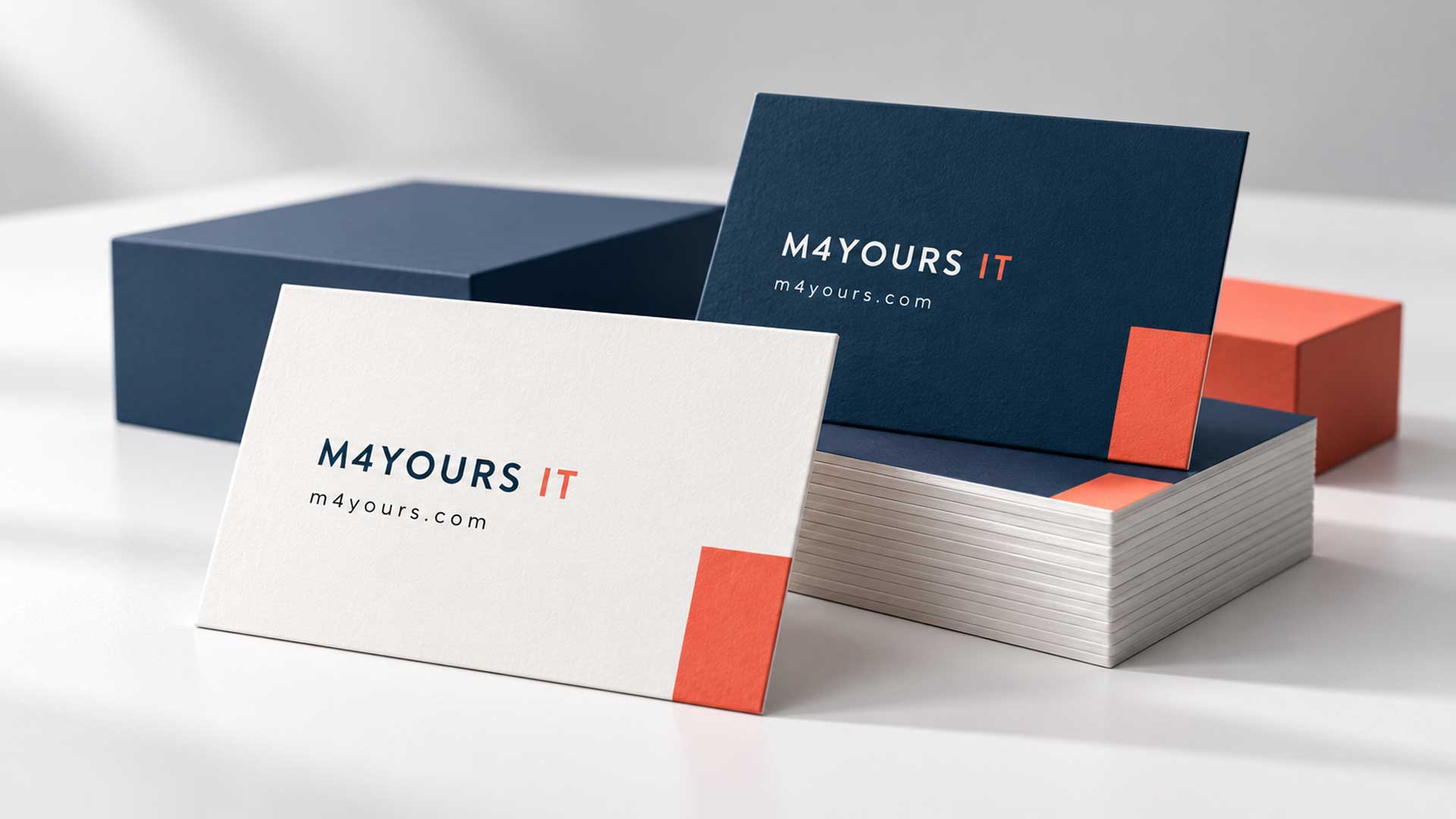
Minimalism does not require a white background. A navy card with a small white logo can be minimalist, as can a coral card with neatly arranged black text.
The defining feature is restraint: every element has a clear purpose.
For example, a consultancy could place its logo on the front and keep the person’s name, role, phone number, email, and website on the back. The layout leaves room for the information to stand out.
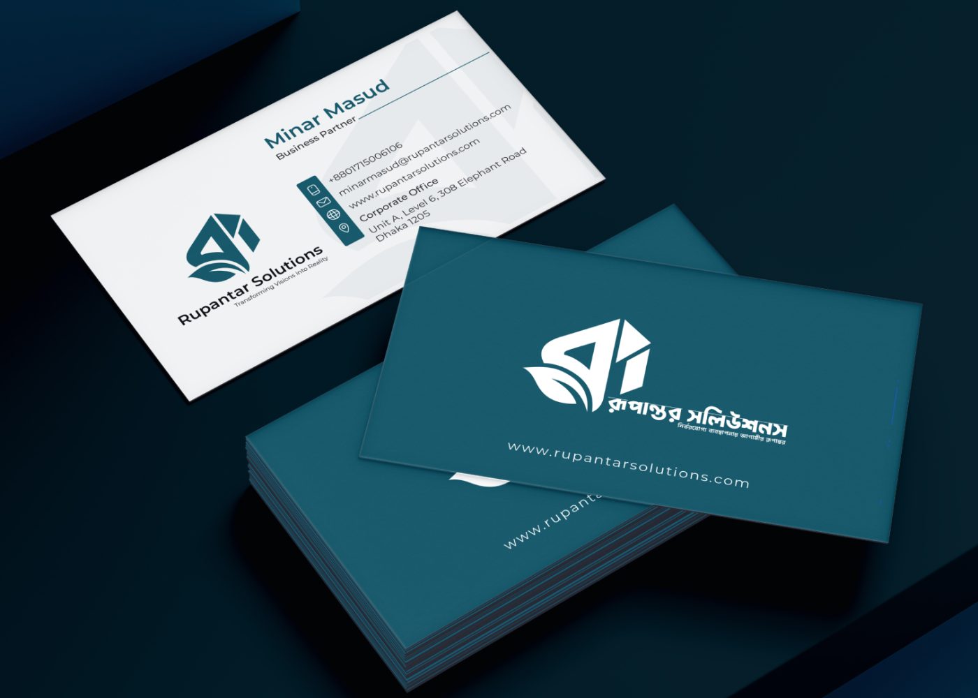
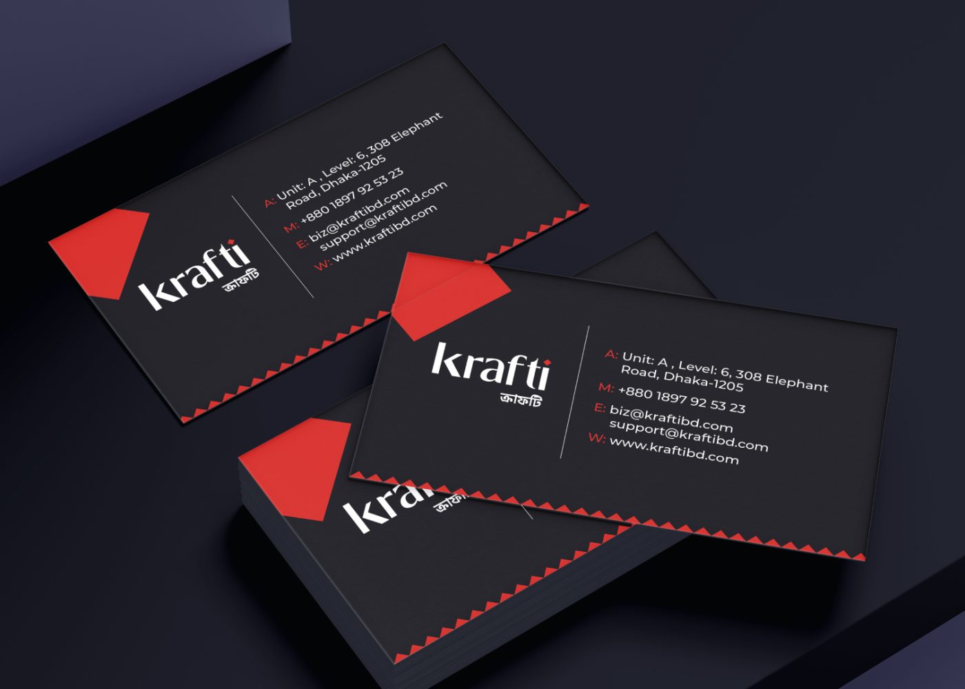
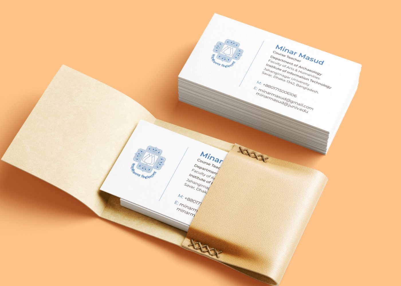
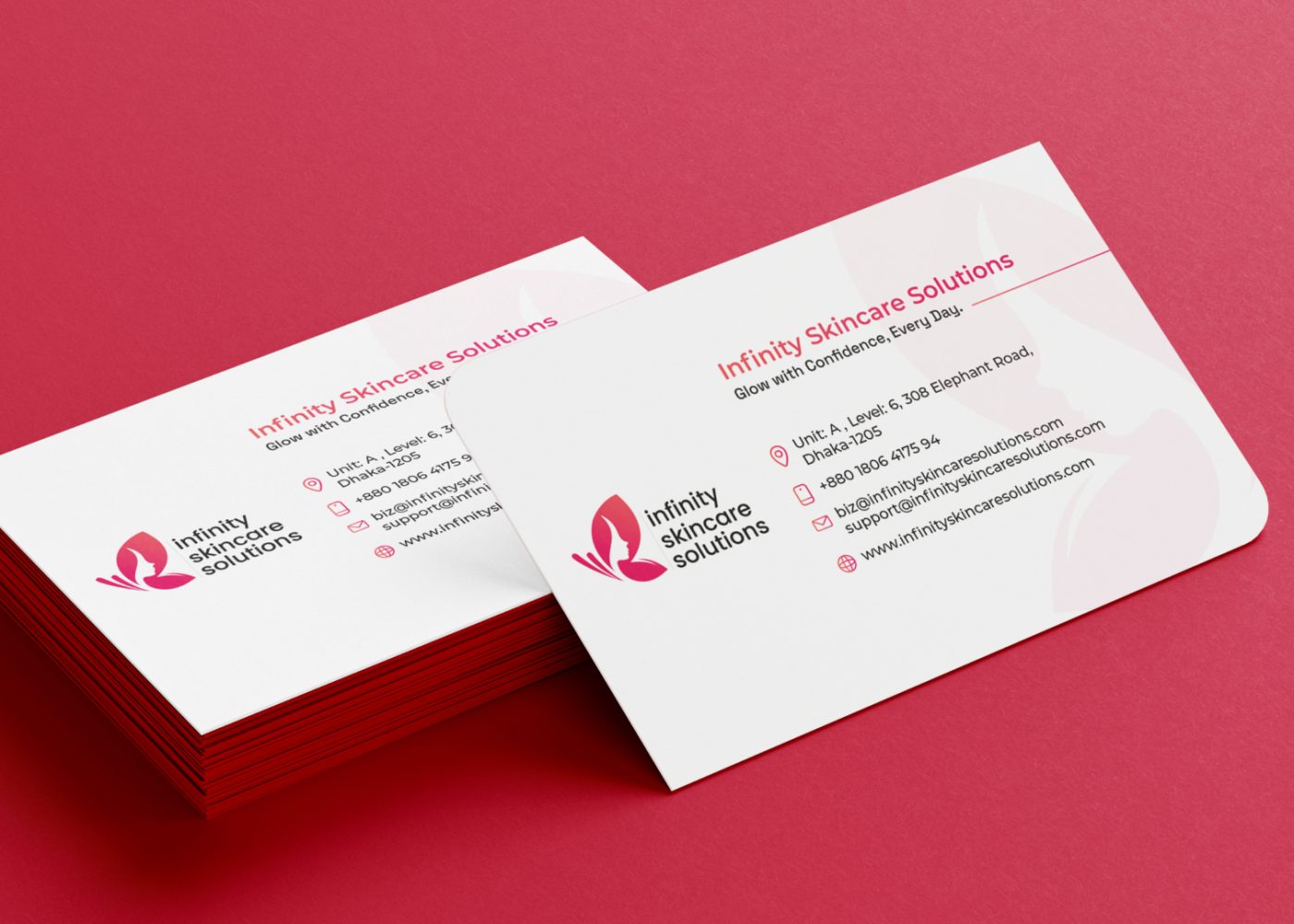
Benefits of a Minimalist Design
A restrained layout can make information easier to find because fewer elements compete for attention. It also gives you a consistent structure when producing cards for several team members.
Minimalism can suit a brand that wants to communicate precision, confidence, or a considered approach. A distinctive logo, thoughtful typography, and suitable paper can give a simple card plenty of character.
Where Minimalism Can Fall Short
A card can become too generic when the designer removes the details that make the brand recognizable.
A plain background and standard font will not communicate much on their own. If the logo is weak, the spacing feels accidental, or the text is difficult to read, simplicity will not fix the problem.
The goal is to remove distractions while keeping your brand’s identity visible.
What Is Creative Business Card Design?
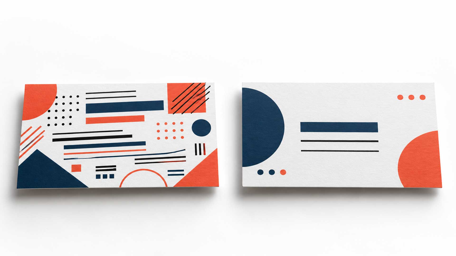
Creative business card design uses distinctive visual choices to express a brand’s personality. Those choices could include an illustration, an unexpected layout, bold typography, a pattern, or an unusual material.
A creative card might feature:
- A graphic inspired by the brand’s product or service.
- A recognizable pattern or illustration.
- Expressive typography for the brand name.
- A striking color combination.
- A vertical layout or carefully chosen special finish.
Creativity does not depend on filling every space. A card with one original illustration and a clean contact layout can be highly creative.
For example, a photographer could use a carefully selected image on one side. A skincare brand might carry a recognizable packaging motif onto its card. An architecture studio could use a simple line drawing that reflects its design approach.
Benefits of a Creative Design
A distinctive detail gives people something specific to associate with your business. It can also act as a small example of your work, particularly when visual expression is part of the service you sell.
For a designer, illustrator, or creative agency, the card itself can help communicate how the business thinks about design.
Where Creative Design Can Fall Short
Problems appear when decoration makes the card harder to use. A busy pattern behind an email address, an elaborate font for a phone number, or an awkward shape can reduce its usefulness.
Some production ideas also need more preparation. If you want foil, embossing, or a custom shape, discuss the artwork requirements and quote with your printer before finalizing the design.
A creative card succeeds when its distinctive features support the message and preserve readability.
Minimalist vs. Creative Business Card Design: A Comparison
These are common design tendencies, rather than fixed rules.
| Design factor | Minimalist approach | More expressive creative approach |
|---|---|---|
| Visual focus | A few prominent elements | A distinctive image, pattern, layout, or type treatment |
| Color | Often a restrained palette | May use bolder contrasts or more varied color |
| Typography | Simple hierarchy and restrained styling | Expressive display type paired with readable details |
| Layout | Open space and consistent alignment | More freedom in composition and orientation |
| Brand impression | Can suggest calm, precision, or restraint | Can suggest originality, energy, or playfulness |
| Main risk | Becoming generic or losing personality | Letting visual effects compete with information |
| Production cost | Depends on paper, quantity, and finish | Also depends on paper, quantity, and finish |
The cost row matters. A colorful rectangular card printed normally may cost less than a minimalist card with thick stock and foil. Ask for quotes for the actual specifications instead of assuming one style is cheaper.
How to Choose the Right Style for Your Brand
1. Define the Impression You Want to Make
Choose three words that describe how you want clients to perceive your business.
For example:
- Precise, dependable, established.
- Friendly, practical, approachable.
- Inventive, expressive, energetic.
- Refined, thoughtful, exclusive.
Then use those words to judge the design. If your brand should feel approachable, a severe layout may send the wrong signal. If it should feel precise, several competing visual effects may weaken that impression.
If these decisions are still unclear, start with your brand strategy and foundation. A clearer brand direction makes the card easier to design.
2. Consider Who Receives the Card
Think about the people who will actually use it.
Will you hand it to business owners in meetings, students and parents at an education expo, shoppers at a retail counter, or potential clients at a creative event?
Their needs may differ. A parent asking about study abroad options may value an obvious phone number and office location. Someone hiring an illustrator may also want to see a hint of that person’s visual style.
For a business serving local and international audiences, consider whether English, Bangla, or a bilingual layout will be most useful. If two languages are needed, using one on each side may give the information more room.
3. Match Your Existing Brand Identity
Place the proposed card beside your website, social media graphics, and other marketing materials.
Do they look like they belong to the same business?
Carry over the appropriate logo, brand colors, and typography. You can adapt the layout for a small printed format while preserving the visual identity people already know.
A clear logo is especially useful on a restrained card. If yours loses detail at a small size, review the logo design before building the layout around it.
4. Decide What the Card Needs to Do
Choose the most useful next step for its recipient:
- Call or message your business.
- Visit your website.
- View a portfolio.
- Book an appointment.
- Find your office.
Then prioritize the information that supports that action. Avoid turning the card into a full brochure.
VistaPrint’s business card design guidance recommends a clear information hierarchy and prioritizing the contact methods customers should use. VistaPrint US
A QR code can help someone reach a relevant page, but keep a readable website address or another contact method on the card. Print a sample and test the code at its intended size.
5. Compare Physical Samples
A large screen mockup can hide problems that become obvious on a small card.
Print both options at their intended size. Ask a few people from your target audience:
- What kind of business does this appear to be?
- Which information do you notice first?
- Can you find the preferred contact method easily?
- Which design feels more consistent with the brand?
Use their responses to check whether the design communicates the impression you intended.
Can You Combine Minimalist and Creative Design?
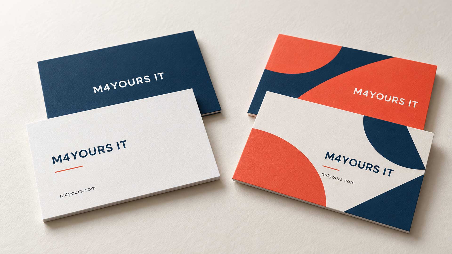
Yes. Minimalism describes how selectively you use elements; creativity describes the originality of your choices. They can work together.
Start with a clear layout, then add one distinctive feature:
- A bold brand color on the reverse.
- An original illustration with plenty of space around it.
- A subtle pattern derived from the logo.
- A striking brand name treatment.
- A carefully placed foil detail.
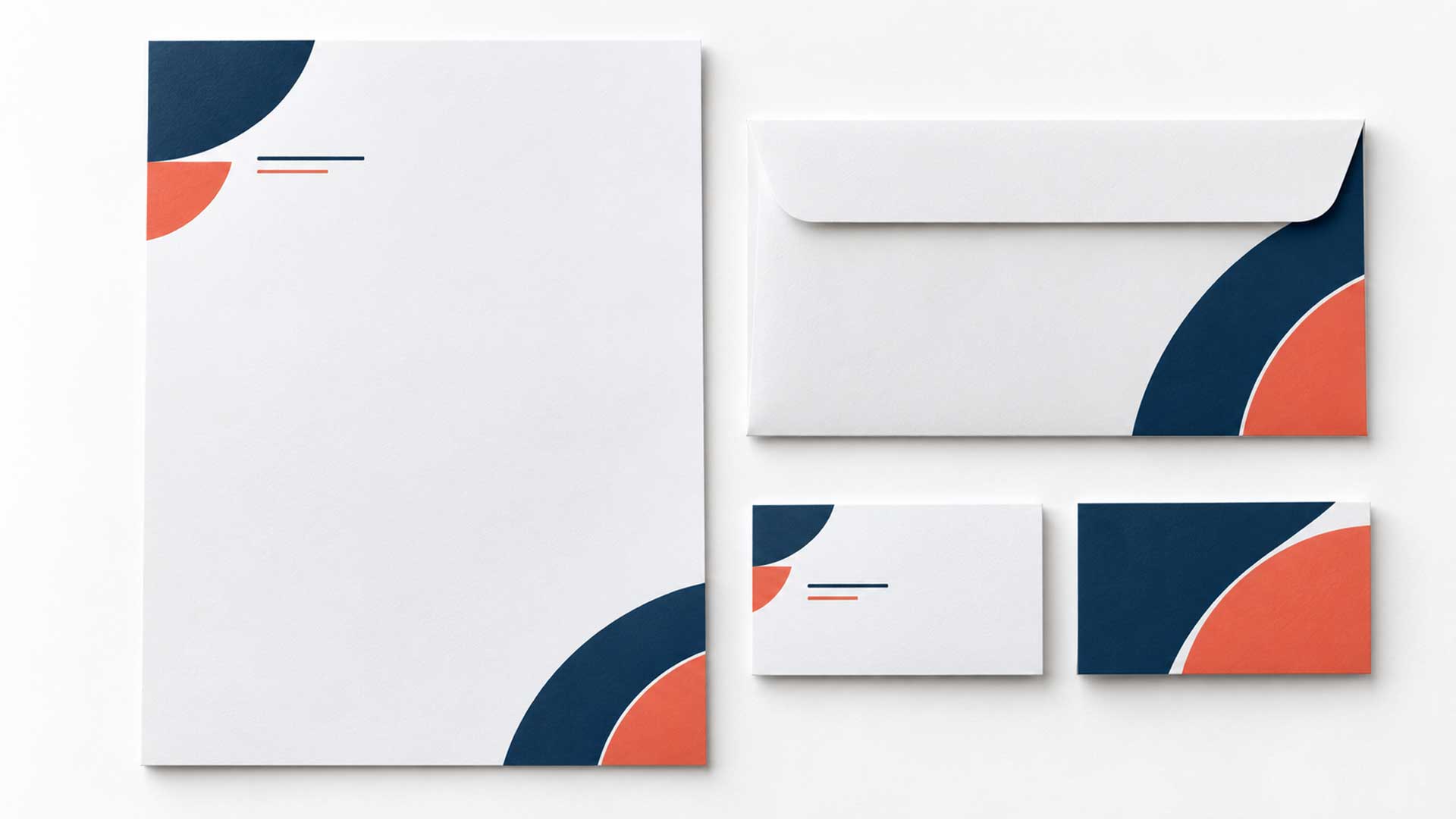
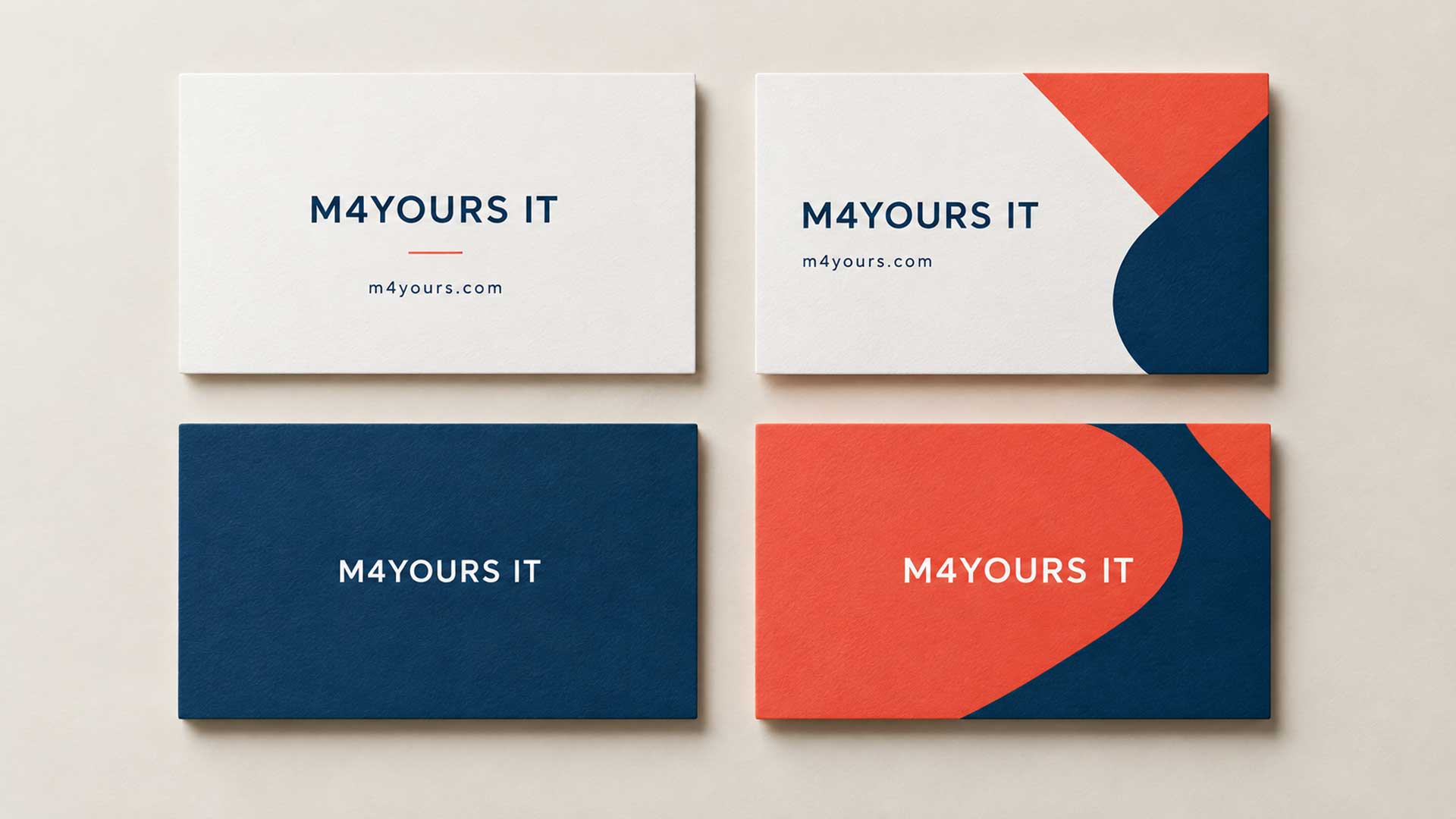
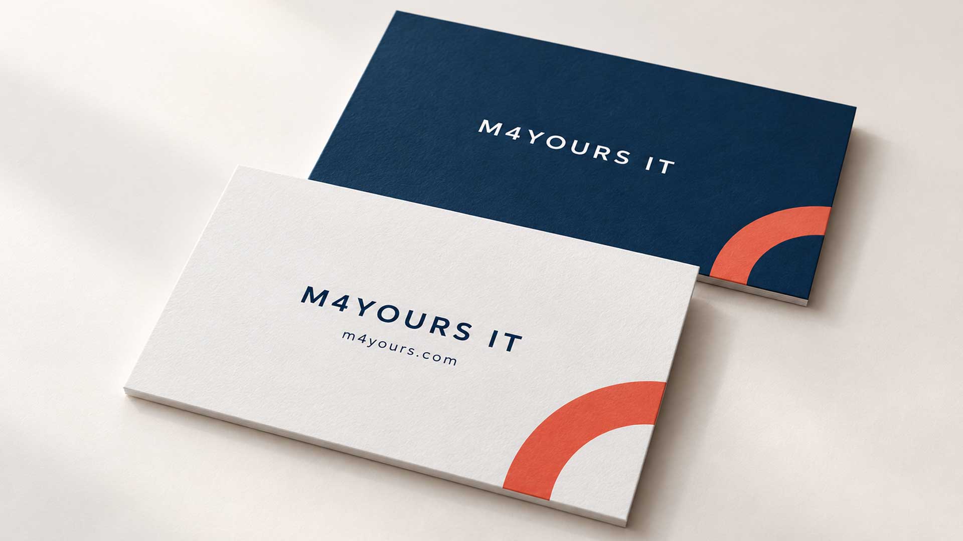
For M4YOURS IT, an illustrative direction could use a white contact side with navy text and a coral accent, paired with a navy reverse carrying the logo. A restrained geometric graphic could add personality while keeping the information clear.
This is a proposed design direction. The final artwork should use the approved logo and print-tested color values.
Suggested Starting Points for Different Businesses
Your audience and existing identity should guide the final choice.
| Business type | Suggested direction | Detail to prioritize |
|---|---|---|
| Education consultancy | Clear layout with a controlled brand accent | Counselor name, contact details, and office information |
| Immigration consultancy | Restrained or balanced design | Readable identity, role, and preferred contact method |
| IT or software company | Minimalist layout with a distinctive graphic | Website and a clear description of the business |
| Skincare or beauty brand | Refined layout with an expressive brand detail | Consistency with packaging and retail identity |
| Designer or photographer | Creative composition with clear contact information | A visual example or a link to selected work |
| Property business | Structured layout with recognizable branding | Agent name and direct contact details |
| Artisan or lifestyle brand | Illustration, pattern, or distinctive typography | A detail connected to the product or craft |
Two businesses in the same industry can reasonably choose different styles. An architecture studio known for colorful interiors may need a different card from one known for restrained spaces.
Print Details That Matter for Both Styles
The best concept still needs artwork that reproduces properly.
Before approving the file:
- Use the printer’s template. Confirm the finished size, bleed, and safe area for the exact product.
- Check text at its printed size. Choose type that remains comfortable to read, especially for contact details.
- Keep essential information inside the safe area. Extend backgrounds into the bleed when they reach the edge.
- Prepare suitable artwork. Use vector artwork for logos where possible and adequately resolved photographs.
- Confirm special-finish requirements. Ask how the printer needs foil, raised details, or other effects supplied.
- Proofread and test. Check names, numbers, email addresses, website links, and any QR code.
For reference, MOO’s business card artwork guidelines specify text of at least 8 pt and photographs at 300 dpi or higher. Those are supplier requirements; your chosen font, stock, and printing method may call for adjustments. MOO
A physical proof also helps you assess how the colors and finish look away from the screen.
Frequently Asked Questions
Either approach can look professional. Readable information, careful spacing, consistent branding, and suitable printing matter more than the style label.
Yes. One original illustration, a distinctive type treatment, or an unexpected color combination can make a simple layout creative.
Choose the style that reflects your business and helps customers contact you. A clear layout with one recognizable brand detail is a useful starting point when you are unsure.
Not necessarily. Quantity, stock, finishes, and production methods determine the quote. Compare specifications for both options.
Include a short description if it helps people understand what you do. Put a longer service list on your website or brochure so the card has room for its main information.
Include one when it offers a useful next step, such as viewing a portfolio or booking a consultation. Keep the destination relevant and test a printed sample before ordering.
Compare them at actual size with your brand materials beside them. Check readability and ask intended recipients which impression each design gives them.
Create a Business Card That Feels Like Your Brand
Choose a minimalist design if a focused, restrained presentation fits your brand. Choose a more expressive design if a distinctive visual detail helps communicate your personality or work. Combine them when both serve a clear purpose.
The card should look like your business and make the next step easy.
M4YOURS IT’s corporate identity design services include branded business cards and corporate stationery. Explore the service to discuss a card that fits your wider visual identity. M4YOURS IT