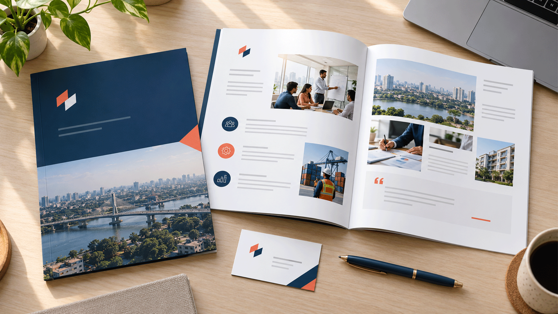



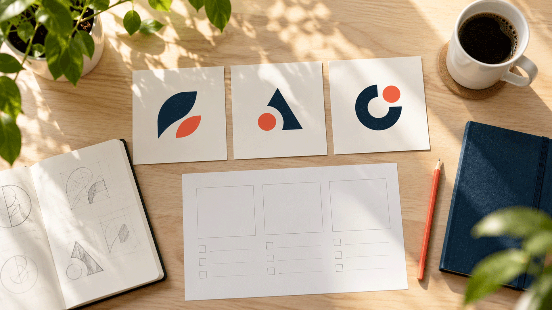
Your designer presents three logo concepts. One feels familiar, one looks more distinctive, and one catches your attention because it uses your favourite colour.
Then the feedback begins.
A colleague prefers the lettering in the first concept. Another likes the symbol in the second. Someone suggests combining all three.
To choose between logo concepts, compare them against an agreed brief, review them under the same practical conditions, and use evidence to investigate the most important differences. Personal taste can contribute, but it should sit alongside your audience, business goals, and application requirements.
A structured review gives your team a clearer reason for choosing a direction and a more useful way to request refinements.
Start With the Job the Logo Needs to Do
Before discussing concepts, restate what the identity needs to support.
Who should recognize the business? What impression suits the offer? Where will the logo appear? Are there familiar features that an existing audience already associates with you?
Write down the essential requirements before choosing a favourite.
| Brief element | What to agree |
|---|---|
| Audience | The people and buying situations the identity should serve |
| Business direction | The offer, positioning, and priorities guiding the work |
| Intended expression | Communication qualities described in practical terms |
| Main applications | Website, social profile, packaging, signage, proposals, or other relevant uses |
| Existing assets | Recognizable features worth investigating or retaining |
| Decision ownership | Who provides input and who approves the direction |
If these answers are unclear, revisit your brand strategy and foundation before expecting the concepts to resolve the disagreement.
For example, “approachable and organized” needs interpretation. It could mean readable lettering, a clear structure, and a restrained visual system. Agree on what the words should mean in your context.
Separate Preference, Observation, and Evidence
These three kinds of feedback can sound similar in a meeting.
| Feedback | What kind is it? | Useful follow-up |
|---|---|---|
| “I prefer Concept A.” | Preference | What specifically attracts you, and does it relate to the brief? |
| “The name becomes difficult to read in the mobile header.” | Observation | Check the actual size and compare the alternatives |
| “Several participants misread the same letter.” | Research finding | Review the examples, participants, and conditions |
| “Customers will definitely love this.” | Prediction | Identify what would need testing |
An observation can reveal a real problem. A research finding can strengthen the case, but its scope still matters. A few exploratory conversations cannot establish what an entire market will prefer.
Nielsen Norman Group’s guidance on design critiques centres feedback on whether a design meets its objectives and recommends agreeing on scope and goals. Applying that principle to logo reviews gives discussion a useful shared reference. NN/G
1: Compare Concepts Under Equivalent Conditions
Presentation can influence your reaction.
A concept shown on an elegant shopfront may feel more convincing than another shown alone on a white slide. You may be responding partly to the photography, environment, or production quality.
Ask for a consistent comparison set.
Review every concept:
- At a comparable visible size.
- With the same business name and supporting wording.
- On equivalent backgrounds.
- In the same priority applications.
- At a similar level of refinement.
Comparable size does not always mean identical dimensions. A long wordmark and a compact symbol need sensible treatment so each receives a fair presentation.
Start with the core designs, then review their application. Keep sophisticated mockups useful without allowing them to hide a weak or unreadable mark.

Step 2: Check Essential Requirements Before Scoring
Some problems should be resolved before a concept competes on a weighted scorecard.
Identify the requirements your project cannot comfortably compromise.
Examples might include:
- The name must be readable in the main website header.
- The mark must remain usable on your actual packaging.
- A required Bangla version must work adequately.
- An essential existing feature must be considered during a refresh.
- The identity must support a particular production method.
Record whether each requirement is met, needs refinement, or remains untested.
A strong overall score should not hide a failure in an essential application. Equally, a concept that needs a small adjustment should not be dismissed before the designer has assessed the issue.
Discuss whether the problem is structural or reasonably fixable.
Step 3: Evaluate Five Useful Criteria
1. Fit with the agreed brief
Ask whether the concept supports the business direction and intended expression.
Refer to specific features and context. “This feels premium” needs explanation: is that impression relevant, shared by the intended audience, and supported by the surrounding identity?
Avoid treating a colour or font as having one fixed meaning for every audience.
2. Potential to distinguish the business
Compare the concept with relevant alternatives in the market.
Look at silhouette, lettering, composition, colour combinations, and overall structure. Identify specific similarities that could create confusion.
The Ehrenberg-Bass Institute’s guidance on distinctive brand assets stresses the importance of association with the intended brand and the extent to which competing brands also come to mind. A visually unusual concept still needs to become associated with your business. marketingscience.info
For a new identity, assess its potential and investigate confusion. Do not describe an unfamiliar concept as an established recognition asset.
3. Name readability and clarity
Check whether people can read the business name in required settings.
Examine small lettering, spacing, unusual characters, and the relationship between the symbol, name, and any descriptor.
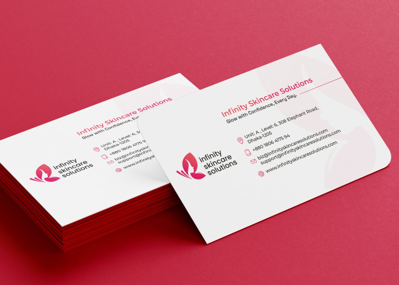
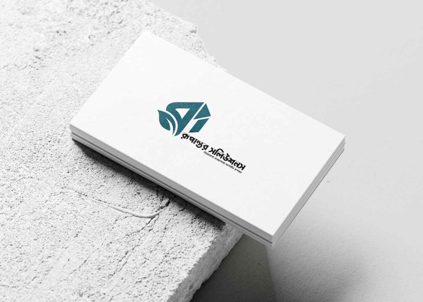
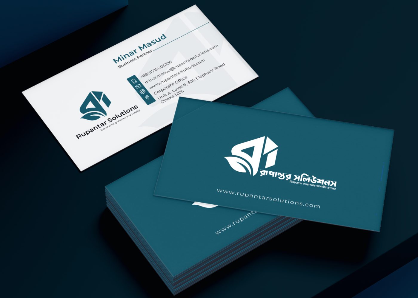
For bilingual identities, assess both versions. A strong English wordmark does not automatically establish that its Bangla counterpart works.






4. Performance in real applications
Review your actual customer touchpoints.
A social avatar may crop the mark. A narrow website header may constrain a long name. Printing or embroidery may expose details that disappear at small sizes.
Ask for suitable variations while preserving a coherent identity.
5. Potential to support a wider identity
Consider whether the concept gives the team a workable basis for layouts, documents, digital assets, or packaging.
Review a small set of relevant examples. The purpose is to understand how the identity could work across everyday materials.
A corporate identity system can develop those rules and applications after a suitable direction has been chosen.
Step 4: Use a Scorecard to Make Trade-Offs Visible
A scorecard can organize the discussion. It does not turn design judgement into scientific certainty.
The following weights are an illustrative starting point. Agree on your own priorities before scoring.
| Criterion | Example weight |
|---|---|
| Fit with the brief | 25% |
| Potential to distinguish the business | 25% |
| Name readability | 20% |
| Performance in priority applications | 20% |
| Potential for a coherent identity system | 10% |
| Total | 100% |
Rate each criterion from 1 to 5, using shared descriptions:
| Rating | Meaning for this review |
|---|---|
| 1 | Materially misses the requirement |
| 2 | Needs substantial improvement |
| 3 | Adequate, with identified refinements |
| 4 | Strong, with minor concerns |
| 5 | Clearly meets the criterion in the examples reviewed |
Use “not yet assessed” where evidence is missing. Do not assign an average score simply to fill a blank.
For each assessed criterion, calculate:
Weighted points = rating ÷ 5 × percentage weight
Add the points only when the same criteria have been assessed for each concept. The resulting total is an internal comparison, not a prediction of business performance.
Example comparison
These ratings are fictional and demonstrate the method.
| Criterion | Weight | Concept A | Concept B | Concept C |
|---|---|---|---|---|
| Fit with the brief | 25% | 4 | 4 | 3 |
| Potential to distinguish | 25% | 3 | 4 | 4 |
| Name readability | 20% | 5 | 4 | 3 |
| Priority applications | 20% | 4 | 4 | 2 |
| Identity system potential | 10% | 4 | 4 | 3 |
| Weighted total | 100% | 79/100 | 80/100 | 61/100 |
Concept B scores one point above Concept A. That is a reason to inspect the trade-off, not evidence of a decisive winner.
Concept A has stronger readability in this example. Concept B receives a stronger distinction rating. Investigate whether B’s readability can be improved and whether the perceived distinction holds up in relevant comparisons.
Record the reason and evidence behind every rating. The notes often matter more than the total.
Step 5: Gather Independent Feedback Before Group Discussion
Ask reviewers to record their observations against the brief before the meeting.
This makes it easier to see where people agree and where their interpretations differ.
Then review the concepts together. Let the designer explain the rationale and respond to practical questions. Internal reviewers should understand that rationale, while customer research should still capture initial reactions before providing the explanation.
Name a facilitator to keep the discussion focused and a decision-maker to resolve the final trade-offs.
The decision-maker should consider relevant input and explain the choice. Requiring unanimous enthusiasm can leave a team endlessly revising a workable direction.
Step 6: Turn Vague Reactions Into Useful Feedback
Your designer needs to understand the issue you are trying to solve.
| Initial reaction | More useful feedback |
|---|---|
| “Make it more modern.” | “The thin lettering becomes unclear in our small profile image; can we explore a clearer treatment?” |
| “It needs more personality.” | “The silhouette resembles several competitors. Which feature could help distinguish it?” |
| “I don’t like the symbol.” | “The symbol suggests a service we do not provide; can we investigate that interpretation?” |
| “Use a brighter colour.” | “The current application has weak separation from the background; can we improve visibility?” |
| “Combine all three.” | “Concept B best fits the brief. Can we explore a refinement that addresses the readability concern?” |
Keep uncertain interpretations labelled as questions. “I wonder whether this suggests a different service” is a useful hypothesis to investigate.
Explain the problem and allow the designer to explore solutions. A prescribed visual change may solve one concern while creating another.
Step 7: Use Customer Feedback to Answer Specific Questions
Choose participants relevant to the audience, and decide what you need to learn.
Useful questions may concern:
- Whether the business name is readable.
- What category or service the full presentation suggests.
- Whether another business comes to mind.
- What is confusing in a specific application.
- Which existing features customers already associate with you.
Ask neutral questions. Nielsen Norman Group’s guidance on avoiding leading questions explains how wording that suggests a desired answer can influence participants’ responses. NN/G
For example, ask “How would you describe this?” before introducing words such as “trustworthy,” “innovative,” or “friendly.”
Where practical, vary the order in which concepts appear. Give each comparable exposure and avoid explaining one more enthusiastically than another.
A preference vote can describe what the surveyed group liked under those conditions. It cannot establish that the winner will be more recognizable or commercially successful.
Keep initial understanding, liking, and recognition as separate questions.
What If Stakeholders Still Disagree?
Identify the exact source of disagreement.
Is it about an observed problem, a rating, a different interpretation of the brief, or personal preference?
If reviewers disagree about the brief, resolve that issue first. If they disagree about whether lettering is readable, examine it in the intended application. If they disagree about audience interpretation, choose an appropriate research task.
When two concepts meet the requirements and evidence does not separate them clearly, informed judgement remains part of the decision.
State the trade-off openly:
We are choosing Concept B because it meets the brief, works in our priority applications, and offers a promising distinction from relevant competitors. We will refine the small-size lettering before final approval.
That creates a reviewable reason for proceeding.
What If None of the Concepts Fits?
Return to the brief and identify the unmet requirements.
A clearer revision request might say:
All three concepts rely on similar category symbols, while our brief calls for a more identifiable name-led direction. Please explore that direction and show how it works in the website header and proposal cover.
Check whether the project’s scope, constraints, or business direction changed after the initial briefing.
Agree on the next work with the designer before requesting another round. Repeatedly asking for “something different” gives the team little guidance.
A Practical Logo Selection Checklist
Before approving the direction, confirm that you can answer these questions:
- Have we agreed on the audience, brief, and priority applications?
- Were the concepts presented under comparable conditions?
- Have essential requirements been checked?
- Are scorecard ratings supported by reasons?
- Have we investigated important confusion or readability concerns?
- Have we recorded what needs refinement?
- Is the final decision-maker clear?
- Can we explain the choice in terms of the brief?
After selecting a direction, review the refined artwork and relevant applications again.
FAQ
The approval role should be agreed at the start. The owner may hold that role, while considering customer evidence, design expertise, and practical requirements.
Use voting only for the question it actually answers. A popularity result does not automatically establish stronger identification, readability, or suitability.
Yes. Aesthetic judgement is part of design. Discuss it alongside the brief and evidence, and distinguish a personal preference from a customer or application requirement.
No. Check essential requirements, uncertainty, evidence quality, and close trade-offs. The scorecard helps organize judgement; its totals do not validate it.
Ask whether a particular combination solves an identified problem and remains coherent. The designer should assess that possibility rather than automatically merging favourite elements.
Bring your business goals, audience priorities, intended applications, and decision requirements into the design process.
M4YOURS IT’s professional logo design service includes discovery, concept development, refinement, variations, and usage guidance that can support a structured review. M4YOURS IT
Discuss your logo project with M4YOURS IT to define the brief, compare concepts fairly, and choose a direction with clear reasons behind it.