


A bakery owner asks for bread in the logo. A construction company wants a building. A technology business suggests a laptop, cloud, and circuit board.
The reasoning is understandable: if the logo shows the service, customers should immediately understand the business.
Your logo does not have to picture what your business does. It needs to help people identify your company and work effectively wherever they encounter it. A descriptive symbol can be useful, but it is one possible approach.
The right choice depends on your name, audience, offer, existing recognition, and the information surrounding the logo.
What Should Your Logo Actually Do?
A logo gives your business a visual identifier. It can include a name, symbol, lettering, or a combination of elements that people learn to associate with you.
It may also suggest a category, personality, or idea. However, it does not need to explain your complete offer.
Your website headline, product photographs, packaging information, service descriptions, and sales conversations can communicate details the logo cannot carry comfortably.
The Ehrenberg-Bass Institute discusses the identifying role of logos and other brand assets, emphasizing that customers need to connect those assets with the correct business. That provides a useful starting point when setting expectations for your design. marketingscience.info
For a growing company, review whether the logo:
- Makes the business name readable where needed.
- Can be distinguished from relevant alternatives.
- Works in its intended sizes and formats.
- Fits the way the business presents itself.
- Can be applied consistently across customer touchpoints.
A useful logo design brief turns those requirements into criteria for exploring and evaluating concepts.
Descriptive, Suggestive, and Abstract Logos Explained
These terms describe how directly a design points toward a product or service.
| Approach | How it works | Illustrative example |
|---|---|---|
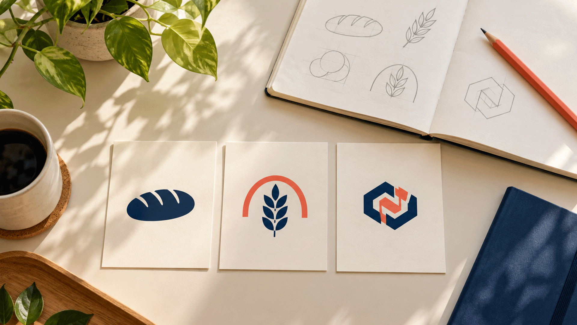
| Descriptive symbol | Shows a recognizable product, tool, or category cue | A bread loaf for a bakery |
| Suggestive symbol | Hints at an associated idea or benefit | A rising form suggesting progress |
| Abstract symbol | Uses a form without an obvious product depiction | A distinctive geometric arrangement |
| Wordmark | Presents the business name through lettering | A company name in carefully developed typography |
These approaches can overlap. A wordmark may include a descriptive name, and an abstract symbol may appear beside a clear service descriptor.
Descriptiveness can also come from words. A logo reading “North Street Bakery” communicates a category even without a loaf illustration.
That is why the choice is broader than “picture of the product” or “meaningless shape.”
When a Descriptive Logo Can Help
Your audience needs a quick category cue
A descriptive element may help when people encounter an unfamiliar business with little supporting information.
For example, a bakery sign seen from the street has different communication conditions from a consultancy logo beside a detailed website headline.
If customers need to understand the category quickly, explore whether the business name, symbol, descriptor, or surrounding presentation provides that information most effectively.
The business has a focused offer
A business specializing in one recognizable product may find a related symbol useful.
A bicycle repair shop could explore a bicycle component. A bakery could consider bread or another relevant product cue.
The challenge is to develop a coherent identity that customers can identify, rather than using a familiar symbol without considering competing businesses.
Research supports the direction for your audience
A 2019 Journal of Marketing Research study on logo descriptiveness found that more descriptive logos could improve brand evaluations and purchase intentions in the conditions studied. The benefits were weaker for familiar brands and reversed for categories associated with negative feelings. journals.sagepub.com
Those findings give businesses reasons to consider descriptiveness. They do not establish that every company should illustrate its products or that a particular logo will improve sales.
Use the research to inform the questions you test with your own audience.
When an Abstract or Name-Based Approach May Fit
Your offer includes several services
Some businesses cannot be represented clearly by one product image.
An IT company may provide website development, applications, cloud services, automation, and digital marketing. Combining a laptop, phone, cloud, robot, and chart could leave the designer with a crowded mark.
A recognizable name and a coherent symbol may give the identity a practical structure. Service pages, navigation, and introductory copy can explain the different offers.
The business name already provides enough context
If the name clearly identifies the category, another descriptive element may repeat information.
Consider the complete combination. Does a picture add useful clarity, contribute visual character, or make the design harder to use?
A name-based design still needs careful typography, spacing, proportions, and application. Choosing a wordmark does not remove the design work.
A literal image could imply the wrong scope
A company might offer broader support than the object in its logo suggests.
For example, a business offering office maintenance may want to investigate whether a mop illustration makes prospects think it provides only cleaning.
That is a question for customer research. Avoid assuming a particular image will always create the same interpretation.
You have credible plans to expand
A narrow product depiction may become less suitable when a business changes its offer.
Discuss realistic plans during the brief. A bakery adding related products has different needs from a company moving into an unrelated market.
Choose a direction that supports the business you intend to build, while making the current offer understandable.
A Descriptive Logo Can Still Be Distinctive
Showing a product does not automatically make a logo generic.
The execution matters: lettering, shape, proportions, composition, colour relationships, and the way the elements work together.
Two bakeries can both use a loaf illustration and still develop different identities. Conversely, two companies can choose abstract symbols that look almost interchangeable.
The Ehrenberg-Bass Institute’s guidance on distinctive assets highlights the importance of people associating an asset with the intended brand rather than competing brands. That question remains relevant whether the design is literal or abstract. marketingscience.info
When reviewing concepts, examine both category clarity and business identification:
| Question | What you are checking |
|---|---|
| What type of business does this suggest? | Category interpretation |
| Which business does this belong to? | Brand association |
| Can you read the name? | Legibility |
| Does it resemble another company? | Potential confusion |
| Does it remain clear in actual use? | Practical suitability |
A logo can communicate “bakery” successfully while giving customers little help distinguishing one bakery from another. Investigate both tasks.


Your Logo Does Not Need to Include Every Service
A common design problem begins with a reasonable request: “Can we add one more thing?”
A builder adds a house, bridge, crane, road, and initials. A consultancy adds a globe, graduation cap, aircraft, handshake, and flag.
Each element may have a business explanation. Together, they may become difficult to reproduce or interpret at the sizes required.
Start by deciding which information belongs in the logo and which belongs elsewhere.
| Communication need | Places to address it |
|---|---|
| Identify the business | Logo and business name |
| Explain the main offer | Headline, descriptor, or introduction |
| Show products or completed work | Photography, portfolio, catalogue |
| Explain several services | Navigation, service pages, brochure |
| Support claims | Relevant evidence, process details, customer feedback |
| Guide the next step | Clear contact information and calls to action |
A brand strategy and foundation helps establish those priorities before the design becomes overloaded.
You can then judge the logo as part of a complete customer experience.
Use the Surrounding Context to Make Your Offer Clear
A non-descriptive logo does not give a business permission to be vague.
If the name is unfamiliar and the symbol is abstract, provide useful information nearby.
For example:
- A website header can lead into a clear statement of the service.
- A shopfront can include a readable category descriptor.
- Packaging can show the product and explain what it contains.
- A social profile can state who the business helps and what it provides.
- A proposal can identify the relevant service and scope.
Review what customers actually see together.
A logo isolated on a presentation slide may feel mysterious. The same logo beside an accurate business name, product photograph, and clear headline may be understandable in use.
The reverse also applies: a descriptive logo cannot compensate for confusing service information or an unclear buying process.
How to Choose the Right Approach for Your Business
Use these six questions during the brief.
1. How familiar are customers with your business?
An established audience may already connect a symbol with the company. An unfamiliar audience may need the name and category explained more explicitly.
Avoid using a famous brand’s ability to display a symbol alone as proof that your own business can do the same immediately.
2. What does your name communicate?
Consider whether it is descriptive, suggestive, invented, or based on a person’s name.
Review the name and symbol together. Your design decisions should account for the information the name already provides.
3. What information will appear beside the logo?
A small product label, roadside sign, social avatar, and full website offer different amounts of supporting context.
Identify the demanding applications early so you can develop suitable versions.
4. What are competitors doing?
Compare relevant businesses using similar criteria. Look for crowded visual conventions and features your audience might confuse.
The aim is to understand the environment your identity will appear in.
5. What needs to remain recognizable?
If you already have customers, identify useful existing features before changing them.
The current colour combination, lettering, or shape may carry recognition even when other parts need refinement.
6. What direction best supports the brief?
Compare concepts against agreed needs: identification, category clarity where required, readability, applications, and appropriate presentation.
Personal preference can be part of the discussion. It should sit alongside evidence about how the design works.

A Practical Example: Three Directions for One Bakery
Imagine a new neighbourhood bakery preparing its identity. This is an illustrative example.
The owner has three possible directions:
| Direction | Possible advantage | Question to investigate |
|---|---|---|
| Name with a loaf symbol | Provides an obvious product cue | Can customers distinguish it from other bakeries? |
| Name with a suggestive rising shape | Offers an indirect connection with baking | Does the full identity give enough category context? |
| Distinctive wordmark with a descriptor | Keeps the name central and explains the category through words | Is it readable on signs, bags, and small labels? |
Each deserves a fair presentation.
Compare them on the same bakery sign, takeaway bag, website header, and label. Use comparable sizes and production quality.
Ask prospective customers what they understand, what seems confusing, and how they identify the business.
One approach may suit the brief better. That does not make it the right answer for every bakery.
Test the Complete Identity Before Approving It
Prepare realistic examples that include the information customers would normally see.
Useful checks include:
- Category understanding: What do people think the business offers?
- Name readability: Can they read and repeat the business name?
- Competitor confusion: Does another company come to mind?
- Application quality: Does the design work at the required size and on different backgrounds?
- Brand association: For existing customers, which features already identify the business?
Keep leading explanations out of the first response. If you tell participants the symbol represents growth before asking what it communicates, you cannot treat their agreement as an independent finding.
For unfamiliar concepts, distinguish first impressions from established recognition. People cannot be expected to identify a company they have never encountered.
Small exploratory checks can reveal useful issues. They do not establish a market-wide success rate or guarantee future commercial results.
Common Mistakes to Avoid
- Requiring every product or service to appear in one mark.
- Assuming an abstract shape automatically feels premium.
- Assuming a literal symbol automatically looks unprofessional.
- Removing a clear business name to imitate established brands.
- Judging concepts only on large presentation slides.
- Choosing a generic industry image without comparing alternatives.
- Approving a design that requires a long explanation to satisfy the brief.
- Changing familiar features without checking whether customers value them.
Use the brief to keep the discussion focused. The design should work for customers in the settings where they encounter it.
A consistent corporate identity system can help apply the chosen direction across documents, packaging, digital channels, and marketing materials.
FAQ
Yes. Keep the business name readable and explain the offer through the surrounding communication. Review whether prospective customers understand the complete presentation.
It can help provide category information, and research suggests benefits under some conditions. The decision still depends on the name, audience, category, execution, and intended applications.
No. Explore directions that fit its offer and identity requirements. A readable name, suitable symbol, and clear service communication can work together without showing a device.
Yes. A wordmark can serve as the main identifier. Develop and test its lettering, spacing, readability, and variations as carefully as you would a symbol.
A short descriptor may help where context is limited. Check readability and develop versions for applications where extra words become too small. Your headline and other content can explain more.
Begin with a specific problem. If customers recognize it and it works in your applications, there may be useful features to preserve. Review clarity, confusion, and business changes before deciding on a redesign.
Bring your business name, audience priorities, current offer, existing materials, and intended applications into the design discussion.
M4YOURS IT’s professional logo design service includes discovery, concept exploration, refinement, variations, and usage guidance to help develop and apply your identity.
Discuss your logo with M4YOURS IT to explore descriptive, suggestive, abstract, and name-based directions against a clear business brief.