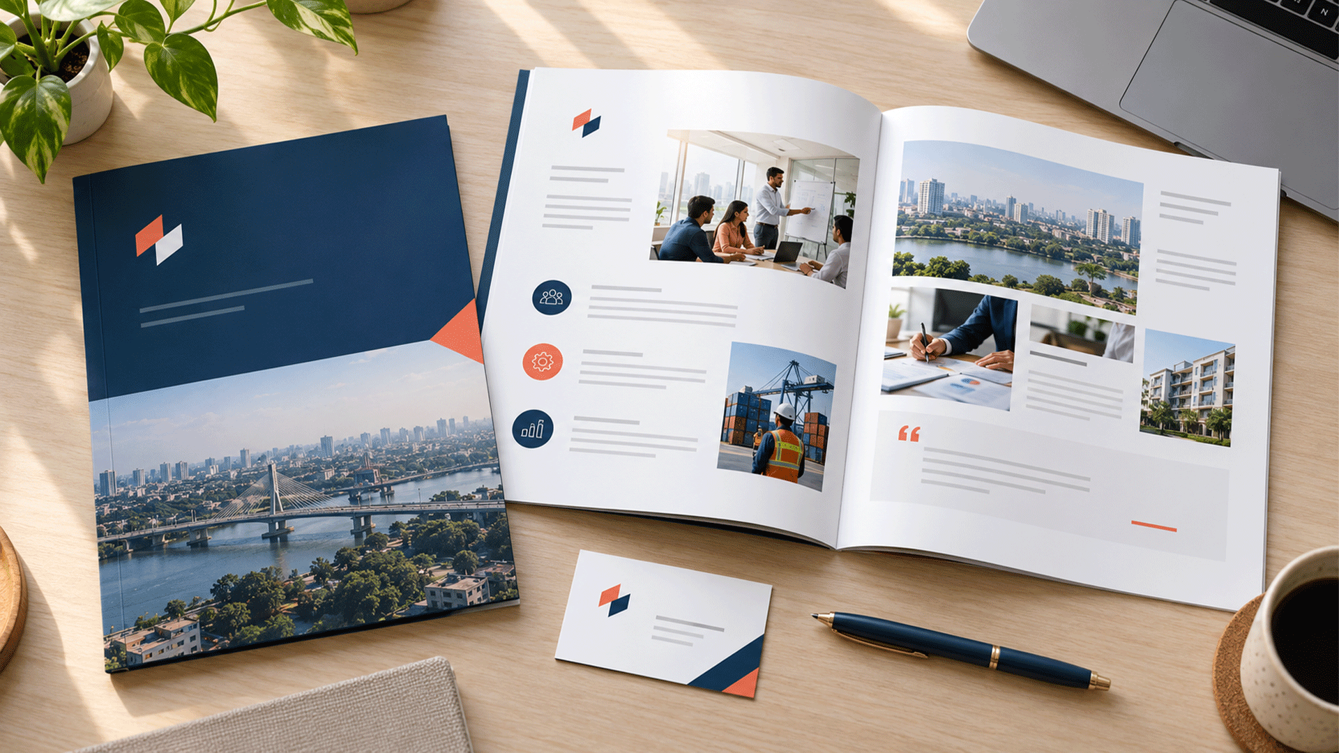



Your website looks modern and restrained. Your proposals use different colours and fonts. Your social posts follow a style that seems unrelated to either.
The business name is the same, but the materials do not feel like one company.
That mismatch is a form of inconsistent branding.
Your company can look different across channels because each channel has been created and maintained separately, without shared visual rules, usable templates, current assets, and clear responsibility for updates.
Sometimes the identity itself needs attention. In other cases, the approved identity is suitable, but the team lacks the tools or process to apply it.
The useful first step is to find where the inconsistency begins. Then you can decide which standards, templates, files, or implementations need to change.
What Does Brand Consistency Actually Mean?
Brand consistency means applying a recognizable set of visual and communication principles across relevant customer interactions.
It can involve the logo, colour roles, typography, imagery, layout, terminology, and the way you describe your offer.
A website, invoice, and social post have different jobs. They can use different layouts while remaining part of the same visual family.
Nielsen Norman Group’s guidance on consistency and standards discusses shared visual patterns and familiar content across digital experiences and marketing materials. Its guidance supports reviewing both design and communication when assessing consistency. NN/G
For a business, the practical question is:
Can customers and employees recognize the company across these materials, while each format remains clear and useful?
Eight Causes of Inconsistent Branding to Check
1. Each Channel Was Designed as a Separate Project
Your website may have been built at launch, your proposal created by a salesperson, and your social templates introduced by a later agency.
Each person made reasonable decisions within a limited brief.
The problem appears when those decisions never become part of a shared system.
Compare the dates, source files, and instructions behind the materials. You may find that different contributors were working from different assumptions.
The fix begins with agreeing on the current direction and explaining how it should carry across channels.
2. The Guidelines Leave Everyday Decisions Unanswered
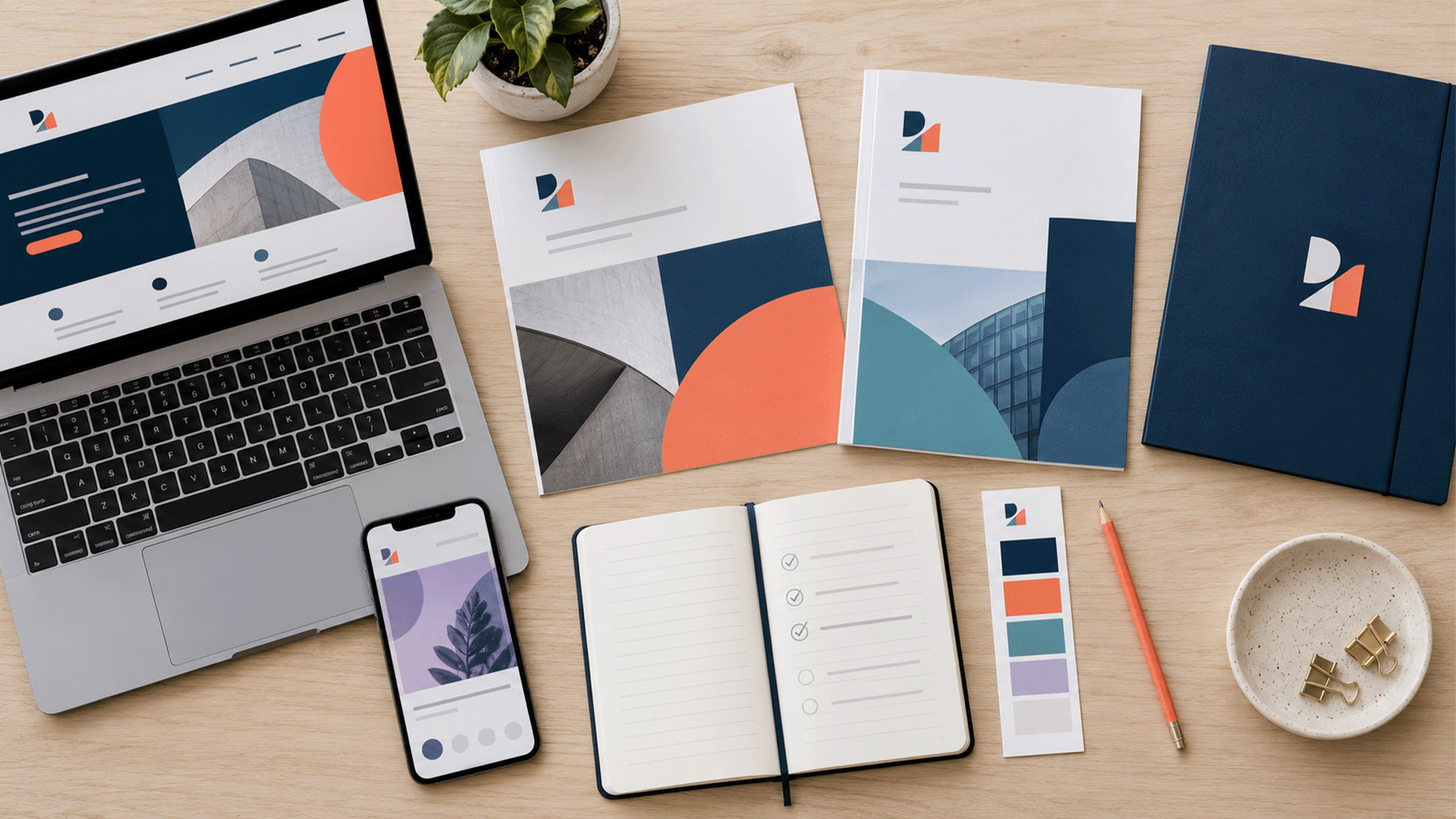
A logo file and a short colour list do not explain how to format a report or create a social announcement.
Employees may still need answers about:
- Which heading and body styles to use.
- How colours should be combined.
- Where the logo belongs.
- How images should be selected and cropped.
- How to present tables, prices, or contact details.
Check whether the guide answers the tasks people actually perform.
Where the rules are missing or ambiguous, contributors have to interpret them independently.
3. The Team Has Examples but No Working Templates
A polished mockup demonstrates a design. It may not help someone prepare tomorrow’s client proposal.
Without editable templates, employees often copy old documents and make local adjustments.
Over time, those adjustments become new starting points for other people.
Ask a colleague to create a normal document using the available materials. Watch where they need to improvise.
The solution may involve document styles, reusable layouts, sensible content areas, and instructions that fit the software the team already uses.






4. Old and Current Assets Are Mixed Together
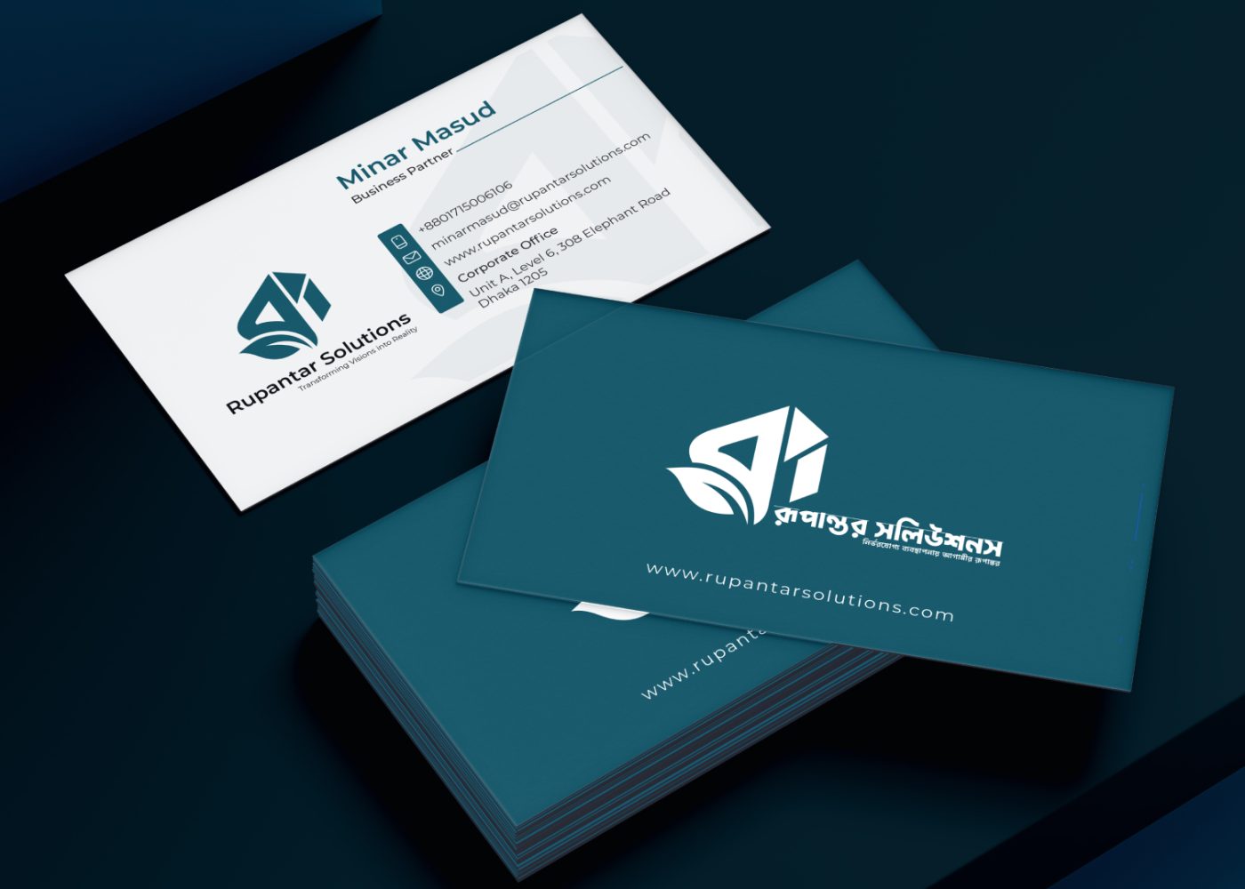
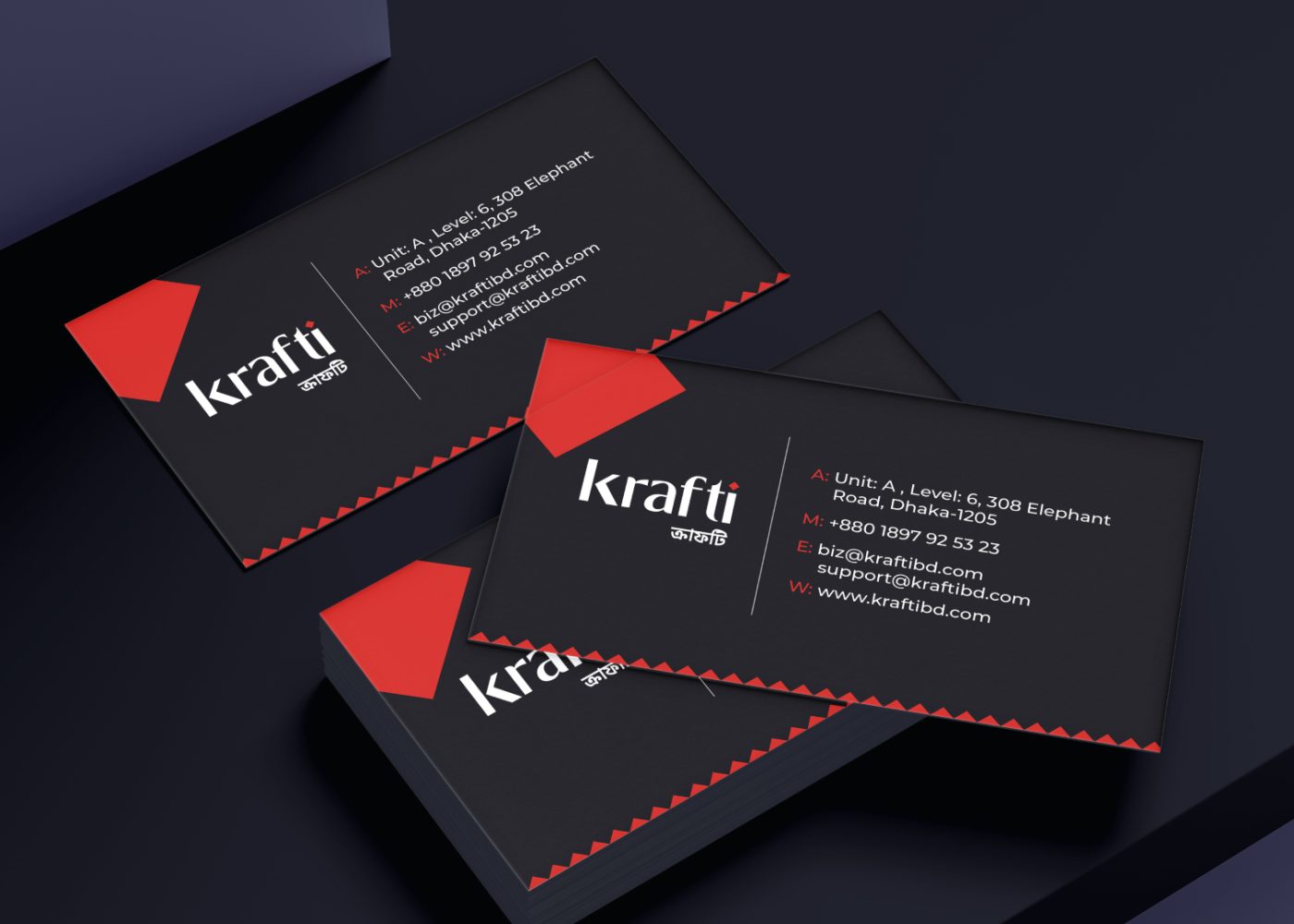
Different employees may have saved different logo versions, colour references, or presentation files.
A recently updated website can coexist with an older proposal template because no one identified that template during rollout.
Look for repeated filenames, email attachments, local copies, and bookmarks leading to superseded materials.
Create a clearly identified location for approved assets. Mark older templates as archived and redirect employees to the current versions.
Record what changed so people can tell whether an update affects their work.
5. Fonts and Software Change the Appearance
A document can look correct on the designer’s computer and different on a colleague’s device.
Missing fonts, substituted characters, altered styles, or conversion settings can change the result.
Microsoft’s guidance on embedding custom fonts explains how embedding can help preserve fonts and layout in supported applications. It also notes that embedding capabilities depend on the font and software involved. Microsoft Support
Check the actual editing and export workflow.
Agree on font access, suitable alternatives, and a test process for the formats your team shares. Include realistic Bangla and English content where both are required.
6. New Campaigns Introduce Uncontrolled Visual Changes
A campaign may need a fresh treatment. Problems arise when each campaign introduces unrelated typography, colours, imagery, and logo arrangements.
The business gradually accumulates several competing styles.
Define which elements remain stable and where creative variation is allowed.
For example, a campaign might introduce a supporting illustration while keeping the approved logo, type hierarchy, and core colour roles.
Document the purpose and duration of significant exceptions. This gives the team a way to distinguish an intentional campaign treatment from a new identity standard.
7. Responsibility for Consistency Is Unclear
A guideline document cannot answer every future question.
Someone needs responsibility for maintaining templates, approving new variations, and communicating changes.
Without that ownership, a developer, salesperson, designer, and supplier may each believe a different asset is the latest version.
Assign a named contact or role. Explain which decisions employees can make independently and which require review.
Keep the process proportionate. Routine work should be possible using approved templates without repeatedly rebuilding or reapproving the same decisions.

8. The Company Has No Shared Communication Direction
Sometimes the visual differences reflect a deeper disagreement.
The website presents a specialist consultancy. Social posts position the company as a discount provider. Proposals describe a much wider range of services.
Aligning the colours will leave that conflict unresolved.
Review the priority audience, offer, positioning, and supported claims.
A focused brand strategy and foundation exercise may be appropriate where those decisions are unclear. Once the direction is agreed, the team can express it coherently across formats.
Intentional Variation or a Consistency Problem?
Use the purpose of the application and the approved standards to judge differences.
| Difference | What to check |
|---|---|
| A social profile uses a compact mark | Is it an approved version suited to the crop? |
| A proposal has a more restrained layout than a campaign post | Do both follow the same identity principles? |
| A document uses an alternative font | Is the alternative documented and appropriate to the workflow? |
| A campaign introduces an accent colour | Is the treatment agreed and clearly related to the core identity? |
| A page shows a different logo | Is it approved, or an outdated or altered asset? |
| Two channels describe the service differently | Is the wording adapted to context, or does it make conflicting claims? |
Preserve useful variation. Focus the review on unexplained differences, unmet requirements, and decisions that employees cannot repeat reliably.
Run a Practical Brand Consistency Audit
Start with a manageable sample of current materials.
You could collect:
- The homepage and a key service page.
- A recent proposal and invoice.
- A presentation used by the sales team.
- Several recent social posts.
- A profile image, cover graphic, and email signature.
Include actual files and live examples. A design presentation alone may not reveal what employees and customers currently see.
Step 1: Confirm the Approved Baseline
Identify the current logo assets, palette, typography, and guidelines.
Check who approved them and whether the business direction has changed.
If no clear baseline exists, agree on one before instructing everyone to copy a particular channel.
Step 2: Compare the Materials Together
Review the samples side by side.
Look at logo treatment, colour use, heading styles, spacing, imagery, recurring business information, and service descriptions.
Record specific observations. “The proposal uses a different heading font” is easier to investigate than “the proposal feels wrong.”
Step 3: Trace Each Difference to Its Source
Open the underlying template or ask the person who created the material.
Check whether the cause is an absent rule, an old file, an editing workaround, or an implementation problem.
The same visible mismatch can have different causes and require different fixes.
Step 4: Prioritize the Findings
Give attention to incorrect business information, conflicting claims, important readability problems, and materials in active use.
Then consider frequently produced assets and highly visible customer interactions.
Historical materials can be reviewed according to relevance and the agreed rollout plan.
Step 5: Assign the Fix and the Acceptance Check
Name the person responsible, the action required, and how completion will be checked.
A corrected template is useful only when the team can find it, use it, and produce the intended output.
A Brand Consistency Audit Table You Can Copy
| Asset | Observation | Cause to investigate | Action | Completion check |
|---|---|---|---|---|
| Website service page | Heading treatment differs from the approved style | Page-specific settings or older component | Apply the agreed style | Check desktop and mobile views |
| Proposal | Font changes on another employee’s computer | Font availability or substitution | Resolve font use and update the template | Open, edit, and export on the team’s setup |
| Social profile | An older logo appears | Profile asset missed during rollout | Upload the approved version | Check the live profile crop |
| Presentation | Several layout styles appear | Slides copied from multiple older files | Create and distribute an approved template | Build a sample deck using normal content |
| Brochure | Service description conflicts with the website | Copy was not updated | Confirm wording and revise the source | Review the final exported file |
These entries are illustrative. Use your own evidence, owners, and priorities.
How to Fix the System Behind the Mismatch
Establish the Core Rules
Document the decisions that should remain stable.
Include approved logo arrangements, colour roles, typography, imagery direction, layout principles, and recurring communication rules.
Use examples from your actual materials so employees can connect the guidance with daily tasks.
Explain permitted alternatives, including language versions and practical font fallbacks.
Build Templates Around Real Content
Prioritize the materials people create repeatedly.
A proposal template may need a long client name, several service options, tables, and a contact page. A social template may need room for different headline lengths and image crops.
Test those situations before finalizing the layouts.
Specify where content can change and which identity elements should remain fixed.
Apply the Rules in Each Channel
Update website styles, document templates, and social assets according to their actual implementation needs.
A change in a design file does not automatically update a live website or an employee’s saved presentation.
Include the people responsible for each channel in the rollout. Confirm the final output where customers will encounter it.
Review recurring components as well as individual pages.
Make Approved Assets Easy to Use
Organize the current files by purpose.
For example, separate logo artwork, document templates, presentation layouts, digital exports, and guidelines.
Use descriptive filenames and identify the current versions clearly.
Add a short guide explaining which files are appropriate for common tasks. Give new employees and external contributors the same starting materials.
Set a Review and Update Process
Assign responsibility for the system and decide when review is needed.
Useful triggers include a new campaign, service launch, website change, major template revision, or new production supplier.
Review a sample of current outputs periodically and investigate repeated workarounds.
If people regularly bypass a template, find out whether it is difficult to use, missing a required layout, or based on outdated information.
Example: Fixing Inconsistency Without Replacing Everything
Consider a fictional B2B service company with a suitable logo and a clear offer.
Its website follows the current identity. Proposals come from an older document, while social posts use several unrelated templates.
The audit identifies three practical causes:
- The proposal template was missed during the identity update.
- Employees cannot reliably access the intended fonts.
- Social contributors have no agreed layout or imagery guidance.
A focused project could retain the logo, rebuild the proposal template, establish practical font use, and create a small set of social layouts.
The handover would include current assets, usage examples, and responsibility for future changes.
This is an illustrative scope. Its purpose is to show how an audit can lead to targeted work rather than an assumed replacement of every asset.
Do You Need a Refresh, a New Identity, or Better Implementation?
Use the findings to define the scope.
| Finding | Possible next step |
|---|---|
| The existing rules are suitable, but assets are outdated | Update files and complete the rollout |
| The guide is clear, but templates are difficult to use | Improve templates and workflow support |
| Everyday visual decisions are undocumented | Develop the identity system and practical guidelines |
| The logo cannot meet confirmed application needs | Review the logo system |
| Audience, offer, or positioning has changed | Revisit strategic direction before dependent design work |
If the mark itself needs attention, a professional logo design review can be part of the scope.
Where the problem involves standards, templates, and application across channels, focus the project on those needs.
How to Check Whether the Fix Is Working
Begin with observable operational checks:
- Are employees using the current templates?
- Can they find the approved assets?
- Do files open and export correctly?
- Are recurring service descriptions aligned?
- Have the agreed live channels been updated?
- Are the same avoidable corrections appearing repeatedly?
Ask employees to complete ordinary tasks using the system.
Customer feedback can reveal confusing names, descriptions, or visual associations. Treat it in context rather than assuming every preference requires another redesign.
Sales or enquiry changes need broader analysis. Improvements in consistency alone do not establish what caused a commercial result.
FAQ
Each channel should follow the same identity principles while adapting to its purpose. A report, social graphic, and website can use different layouts and remain recognizably connected.
Yes. The work may involve guidelines, templates, asset access, and implementation while retaining a suitable logo.
It provides a reference, but the team also needs usable assets, appropriate templates, access, and responsibility for maintenance.
Decide according to current visibility, relevance, incorrect information, and the rollout scope. Prioritize active profiles and materials customers are likely to encounter.
Bring together your website, documents, presentation materials, and social examples to identify where the mismatch begins.
M4YOURS IT’s corporate identity design service covers areas including visual standards, stationery, presentation templates, digital assets, and implementation guidance. Agree on the work needed for your business. M4YOURS IT
Discuss your company’s brand consistency with M4YOURS IT to establish practical rules, improve everyday materials, and support a coordinated rollout.