Share




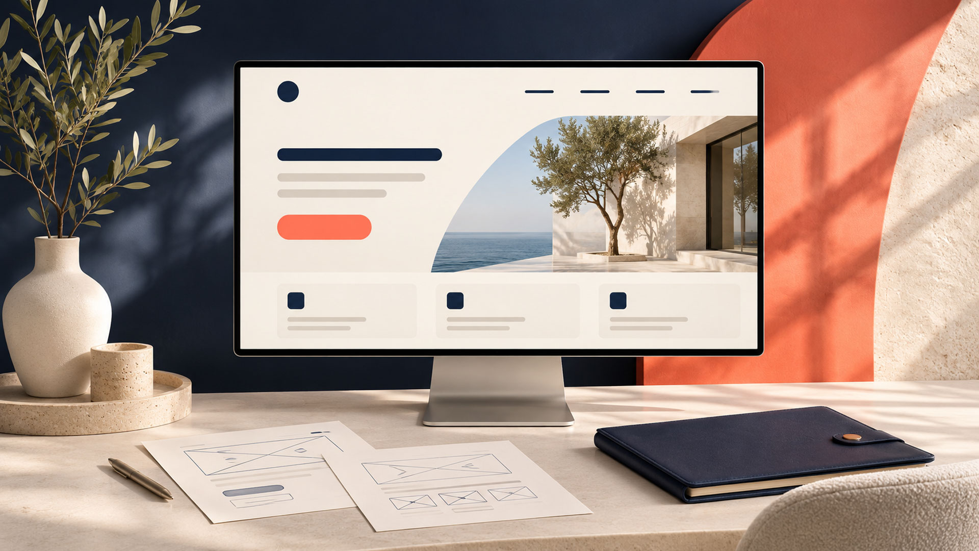









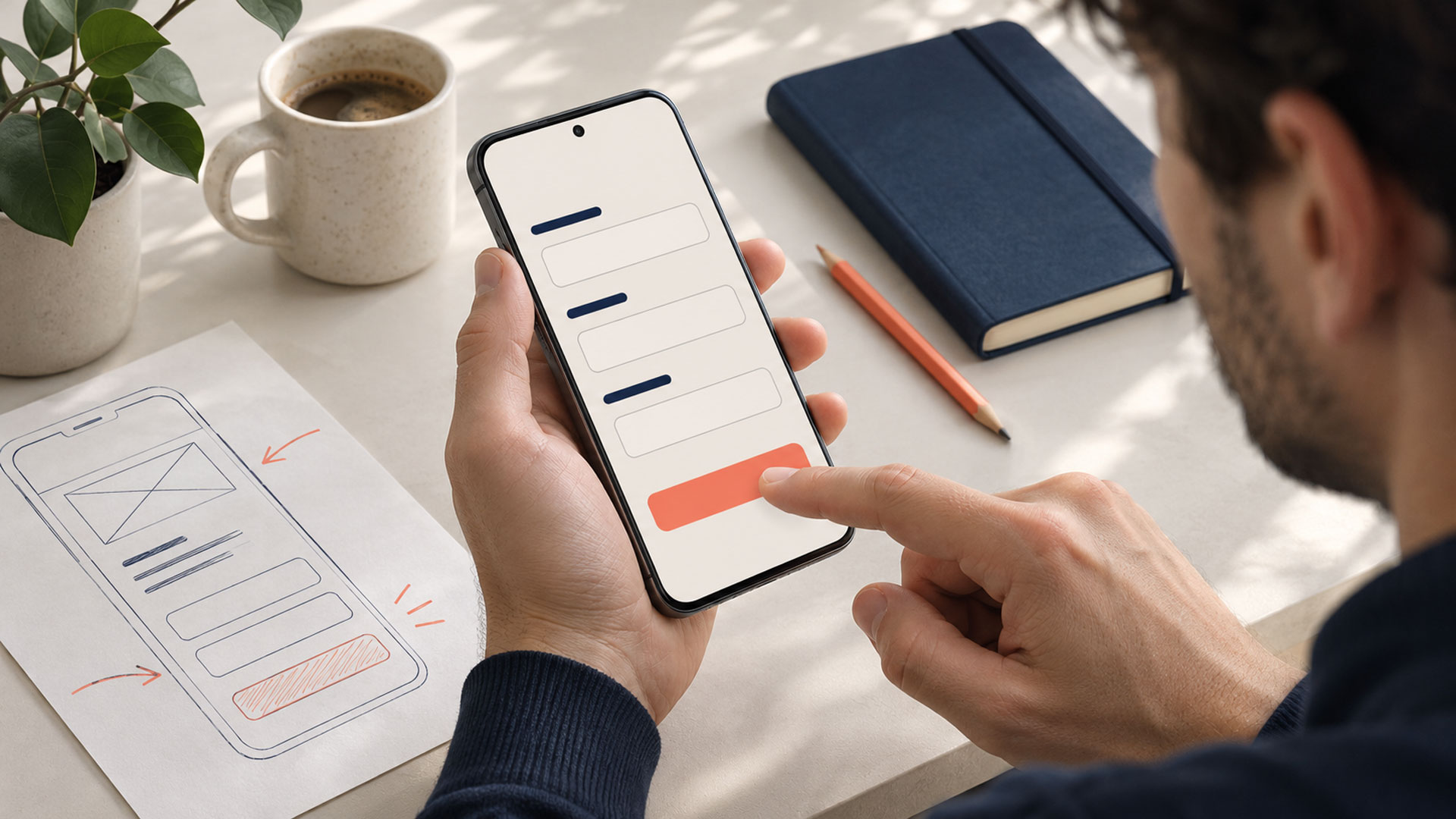
A beautiful website can fail to convert when visitors cannot understand the offer, decide whether it suits them, or complete the next step confidently. Visual quality supports the experience, but the journey also needs clear information, appropriate actions, accessible interactions, and reliable functionality.
Before commissioning another redesign, identify where that journey breaks down. The problem could be a mismatch between an advertisement and its landing page, missing purchase information, a demanding enquiry form, or a submission that never reaches your team.
At M4YOURS IT, our recommendation is to investigate the complete path from arrival to a useful business outcome. That gives design improvements a specific purpose and makes their results easier to evaluate.
An attractive website can create a positive impression even when people struggle to use it. Nielsen Norman Group describes this as the aesthetic-usability effect: visual appeal can influence perceived usability and can sometimes mask difficulties during research. Positive comments about appearance need to be considered alongside observed behavior. NN/G
For a business owner, that distinction matters when reviewing a new design. A stakeholder may like the typography and photography while a customer still cannot find prices, compare services, or finish a booking.
Ask reviewers to complete realistic tasks. Observe what they understand, where they hesitate, and whether the intended action succeeds. Those findings give your website design project a more useful direction than appearance feedback alone.
Choose an outcome that reflects what your website is supposed to achieve.
| Business Type | Useful Primary Outcome | Quality Check |
|---|---|---|
| Ecommerce store | Completed purchase | Successful payment and appropriate order fulfilment |
| Consultancy | Relevant enquiry or booked consultation | Fit with the services offered |
| Software business | Trial user reaching a useful product action | Continued use and customer suitability |
| Service provider | Appointment or quotation request | Valid details and realistic service requirements |
A button click is a useful signal, but it does not confirm that an enquiry was received or an appointment was booked. Define the steps separately so your reporting can show what happened.
Also establish what makes a lead qualified. Your team needs a shared definition before you can assess whether a design change improves the enquiries you receive.
Someone who clicks an advertisement for a specific service arrives with a particular question. A generic homepage may leave them searching again for the information they expected.
Review the relationship between the traffic source, page headline, offer, and next action. A student interested in a particular destination should be able to recognize that destination and the relevant service on arrival.
Match the page to the promise you made. Check that important details remain consistent through the enquiry or booking process.
A page can contain beautiful images and substantial copy while still missing the details a customer needs.
For a service, those questions might concern scope, suitability, location, fees, deliverables, or what happens during a consultation. For a product, they might concern size, specifications, availability, delivery, and returns.
List the questions customers ask before buying or contacting you. Review whether the relevant page answers them clearly. Your ecommerce website design should present purchase information where shoppers can use it to make a decision.
A page may ask visitors to book a call, read a blog, subscribe, download a guide, watch a video, and start a chat with little indication of priority.
Choose the main task for that page and give its action appropriate emphasis. Keep supporting actions available where they help visitors evaluate the offer or prepare for the next step.
Button wording should describe what follows. “Request a Project Quote” sets a different expectation from “Book a Consultation.” Review whether the destination actually delivers the action promised by the label.
Internal departments and branded service names may be familiar to your team while giving new visitors little guidance.
Observe how customers try to find a relevant service. If they repeatedly open unrelated pages, examine category names, page relationships, and the information available within each route.
A useful navigation review connects labels to real customer tasks. Avoid changing the menu based only on a preference for a shorter or more fashionable layout.
A visitor making an initial enquiry may be unwilling or unable to provide the detail required for a full application or project specification.
Decide what your team genuinely needs at that stage, including information required to assess fit. Explain unusual requests and show which fields are optional.
W3C’s accessible forms guidance recommends requesting necessary information and providing labels, instructions, validation, and completion feedback. These details help users understand and complete the process. W3C
Evaluate the quality of the resulting enquiries as well as the number. Removing a useful qualifying question can increase submissions while creating more unsuitable leads for your team to review.
A polished page may invite people to share contact details without explaining the follow-up process. A booking page may leave the duration, format, or cost unclear.
Review what a visitor needs to understand before making that commitment. Provide accurate information about the process and use relevant evidence of your work, qualifications, or service delivery where it helps them assess fit.
Keep reassurance close to the decision. For example, consultation details belong near the booking action, while delivery and return information should be available during purchase consideration.
A responsive layout can still be difficult to use. A floating chat widget may cover a form control, a sticky banner may hide feedback, or the keyboard may make the next action difficult to reach.
Review the complete task on the devices your customers use. Try opening menus, comparing information, entering data, correcting mistakes, and reaching confirmation.
Include keyboard and assistive technology checks in the review. Your UI/UX design assessment should examine how interactions work alongside how screens adapt to different sizes.
Large media, delayed responses, shifting content, or failed integrations may interrupt an otherwise clear page.
Google’s Core Web Vitals guidance covers loading performance, responsiveness, and visual stability through LCP, INP, and CLS. These measures can help your developers investigate aspects of the experience. web.dev
Check functional reliability separately. Verify that forms reach the intended system, payments complete, booking availability is accurate, and confirmation messages reflect the actual result.
A successful-looking screen needs to correspond to a successful action behind it. Include technical diagnosis in your website optimization work when the journey depends on integrations or server behavior.
Review one important journey from beginning to end. Use the same traffic segment and outcome definitions throughout the investigation.
| Journey Stage | Question to Investigate | Evidence to Review |
|---|---|---|
| Arrival | Does the page match the visitor’s reason for coming? | Campaign message, landing page, user feedback |
| Evaluation | Can the visitor decide whether the offer fits? | Customer questions, task observations, page content |
| Action | Is the next step clear and appropriate? | CTA behavior and destination |
| Completion | Can the visitor finish successfully? | Form errors, payment results, booking records |
| Follow-up | Does the business receive and act on the result? | CRM records, notifications, response process |
Analytics can reveal a step that deserves attention, but an exit does not explain its own cause. Observe representative users and review technical records to understand what happened.
Segment the investigation by relevant factors such as device, landing page, and traffic source. A blended conversion rate can conceal a problem affecting one important customer group.
Use this table to plan the first investigation.
| What You Observe | Investigate First | Possible Improvement |
|---|---|---|
| Ad visitors seem uncertain on arrival | Message and landing-page match | Clearer, more relevant page content |
| Users ask questions the page should answer | Missing decision information | Revised content and information placement |
| Several actions compete for attention | Page goal and visual hierarchy | Clearer action priority and labels |
| Visitors start a form but struggle to finish | Field requirements, errors, mobile behavior | Better form design and technical fixes |
| Analytics show success but the team receives nothing | Tracking and integration behavior | Reliable delivery and corrected measurement |
| Mobile visitors encounter repeated obstacles | Complete mobile task flow | Revised controls, overlays, and feedback |
| Enquiries arrive but few are suitable | Offer, traffic targeting, qualification | Better targeting and clearer suitability information |
Prioritize work by the seriousness of the obstacle, the number of relevant users affected, and your confidence in the cause. Record uncertainty so your team knows which findings need further investigation.
Start with a high-value task such as requesting a consultation or purchasing a key product. Define the intended outcome and record the current experience.
Check that your measurement reflects actual completion. Compare a sample of recorded outcomes with the records your team receives.
Describe the observed problem and a plausible cause. For example:
Visitors begin booking but cannot tell whether an appointment has a fee. Showing that information before time selection may help them make a confident decision.
This gives your team a specific change to evaluate.
Use a draft or prototype where appropriate. Ask representative participants to complete the relevant task and observe how they use the information.
Refine the proposal before implementation, then check the working experience. Include errors, recovery, and confirmation in the scope.
Record the release date and what changed. Review task completion, enquiry quality, technical failures, and customer feedback against the baseline.
Choose the next improvement from the evidence you collect. A focused review cycle helps keep the project connected to customer needs as you extend the work.
Use both completion and quality measures. The following hypothetical example shows why the distinction matters.
| Measure | Before a Change | After a Change |
|---|---|---|
| Eligible website sessions | 1,000 | 1,000 |
| Enquiries received | 20 | 30 |
| Qualified enquiries | 15 | 12 |
| Enquiry rate | 2% | 3% |
| Qualified enquiry rate per session | 1.5% | 1.2% |
Submissions increased, while qualified enquiries fell. The next investigation should examine traffic quality, offer clarity, qualification criteria, and follow-up before declaring the change successful.
These figures illustrate measurement choices; they are not a performance forecast. In a live project, account for changes in traffic, campaigns, seasonality, and other conditions when interpreting results.
For ecommerce, follow completed payments and order outcomes. For booking websites, review confirmed appointments and cancellations. Select measures that connect the website interaction to the result your business needs.
Your next project
Have a business in mind? Tell us about your ideas, your audience, and the identity you want to create.
Prefer a direct conversation?
Animation can be useful when it explains an interaction or directs attention appropriately. Evaluate it against the customer’s task, accessibility needs, and performance. Begin with the observed problem and test whether the proposed motion helps resolve it.
Choose the scope after diagnosis. A problem in one form or page may support a focused improvement. Connected problems across navigation, content, templates, and several journeys may justify broader redesign planning.
Use customer conversations, support questions, and observed task sessions alongside the analytics available. These can reveal difficulties worth investigating. Limited traffic makes it especially important to avoid treating short-term numerical changes as conclusive evidence.
Review the audience, offer, price, availability, competition, technical delivery, and sales follow-up. A website operates within that wider business process. Diagnose those factors together so design work addresses problems it can meaningfully influence.
Begin with the journey that matters most: what visitors expect, what they need to decide, and what must happen for the task to succeed. Use those findings to set your design priorities.
M4YOURS IT supports businesses with website design, UI/UX design, and redesign and optimization services. Our recommended starting point is a focused review that connects customer obstacles to practical improvements. M4YOURS IT
Have a polished website that produces disappointing results? Discuss your website with M4YOURS IT to identify where the journey needs attention.
Adding {{itemName}} to cart
Added {{itemName}} to cart