Share













Customers can give up when they cannot predict where a link leads, find the right category, or continue after reaching a page. Improving navigation starts with understanding those difficulties and creating clear, reliable routes to the information and actions people need.
A menu can look tidy while leaving visitors uncertain. A website can also offer plenty of links without helping anyone choose between them.
At M4YOURS IT, our recommendation is to review navigation around real customer tasks. Establish what people want to find, observe where their route becomes unclear, and test changes to the labels, page grouping, and menu controls involved.
Review your website against four practical questions:
The header menu is only part of that experience. Category pages, search, breadcrumbs, contextual links, and the footer can all provide routes through your content.
Include these routes in your website design brief. A useful brief identifies customer tasks and the pages needed to support them.
Internal department names, branded packages, or abstract labels may provide little guidance to someone visiting for the first time.
Compare each label with the destination it describes. Could a prospective customer explain what they expect to find before clicking it?
For example, a service category called “Digital Solutions” may need more descriptive options beneath it, such as website design, mobile apps, or business automation. The right wording depends on your offer and the vocabulary your customers use.
Test proposed labels using realistic goals. Record which options people choose and what they expect the next page to contain.
A website can accumulate categories as new services, products, and departments are added. Over time, the distinctions between those categories may become unclear.
Imagine a visitor trying to decide whether an ecommerce project belongs under “Development,” “Creative,” or “Business Solutions.” Review whether each route explains its purpose and leads to the relevant service.
Organize content around meaningful differences that your customers recognize. Where two routes serve different browsing needs, they can lead to the same maintained destination.
Choose the number and depth of categories through content review and task testing. Reducing the menu to a preferred item count should not hide necessary information.
A minimal header may conceal the website’s main options behind an unfamiliar icon or low-contrast control, even where the screen has room to show them.
Nielsen Norman Group’s menu-design guidance recommends visible navigation on larger screens and clear, familiar labels. These choices help people identify the available options. NN/G
Check whether visitors notice your navigation before investing in a new animation or transition. Review the menu against changing backgrounds, different screen widths, and the actual content on the page.
If some options must be collapsed, make the control recognizable and test whether people understand what it opens.
Someone arriving from search or an email may enter directly on a service detail page. They need enough context to understand how that page relates to the rest of your offering.
Review page headings, selected navigation states, and links to related or parent pages. On a website with several content levels, consider breadcrumbs.
W3C’s breadcrumb pattern describes a sequence of parent-page links that helps users understand their location within a hierarchy. W3C
For a product page, a useful route might show the relevant product category and provide a way to return to it. Check that the route reflects the website’s actual organization.
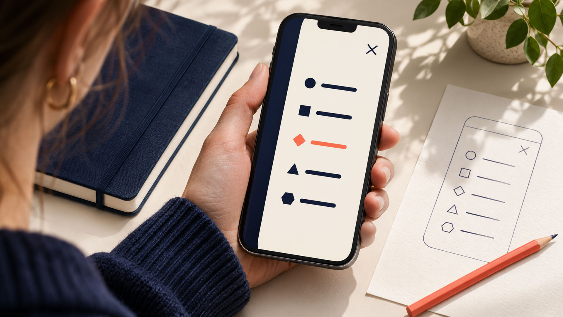
A mobile menu may open successfully but still leave important options difficult to reach. Long lists, unclear submenu controls, overlapping widgets, or an inaccessible close control can interrupt the task.
Review the whole interaction: opening the menu, exploring a category, returning to the previous level, choosing a page, and closing the panel.
W3C’s menus tutorial emphasizes keyboard operability, clear states, and controls that accommodate touch and motor needs. Include keyboard and screen reader checks alongside phone testing. W3C
Check whether navigation depends on hover and whether an alternative works for other input methods. Ask your team to verify focus behavior and menu state in the developed website.
Search can offer a useful route for customers who know what they want. It still needs to return relevant, understandable results.
Review real search terms where available. Repeated searches for a service may indicate demand, uncertainty about the menu, or both. Investigate the surrounding behavior before deciding what to change.
For an ecommerce website, test common product names, categories, and customer terminology. Review filters and recovery when a search returns no useful matches.
Use those findings to improve search and content organization together.
A header may use “Consultations,” a page may say “Appointments,” and the footer may link to “Get Advice.” Different wording can be appropriate, but check whether customers understand the relationship.
Create an inventory of important navigation labels and destinations. Identify links that lead to old pages, duplicate versions, unsuitable destinations, or unexpected external systems.
When wording needs to vary, keep the promised action accurate. A link labelled “Book an Appointment” should make it clear whether the next step is an immediate booking or an appointment request.
Include the footer, mobile navigation, and contextual links in the same review.
A visitor may find a relevant page and still be unsure how to continue. They might need to compare options, check supporting information, or contact your team.
Review what customers reasonably need after reading each important page. Provide relevant links and actions where they support that next decision.
For example, a service page could connect to the process, relevant work examples, related services, and an enquiry route. The selection should follow the task and available content.
Test the return route too. Check whether customers can revisit a category or result list and continue exploring without unnecessary repetition.
The following examples illustrate routes to test. They are starting points for planning rather than universal menu structures.
| Business | Customer Task | Possible Route to Evaluate |
|---|---|---|
| Ecommerce store | Find a suitable product and compare alternatives | Product category, relevant filters, product details |
| Education consultancy | Compare study destinations | Destination overview, country guide, consultation information |
| Healthcare provider | Find a doctor at a suitable location | Provider directory, specialty or location options, profile, booking |
| B2B service company | Check whether an agency has relevant experience | Service page, related project examples, enquiry route |
Ask whether the labels support the customer’s starting knowledge. A returning buyer may recognize a product name, while a new customer may need to browse a category or problem first.
You can support both routes when the content and interface make their relationship clear.
| What You Observe | Investigate First | Practical Starting Point |
|---|---|---|
| Customers repeatedly choose unrelated categories | Labels and page grouping | Test clearer names and revised organization |
| Visitors overlook the desktop menu | Visibility and placement | Review exposed routes and recognizable controls |
| Customers lose context on detail pages | Headings and page relationships | Add appropriate location cues and parent links |
| Mobile users struggle inside the menu | Controls and interaction behavior | Review the complete menu flow and accessibility |
| Customers search repeatedly without useful results | Search terms, results, and categories | Improve matching and content organization |
| People reach relevant pages but cannot continue | Page content and next actions | Provide task-relevant links and actions |
A focused UI/UX design review should explain which findings support each proposed change. Ask your provider to distinguish a content problem from an interaction or technical problem.
List your key services, products, guides, and action pages. Record how customers currently reach them and which questions they need answered along the way.
Identify outdated or overlapping pages and assign an owner to resolve them. Navigation changes become harder to maintain when the underlying content remains uncertain.
Ask representative users to complete realistic finding tasks. Describe the goal without naming the menu option you expect them to select.
For example:
Your company wants to start selling products online. Find out whether this provider can help and what you would do next.
Record wrong turns, hesitation, requests for assistance, and whether the destination actually answers the question.
Review a draft page hierarchy or prototype before implementing the full navigation. Ask people where they would look for specific information and why.
Use their explanations to identify ambiguous labels or missing categories. Keep a record of the reason for each change so later stakeholders can understand the decisions.
Check the header, submenus, category pages, search, breadcrumbs, and footer together. Include desktop, mobile, keyboard, and assistive technology use in the agreed review scope.
Start some tasks on detail pages to reflect visitors arriving through external links. Check browser back behavior, menu closure, and routes between related pages.
Agree on acceptance criteria before launch. Confirm who checks destinations, updates labels, maintains page relationships, and reviews new content requests.
Your website redesign and optimization plan can introduce changes in manageable phases when each phase supports a coherent customer journey.
Review navigation when services, products, or customer needs change. Give content owners a process for adding pages without automatically adding another top-level category.
Choose measures that describe finding and completing tasks.
| Measure | What It Helps You Understand |
|---|---|
| Finding-task success | Whether participants reach the correct information |
| Wrong turns and backtracking | Where labels or grouping need investigation |
| Time and assistance needed | How difficult the route is for the tested task |
| Search terms and unsuccessful searches | Information customers seek and may struggle to find |
| Completed enquiries, bookings, or purchases | Whether the wider journey supports business outcomes |
For observed tasks, calculate success using completed tasks divided by attempted tasks, with clear criteria for completion. Keep tasks and participant characteristics sufficiently comparable when reviewing changes.
Menu clicks alone cannot establish success. Someone may click several links because they are exploring useful options or because they are lost.
Combine numerical measures with observations and customer feedback. Review traffic changes and technical incidents when interpreting live business outcomes.
Your next project
Have a business in mind? Tell us about your ideas, your audience, and the identity you want to create.
Prefer a direct conversation?
Choose a set of meaningful categories based on your content and customer tasks. Review whether each option is distinguishable and whether the menu remains usable across devices. Test alternative groupings when the choices become difficult to understand.
A collapsed menu can be appropriate where space is limited. On larger screens, review whether important routes can remain visible. In either case, test whether people recognize the control, understand the available options, and can operate it reliably.
Add search when direct lookup would help customers navigate your content or catalogue. A small website may already offer clear routes through a few pages. A larger website should assess search quality, maintenance, and how search complements browsing.
Yes, when the routes reflect genuine customer needs and lead to a consistent, maintained destination. Review whether the additional route helps people find the page or makes the category boundaries less clear. Avoid creating separate copies solely to support different menu paths.
Begin with a customer task, identify where the route becomes unclear, and test the relevant labels, page relationships, and controls. Use the findings to define a practical improvement scope.
M4YOURS IT can help you plan website navigation as part of your wider website and UX work, connecting content organization with the developed experience.
Are customers struggling to find services, products, or booking information? Discuss your website with M4YOURS IT to review the routes that matter most to your business.
Adding {{itemName}} to cart
Added {{itemName}} to cart