Share











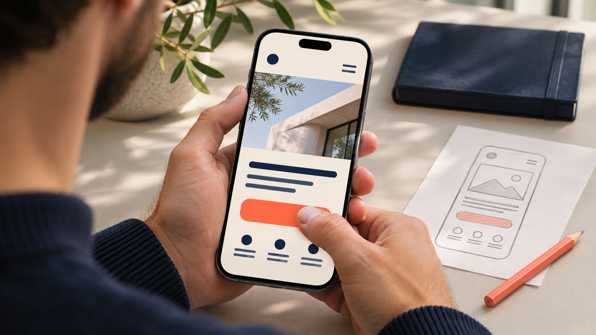
Effective CTA design helps visitors understand what they can do next, what that action involves, and what they will receive. Clear wording, appropriate placement, visible controls, and a reliable destination work together to support that decision.
A visitor may like your website and understand your service, yet still hesitate. “Get Started” might mean creating an account, requesting a quote, or paying a deposit. When the next step is unclear, the visitor has to guess.
A call to action should resolve that uncertainty. It can invite someone to compare services, check availability, add a product to their basket, or send an enquiry. Its purpose depends on the visitor’s task.
For business owners, this makes CTA design part of the customer journey. Your website design brief should define the intended next step for each important page, including what happens after someone selects it.
Start by asking why someone would visit this page and what information they need before acting.
A person comparing service providers may want to see relevant work. Someone who has already reviewed your portfolio may be ready to discuss a project. Presenting an appropriate route for each situation helps people move forward at their own pace.
| Page and visitor task | Suitable CTA example | Expected destination |
|---|---|---|
| Service page: understand the available options | Compare Website Design Packages | Package details with scope and differences |
| Portfolio: assess relevant experience | View This Project | A detailed project case study |
| Product page: purchase a selected item | Add to Basket | Updated basket with the chosen item and quantity |
| Clinic page: enquire about availability | Request an Appointment | A request form with the confirmation process explained |
| Software page: understand the product workflow | Watch the Product Demo | A relevant demonstration |
These are examples to adapt to your actual process. “Request an Appointment” is appropriate when staff must confirm availability. “Book an Appointment” makes sense when the visitor can complete a booking through the next steps.
The same thinking applies to education and immigration consultancies. A visitor checking service coverage needs a different route from someone ready to request an assessment. The page should explain what the assessment includes and how the request will be handled.
Write the visitor’s task and expected destination before designing the CTA. This gives your team a concrete reason for choosing its wording.
A useful CTA label describes the action in language the audience understands.
GOV.UK’s button guidance recommends wording that describes what the control does, including distinctions such as continuing and saving before continuing. That principle helps set accurate expectations. GOV.UK Design System
| Wording to review | More explicit alternative | Use it when |
|---|---|---|
| Learn More | View Website Design Packages | The destination presents those packages |
| Get Started | Start Your Trial | The next steps actually begin a trial |
| Submit | Send Project Enquiry | The form sends a project enquiry |
| Book Now | Request an Appointment | The appointment requires later confirmation |
| Download | Download the Pricing Guide (PDF) | The action provides that PDF |
| Continue | Save and Continue | The action saves the current information |
Context still matters. “Continue” can be clear within a well-explained sequence. A short label can work when the heading and nearby content already establish the next step.
For links, W3C guidance explains the value of text that identifies the link’s purpose so users can distinguish destinations. Use descriptive labels where a repeated “Learn More” leaves people unsure which page they will open. W3C
Keep the promise accurate. If visitors must complete a form before receiving a guide, explain that requirement before they start.
When several actions compete for attention, review their importance within the current section.
A service page might offer “Request a Project Consultation” as its primary action and “View Related Projects” as a supporting route. The consultation can receive stronger visual emphasis, while the portfolio remains easy to find.
Choose emphasis through a combination of position, size, spacing, and styling. Colour alone does not establish a useful hierarchy.
Avoid turning every supporting link into a large, filled button. Pricing details, FAQs, and service comparisons can help visitors make a decision without competing equally with the main action.
A longer page can repeat its primary CTA after meaningful information, such as a project example or service explanation. Each appearance should provide a convenient opportunity to act.
During a UI/UX design review, identify the most important action in each decision area. Then check whether the layout makes that priority understandable to someone seeing the page for the first time.
People need enough information to judge the commitment involved.
Before requesting a consultation, a visitor may want to know whether it is an introductory discussion or a paid session. Before starting a trial, they may need to understand account requirements, billing, and what happens when the trial ends.
Place the information that affects this decision close to the action.
For a service enquiry, useful supporting copy could be:
CTA: Request a Website Project Discussion
Supporting copy: Tell us about your goals and current website. Our team will review your enquiry and contact you about the next steps.
Use details your business can deliver. State a response time only when your team can consistently meet it. Describe a call as free only when there is no charge for that call.
Relevant evidence can also help. A case study near a project enquiry CTA gives visitors an opportunity to assess your work. Product delivery information near a purchase action helps shoppers check whether the order suits their needs.
Keep this supporting information concise. Link to longer explanations where necessary so the action remains easy to locate.
Review your CTA on the devices and input methods your audience uses.
A control that looks comfortable on a desktop can become difficult to operate when text wraps, nearby links crowd it, or a floating chat widget overlaps it on a phone.
Check the following during implementation:
W3C’s target-size guidance addresses the size and spacing of interactive controls, with specific exceptions. Apply the guidance in context and test the finished layout. W3C
The underlying control also matters. A CTA that navigates to another page should use an appropriate link. An action such as submitting a form or opening a dialog should use an appropriate button. W3C distinguishes these functions and describes keyboard operation for buttons. W3C
For a sticky mobile CTA, test a complete task with the on-screen keyboard open. Check that people can read instructions, correct errors, and reach the final action.
Include loading and error behaviour in the review. Visitors should be able to tell whether an action is processing, completed, or needs attention.
The next screen should continue the task the visitor selected.
If “View Pricing” opens a general contact page with no pricing information, the journey fails to meet the expectation created by the label. If “Watch Demo” opens a sales enquiry form, explain the requirement before people select it.
Keep relevant context across the journey. A consultation request started from a specific service page can carry that service into the form, while allowing the visitor to change it. A selected product variant should remain selected when it reaches the basket.
Completion messages need the same care.
An appointment request should finish with a message explaining that the request was received and how confirmation will follow. Display a confirmed booking only when the system has successfully secured it.
Where a CTA depends on a booking system, account workflow, or CRM integration, include the destination and failure cases in the web application development requirements. The interface and the underlying process need to support the same promise.
A practical CTA review can begin with a small number of people who resemble your customers.
Give them a realistic task, such as finding a suitable service and requesting a discussion. Observe what they do without pointing to the control you want them to select.
Use this sequence:
Write changes as clear hypotheses. For example: “Visitors expect immediate scheduling from ‘Book Now’, so we will change it to ‘Request a Consultation’ and explain the confirmation process.”
That gives the team a reason to evaluate both the wording and the resulting expectation.
For an existing site, a focused redesign and optimization review can start with the pages where important tasks stall. Prioritize broken destinations, misleading promises, and difficult interactions before testing minor visual variations.
Click-through rate shows how often people select a CTA relative to the opportunities to do so. Define that opportunity consistently, such as eligible page visits or measured CTA exposures.
Also track the outcome the action is meant to support: completed enquiries, confirmed appointments, purchases, or successfully started trials.
Consider this hypothetical example:
| Measure | Version A | Version B |
|---|---|---|
| Eligible page visits | 1,000 | 1,000 |
| Visits with a CTA click | 60 | 80 |
| Completed enquiries | 12 | 8 |
| Visit-based CTA click-through rate | 6% | 8% |
| Completed enquiries per eligible visit | 1.2% | 0.8% |
Version B attracts more clicks in this example, while Version A produces more completed enquiries. The figures illustrate why a click metric alone cannot describe the whole journey.
They do not establish a reliable test winner. A real comparison must consider sample size, uncertainty, traffic quality, device mix, and any other changes made during the period.
Check enquiry quality as well. A clearer description of the service may help attract requests your team can actually handle.
Verify measurement with a complete test submission. A click event should not count as a successful enquiry, and opening WhatsApp should not count as a conversation.
| What you observe | What to inspect | Practical improvement |
|---|---|---|
| People overlook the main action | Placement, competing elements, and spacing | Establish a clear priority in the decision area |
| People ask what happens after clicking | Label and supporting explanation | Describe the next action and commitment |
| Many clicks produce few completed tasks | Destination, form, loading, and errors | Observe the full journey and fix the point of failure |
| Mobile users struggle to select the CTA | Target spacing, overlays, and layout | Test on a real phone and adjust the usable area |
| People expect a confirmed appointment | Booking wording and completion message | Distinguish a request from a confirmed booking |
| Enquiries rarely match your service | Audience, scope information, and CTA promise | Explain suitability before the enquiry step |
Use these observations to decide what to investigate. The same symptom can have several causes, so review the actual journey before selecting a fix.
Your next project
Have a business in mind? Tell us about your ideas, your audience, and the identity you want to create.
Prefer a direct conversation?
Choose a colour that makes the action distinguishable within your page and provides appropriate contrast for its label and states. A colour that works on one website may blend into another. Review it alongside wording, spacing, and surrounding content, then test the complete design with your audience.
Place an early action where visitors who are ready can find it. Provide another opportunity after important decision information on longer pages. Screen sizes and content needs vary, so avoid relying on one fixed position. Someone comparing a complex service may need more explanation before choosing the next step.
The number depends on the tasks the page supports. Make the main action clear and give supporting routes appropriate emphasis. Repeating the same action can be useful on a long page. Adding several unrelated actions to the same decision area deserves a closer review.
It can suit an audience that prefers messaging and a business that can respond through that channel. Use a label such as “Ask About This Service on WhatsApp” and explain availability where relevant. Keep another contact route available for visitors who cannot use it. Measure actual enquiries separately from clicks.
Review one important page this week. Define the visitor’s task, rewrite the CTA to describe its action, check the destination, and follow the journey through to a completed outcome.
M4YOURS IT can help connect page structure, CTA wording, interface design, and the process behind an enquiry or booking. If visitors reach your website but struggle to move forward, request a consultation to discuss the journey you want to improve.
Adding {{itemName}} to cart
Added {{itemName}} to cart