Share
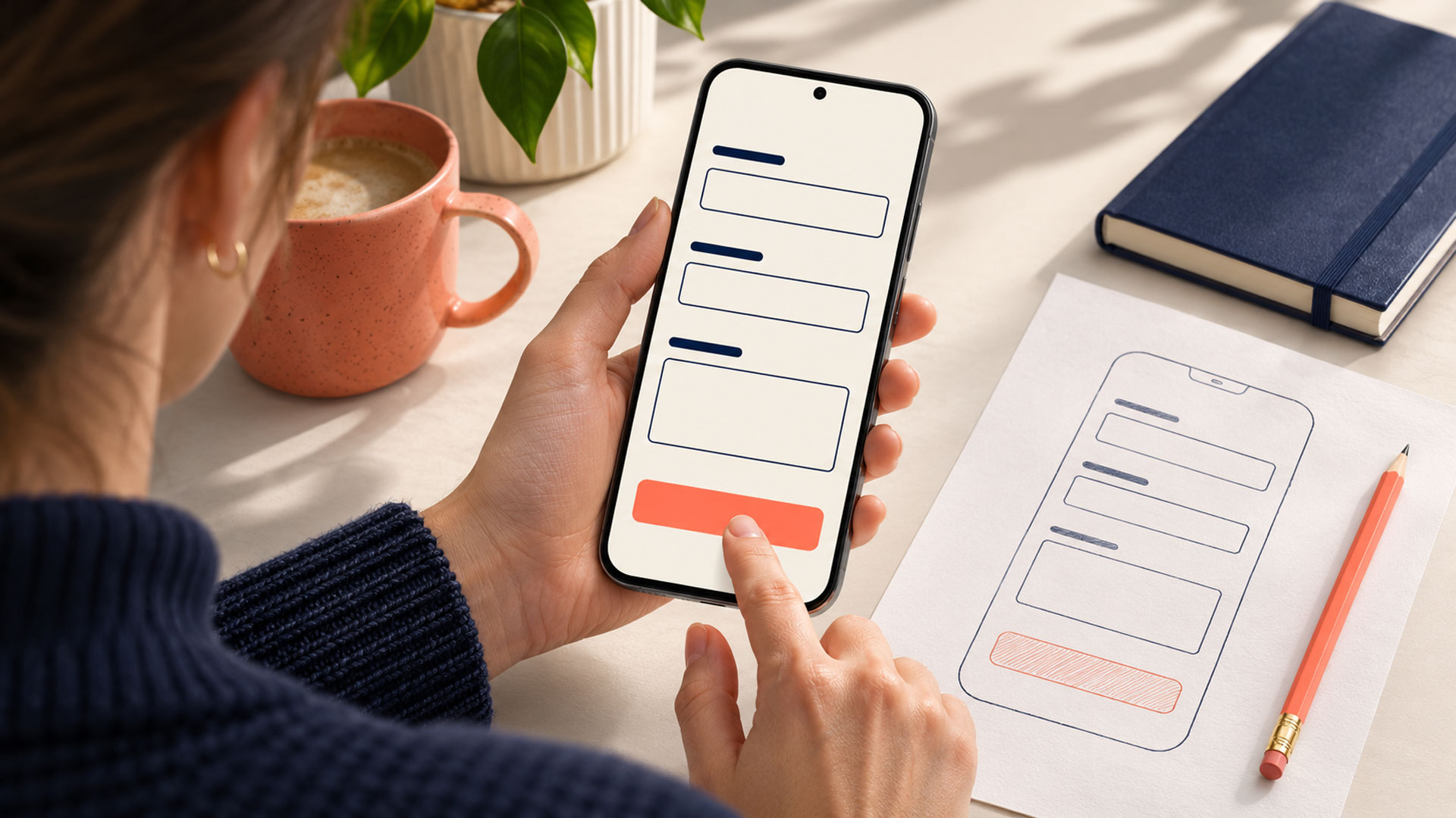













Design a contact form around one clear request: ask for the information needed to respond, explain each question plainly, make mistakes easy to correct, and confirm that the enquiry has been received. The form should work comfortably on mobile, with a keyboard, and with assistive technology.
Completion also needs a business definition. A button click, a successful submission, and a qualified enquiry represent different steps. Your design and reporting should help you understand each one.
At M4YOURS IT, our recommendation is to review the entire enquiry journey, from the invitation to make contact through to the response from your team. That gives every field, message, and technical check a clear purpose.
Decide what this form is meant to accomplish. An initial service enquiry, appointment request, support ticket, and detailed quotation request can require different information.
A visitor asking whether you provide a service should not automatically have to complete the same questionnaire as someone requesting a detailed project proposal.
Define the next action your team will take after receiving the form. Will someone reply by email, assess service suitability, arrange a conversation, or prepare an estimate?
Use that decision to guide your website design brief, the introduction above the form, and the questions you ask.
Review every proposed field with the person who will use the answers. Ask what decision the information supports and whether it is needed at this stage.
The GOV.UK Design System’s question-page guidance emphasizes understanding why each question is asked and requesting information that is genuinely needed. GOV.UK Design System
For a business enquiry, a field review could look like this:
| Proposed Field | Question for Your Team | Possible Decision |
|---|---|---|
| Name | How will it help us address or identify the enquiry? | Keep a simple name field where useful |
| Will we reply by email? | Require it when it is the response channel | |
| Phone | Will we call, or is email sufficient? | Request it when needed or make it optional |
| Service needed | Does the answer help us route the enquiry? | Offer understandable service choices |
| Company | Is it essential for the first response? | Make it optional when appropriate |
| Project budget | Will it affect suitability or the next action? | Explain its purpose and permit uncertainty where valid |
| Detailed documents | Are they necessary before a conversation? | Collect them later if the initial enquiry does not require them |
This review is more useful than choosing an arbitrary field count. A short form can still ask unclear questions, while a more detailed form may be appropriate for a specific request.
If you reveal questions based on previous answers, test how the form behaves when someone changes their selection. Keep the route understandable and avoid unnecessary re-entry.
Use short, direct labels that remain available while people type. State optional fields clearly and place essential guidance beside the relevant question.
GOV.UK’s text input guidance recommends visible labels and explains why placeholder text should not replace them: it disappears during typing and may be difficult to use with assistive technology. GOV.UK Design System
Review wording from a customer’s perspective:
| Unclear Wording | More Specific Alternative |
|---|---|
| Details | Briefly describe what you need help with |
| Contact | Email address |
| Type | Which service are you interested in? |
| Organization | Company name (optional) |
Use hints to explain requirements that customers cannot reasonably infer. If a message has a length limit, tell people before they reach it. If you need a reference number, explain where to find it.
For an open message field, offer a helpful prompt without demanding a complete specification. For example:
Tell us what you want to achieve and anything we should know before replying.
Start with a clear vertical sequence for a simple enquiry form and test whether the layout fits the actual questions. Keep labels, hints, fields, and errors visually connected.
Ask your developer to use appropriate input controls and autocomplete information. GOV.UK’s text input guidance explains how autocomplete identifies a field’s purpose so browsers can help people enter previously provided information. GOV.UK Design System
Test the form with the on-screen keyboard open. Check whether people can see the current field, reach the next control, review their answers, and find the submission button.
Include copy and paste, international contact details, and longer names in your checks. Review any floating chat buttons or sticky banners that may cover controls or feedback.
Your UI/UX design review should also include keyboard navigation, focus visibility, label associations, and how errors and confirmation are communicated to assistive technology users.
An error should explain the problem and help someone correct it. W3C’s form notification guidance recommends clear, concise feedback for errors and successful completion. W3C
Identify the affected question and provide a useful explanation. Preserve the answers that remain valid so the person can continue without starting again.
Review validation rules against the information you actually need. Avoid rejecting a legitimate answer because it does not match an unnecessarily narrow format.
| Situation | Example Feedback |
|---|---|
| Required email is empty | Enter an email address so we can reply |
| Email format is invalid | Enter an email address in the format name@example.com |
| Required service choice is missing | Choose the service you want to ask about |
| Required project summary is empty | Briefly describe what you need help with |
Make feedback available in text and programmatically associated with the relevant controls. Review focus behavior and an error summary where appropriate, rather than relying on a color change alone.
Browser checks can help users correct input, but the receiving system also needs validation. MDN’s form validation guidance explains that client-side checks can be bypassed and cannot replace server-side checks. MDN
A valid email format does not establish that an enquiry reached your business. Verify the application’s submission result before displaying a success message.
Show progress while a request is being processed. Define how the system handles failures, uncertain delivery, retries, and accidental repeated clicks so users receive accurate feedback.
Place useful context near the form. Explain what the enquiry is for, what your team will do with it, and which contact method you will use.
If you state a response window, agree it with the team responsible for replying. Keep the wording aligned with what the business can consistently deliver.
Provide an appropriate privacy notice and describe contact preferences accurately. If marketing signup is offered, make its purpose clear alongside the enquiry action.
The same care applies to button labels. “Send Project Enquiry” describes a different action from “Confirm Appointment.” Use wording that matches the actual result.
The following example illustrates an initial service enquiry. Adapt it to your routing and qualification needs.
Form heading: Tell Us About Your Project
Introduction: Share what you need help with and how we can reply. A brief description is enough to start the conversation.
| Field | Example Treatment | Purpose |
|---|---|---|
| Name | Simple text field | Address the person in the response |
| Email address | Required when replying by email | Provide a response channel |
| Service needed | Clear choices, with “Not sure yet” where appropriate | Route the enquiry |
| Brief project description | Message field with a helpful prompt | Understand the request |
| Company name | Optional if unnecessary for the first response | Provide business context |
Button: Send Project Enquiry
Example confirmation, after the system has accepted the enquiry:
Your project enquiry has been received. Our team will review your message and reply by email.
Add a response window or reference number only when the operating process supports it. If the form merely requests an appointment, the confirmation should explain that the appointment still needs to be arranged or confirmed.
The sample field count is not a universal target. Review whether each question helps your team provide the next useful response.
Include both customer use and operational delivery in the review:
If the form connects to a custom workflow, involve your web application development team when defining acceptance, retries, and follow-up behavior.
Assign ownership for checking the form after changes to plugins, integrations, routing rules, or staff responsibilities. The customer’s enquiry journey depends on that operational path continuing to work.
| What You Observe | Investigate First | Practical Starting Point |
|---|---|---|
| People hesitate over questions | Wording and information requirements | Clarify labels, hints, and field purpose |
| Many valid answers are rejected | Validation rules and accepted formats | Review unnecessary restrictions |
| Mobile users struggle to finish | Layout, keyboard behavior, and controls | Test the complete mobile task |
| People click repeatedly or resubmit | Submission state and feedback | Improve progress, retry, and confirmation behavior |
| Submissions increase but suitability falls | Qualification questions and traffic | Review the information needed to assess fit |
| Staff cannot find submitted enquiries | Delivery and routing | Verify records, notifications, and ownership |
A focused website optimization project should connect observed problems to specific changes and acceptance checks.
Define your measures before changing the form.
| Measure | What It Helps You Understand |
|---|---|
| Sessions with meaningful form interaction | How many sessions genuinely begin the task |
| Sessions with an accepted submission | How many complete the submission process |
| Repeated field errors | Questions or formats that need investigation |
| Qualified enquiries | Whether accepted requests fit your services |
| Confirmed follow-up or bookings | Whether the enquiry leads to a useful next step |
For a session-based completion rate, divide sessions containing an accepted submission by sessions containing a meaningful form start, then multiply by 100. Keep the event definitions and measurement period consistent.
Track error counts and field identifiers without copying entered names, emails, or message text into general analytics events. Use the appropriate enquiry system for reviewing the actual request.
Compare device, page, and traffic source where relevant. A change in enquiry quality may reflect audience or offer changes as well as the form itself.
For a website with limited traffic, combine the available numbers with observed task sessions and staff feedback. Treat those findings as evidence to investigate and refine.
Your next project
Have a business in mind? Tell us about your ideas, your audience, and the identity you want to create.
Prefer a direct conversation?
Include the fields required for the next useful action. Review each one with the team receiving the enquiry. There is no need to collect information solely because another website includes it; the request, response process, and qualification needs should determine the scope.
Require a phone number when a call is necessary for the requested service or next step. If email is sufficient, consider whether phone should be optional. Explain the intended use so visitors understand what providing the number means.
Ask when the answer helps establish suitability or prepare the next conversation. Explain the purpose, offer understandable choices, and allow uncertainty where it is a valid response. Evaluate enquiry quality after changing the question.
Choose based on the amount and complexity of information needed. A straightforward enquiry may fit comfortably on one page. A longer process may benefit from logical steps, clear progress, and a reliable way to review and change previous answers. Test the complete journey.
Review the abuse you are actually receiving and evaluate protection with your technical team. Include legitimate users, mobile use, accessibility, and failure recovery in the checks. Measure whether the protection reduces unwanted submissions while preserving a usable enquiry route.
Give your contact form one clear purpose, justify its questions, and test how people complete and correct it. Then verify that the resulting enquiry reaches the team responsible for responding.
M4YOURS IT can help connect contact form design with your website experience and enquiry workflow, from field planning and feedback to implementation review.
Is your contact form difficult to complete or producing unreliable results? Discuss your website with M4YOURS IT to define a practical improvement scope.
Adding {{itemName}} to cart
Added {{itemName}} to cart