Share













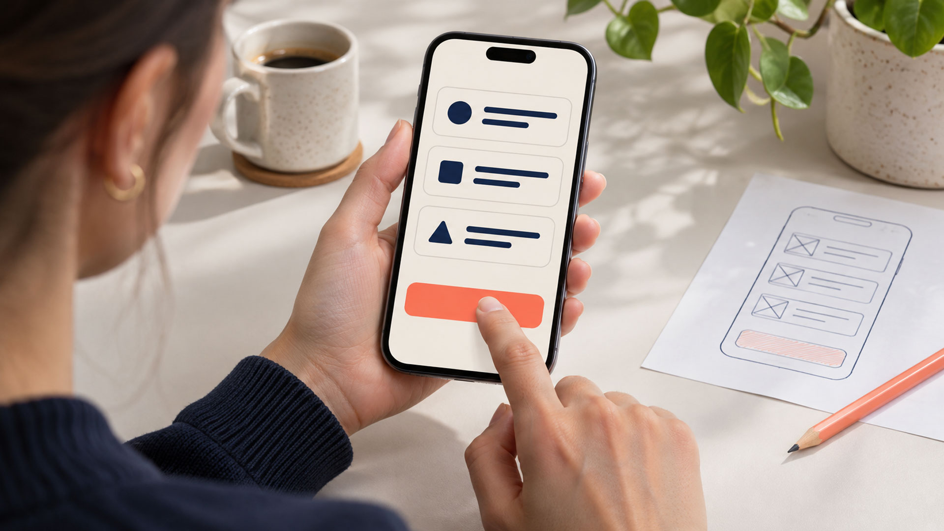
Mobile UX improves when people can read, choose, enter information, and complete a task without unnecessary effort. Start by reviewing the journeys that matter most to your customers: finding a product, requesting a service, booking an appointment, or managing an account.
A website can fit a phone screen while still making these tasks difficult. A visitor might repeatedly tap the wrong control, lose their filters after opening a result, or struggle to find a form button behind the keyboard.
These problems deserve attention because they interrupt the work the visitor came to do.
For a business planning a new website design, define the important mobile tasks before approving page layouts. For an existing website, follow those tasks from the first screen through to the final outcome.
Small controls become especially difficult when they sit close to other actions.
A shopper trying to increase a quantity may accidentally remove the item. A visitor choosing an appointment may select the neighbouring time. A small close icon can make an overlay difficult to dismiss.
Review the usable area of the control, including the space around it. A larger visual icon does not help if only a small part of it responds to a tap.
W3C’s target-size guidance addresses both control size and spacing, with defined exceptions. Use it during implementation and test whether people can select important controls comfortably. W3C
Pay particular attention to:
Observe people using the interface in a natural grip. Do not assume every visitor holds the phone or operates it in the same way.
A desktop page may have several columns, a large navigation bar, and a wide comparison table. Compressing everything can make the mobile version crowded and difficult to read.
Reorganise the content around the task. Bring important information into a useful sequence, and let supporting details remain easy to reach.
For example, a product page should make the selected variant, price, availability, and purchase action understandable together. A service page should establish what is offered and how to take the next step.
W3C’s reflow guidance explains how content should adapt without losing information or functionality or forcing unnecessary scrolling in two directions. It includes exceptions for content that needs a two-dimensional layout, such as some tables and maps. W3C
Check text enlargement as well as narrow screen widths. Important information should remain available when headings wrap or visitors use larger text settings.
Avoid placing essential instructions inside images where they become difficult to resize, read, or translate.
Every unnecessary field adds work to a mobile form.
Start by reviewing what the business needs at this stage. Remove questions without a clear purpose, reuse information already provided where appropriate, and explain unfamiliar requirements.
Then check how the remaining fields behave.
| Information requested | A smoother mobile experience |
|---|---|
| Email address | An appropriate email keyboard and supported autofill |
| Telephone number | A suitable telephone keypad and clear country-code guidance where needed |
| Delivery address | Supported address autofill and fields suited to the regions served |
| Product quantity | A control that accepts the valid quantities for that product |
Google’s web.dev guidance explains how input types and input modes influence on-screen keyboards. Choosing the appropriate configuration helps people enter the expected information. web.dev
Its autofill guidance also explains how suitable autocomplete values help browsers offer relevant saved details. Check that the form works with autofill as well as manual entry. web.dev
Keep labels visible while someone types. Explain accepted formats before an error occurs, and avoid rejecting valid information simply because the user included ordinary spacing or punctuation.
A sticky header, cookie banner, chat widget, and promotional bar can occupy much of a small screen.
Each element may have a purpose, but the combined layout can leave little room for the actual task.
Review the whole page with these elements active. Check whether people can read the content, dismiss interruptions, reach controls, and correct errors.
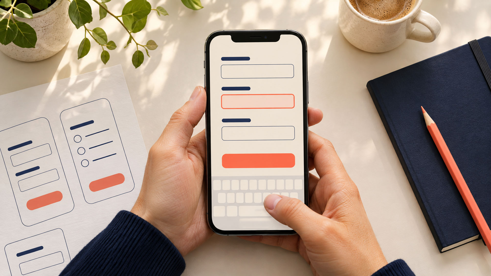
Open the on-screen keyboard during testing. A form that works in a static screenshot may become awkward when the available space changes.
For keyboard navigation, W3C’s Focus Not Obscured guidance addresses controls being entirely hidden by author-created content. Review sticky headers, footers, and other overlapping elements with that requirement in mind. W3C
A persistent action can be useful when it remains relevant and leaves the surrounding task usable. Test its behaviour near the footer, inside forms, and when another panel opens.
A compact mobile menu still needs to help visitors understand where they can go.
Use labels your audience recognises. Make search easy to find when it is an important route, and keep the current section understandable as people move through the website.
For a directory or store, review the complete filtering experience:
Avoid making essential actions available only through an undisclosed gesture. Provide clear controls for actions such as removing an item, moving between options, or opening more detail.
When a menu or panel closes, return people to a sensible place in the journey.
A UI/UX design review can connect navigation decisions to the tasks visitors actually need to complete.
Mobile journeys frequently involve comparison.
A visitor filters a list, opens a result, checks the details, and returns to inspect another option. Resetting the list makes them repeat work they have already completed.
The same problem occurs when a form clears every field after one error or a multi-step journey forgets earlier choices.
Preserve useful context within the journey: search terms, selected filters, relevant scroll position, and valid entries where appropriate.
Choose how to handle sensitive information deliberately. Recovery should fit the service’s privacy and session requirements.
Recheck information that can change, such as stock, pricing, or appointment availability, before completing a transaction. Keeping the visitor’s choices should work alongside an accurate final result.
Include these behaviours in web application development requirements. State handling affects the customer experience as directly as the visible interface.
A slow or uncertain response can leave someone wondering whether their tap registered.
Show useful feedback when loading results, saving information, or processing a submission. Make the current state understandable and provide a recovery option when an operation fails.
Check for sudden movement while the page loads. A control can move just as someone tries to select it.
Google’s guidance on layout shifts identifies causes such as images and embedded content loading without reserved space. Reviewing those causes helps teams keep the page more stable during use. web.dev
Optimise assets and review scripts that delay important interactions. Test on devices and connections that resemble those used by your audience.
Measure the complete task as well as the initial page load. A fast first screen provides limited value if applying a filter or moving to the next form step is consistently difficult.
An account requirement should support a defined need in the journey.
Let visitors explore public product or service information before asking them to sign in. Explain the benefit when an account is needed, such as accessing records or managing an existing booking.
Review the sign-in process itself. Support password managers and appropriate autofill. Google’s autofill guidance describes how browsers can help people enter account details and manage passwords. web.dev
Check what happens if someone needs to recover their account or leave the page briefly to retrieve a verification message.
Keep their intended destination clear. After signing in, help them continue the task they started.
The appropriate requirements depend on the service. A public catalogue, a customer account, and a system containing private records have different needs.
“Something went wrong” gives someone little help when they are trying to finish a task on a phone.
Explain the problem and the available next step. Keep valid information where appropriate, identify fields that need attention, and make the relevant message easy to locate.
Distinguish these states clearly:
| State | What the visitor needs to understand |
|---|---|
| Processing | The action has started and is still being handled |
| Input error | What needs correcting and where |
| Service failure | Whether the task completed and what recovery is available |
| Request received | The information arrived and any review is still pending |
| Confirmed completion | The underlying system successfully completed the stated action |
Avoid showing success merely because someone tapped a button.
If an order or payment status is uncertain, provide a way to check it before inviting another attempt. For an appointment request, explain whether staff confirmation is still required.
Test the final screen with users. Ask them what they believe has happened and what they would do next.
A desktop browser’s mobile preview is useful for layout checks. Real-device testing reveals more about touch, keyboards, browser behaviour, and interruptions.
Choose a small set of important tasks:
Use fictional information in a test environment where transactions or private records are involved.
Include different device sizes and the browsers your audience uses. Check larger text, keyboard operation, and assistive technology where relevant.
Observe hesitation, repeated taps, accidental selections, and lost progress. These observations help explain a problem that analytics alone may not reveal.
Write findings as specific issues. “The chat widget covers the form action when the keyboard opens” gives the team something concrete to fix.
| What you observe | Recommended starting point |
|---|---|
| People repeatedly select the wrong control | Review target size, spacing, and adjacent actions |
| Text or important details disappear on small screens | Review content order, wrapping, and enlargement |
| Form completion involves repeated corrections | Review fields, labels, keyboards, autofill, and validation |
| People restart after returning to a page | Preserve appropriate journey state |
| Taps appear to produce no response | Review feedback, responsiveness, and failure states |
| Visitors misunderstand completion | Align messages with the underlying system status |
Start with problems that block important tasks or cause people to lose work. Then address repeated effort and confusion.
A focused redesign and optimization review can help establish that order without requiring every page to be redesigned at once.
Define what successful completion means for each journey.
For a booking flow, distinguish a completed request from a confirmed appointment. For ecommerce, distinguish adding an item to the basket from placing an order.
Track relevant measures, such as:
Keep definitions consistent when comparing versions. Consider differences in traffic source, device, and connection before attributing a change to the design.
Use observations to interpret the numbers. A long task may reflect careful comparison, while a short visit may reflect an immediate obstacle.
Exclude personal form answers, passwords, payment details, and sensitive records from general-purpose analytics and recordings.
Your next project
Have a business in mind? Tell us about your ideas, your audience, and the identity you want to create.
Prefer a direct conversation?
Responsive layout is an important foundation. Review whether visitors can also navigate, select controls, enter information, recover from errors, and understand completion. A page can fit the screen while the task remains difficult.
Placement depends on the task, surrounding content, and how the interface behaves. A bottom action can be useful, but it must leave instructions, fields, and other controls usable. Test it with the keyboard open and with larger text.
Begin by identifying the problem. A confusing form or broken booking process needs attention regardless of the platform. Consider an app when the service has a defined need for its capabilities and the business can support it. Evaluate that decision separately from routine mobile website improvements.
Start with a problem that prevents an important customer task from being completed. Examples include an unreachable submit button, a failed checkout step, or navigation that loses a visitor’s work. Observe the issue, make a focused improvement, and verify the full journey again.
Choose one important mobile journey and use it on a real phone. Follow it through searching, selecting, entering information, correcting an error, and reaching the final outcome.
M4YOURS IT can help review mobile interfaces and the workflows behind them. Request a consultation to discuss the customer tasks your website needs to make easier.
Adding {{itemName}} to cart
Added {{itemName}} to cart